Consider the soccer season. Throughout most of the world, a domestic soccer/fútbol season is art in and of itself. (We complicate this in the States, but maybe we’ll get it right one day.) Over the course of a season, each club plays the other clubs in its league twice – once at home, and once away – and points are totaled for wins, losses, and draws. At the end of the season, the most points wins the title. Balanced, fair and artfully simple. The data points at play: place and time, clubs, points gained. There are some very ambitious ways one could portray this data; here I’m going to keep it just as simple as the soccer season itself.
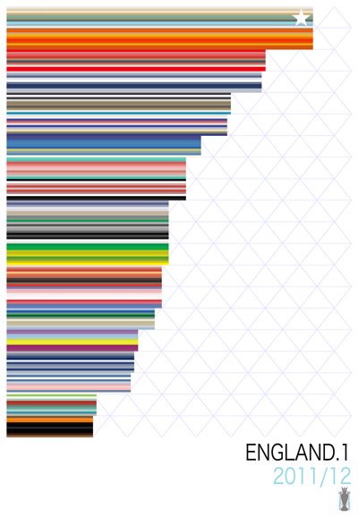
This is the most recently-completed English Premier League campaign, in my humble interpretation. A few details:
Update: Two Items.
1. I expanded the concepts in this post to a full-on web design visualization experiment called Seasons – you can check it out here.
2. A few very limited edition prints of the seasons you see here are available to purchase. Please enquire at m@mwillis.com for details.
Carry on!
The horizontal colored bars indicate clubs – each club is rendered as a collection of ten colored stripes that re-interpret (artfully, I hope) their crest. The grid marks off total points gained (0-100), the clubs in descending order by points. The season’s champion is top, marked with a star; their featured colors also tint the listed year, and below that a representation of the trophy they earned.
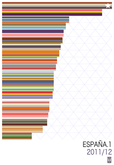
This one (above) is the most recent La Liga campaign. My goal here is to produce something you might want to hang on a wall – something that had a bit of the beauty and pageantry of the matches themselves, a bit of artistic flair, and a story to tell.
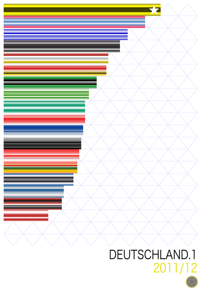
It starts to get even more interesting, to me, when you visually compare league seasons. Not only to see how the winners won, how the losers lost, or the arc to the middle pack – but to compare the colors and graphic styles of different leagues. La Liga 2011/12, above, has tons of rich oranges and reds – and if you check the crests from the participants in that season, you’ll see very traditional Mediterranean colors. The Bundesliga, by way of comparison, has stark, bold primary colors – and a glance at the German design aesthetic (as applied to soccer crest design) will instantly show you why. England has a bit of both.
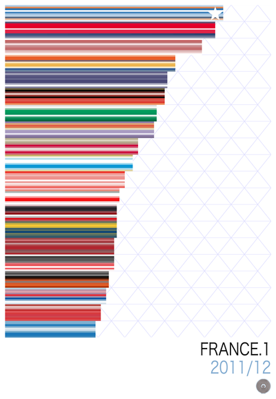
France’s Ligue 1 has the virtue of being the brightest and (to me, anyway) most visually optimistic of the national leagues I looked at. There’s an airiness to the visual language used in French football that’s quite appealing (and might dovetail nicely with what is expected to be a rise in prominence).
And then, we have Major League Soccer.
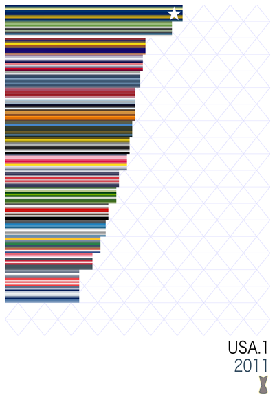
The fit isn’t perfect. M.L.S. doesn’t play a balanced round-robin schedule, for one, so the simplicity of the representation is belied by the messy business of acquiring points in an uneven fashion. Perhaps related to this is that no teams really break from the pack; there’s a gentle, urgent arc to the top tier of other leagues that just doesn’t materialize in an M.L.S. season. The colors are powerful, but perhaps (with some exceptions) not quite as elegant as a few other leagues (but this could be my own artistic interpretation). And the trophy at the bottom is not the league’s premier trophy – that would be the MLS Cup, for the winner of the post-season playoff tournament – but the more modest Supporter’s Shield (for season-long excellence).
Still, the visual language carries the day. To me, these seasons are just plain cool to look at. I’m planing to print at least a couple of these up on poster stock for the ol’ rec room – and perhaps add a few more leagues (other countries? lower divisions? classic past seasons?) to the mix. If you have any requests, pass them along.
Mark Willis writes about art, design, soccer and web stuff here on mwillis.com, and on Twitter. If you like tech and Apple stuff, read “A Couple Things I Wish Apple Did Better”, or “Being a Commodity”. If you like soccer, read about rebooting the Revs, or how the Revs work in the age of mutual love. And if you like sweet t-shirts, check out some stuff to buy. Drop him a line about anything at mark@mwillis.com.