Ah, yes. I just finished detailing some color and kit ideas for US Soccer. Red and white hoops whenever we can; deep navy when we need a change, and pale gold design details (including a sash) to unify the designs. But primary design concepts – especially those based on the current real-life uniforms – can only excite for so long. That’s why I’m taking a few minutes today to discuss the completely provocative, never-quite-fully-realized minefield that is every concept designer’s dream: the third kit.
Author’s note: This is part of a series on US Soccer’s visual identity. When you’re done here, feel free to read on.
Intro: What Makes a USA Kit?
Part I: Colors & Combinations
Part II: Third Kits & Special Occasions
Final Thoughts: American Expression
You can now purchase The Gadsden!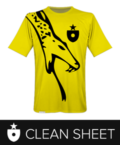
Thanks for reading!
I’ll briefly describe my definition of the third kit, and if we agree, we can move on to a few designs. (If not, see you in five on the message boards.) This is regarding uniform identity at the international level – I think we can agree that clubs are free to completely screw around with their looks every year, and do so with dollar signs in their eyes. But national sides are a bit more beholden to tradition – and this is what makes their kit lineups – first, change, third – so interesting.
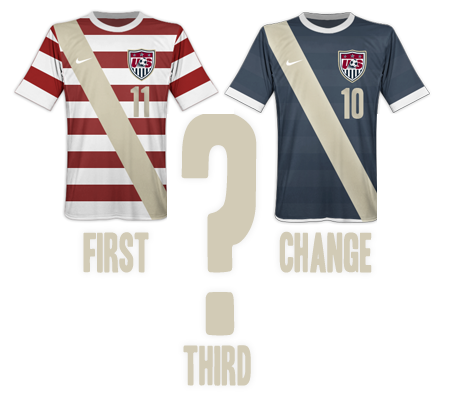
Kit lineups? Well, the first kit is your bread and butter – the visual encapsulation of your soccer identity, the look fans associate with your style, a bright cue that sticks in stories and memories and still shows up vibrantly in decades-old video clips. The first kit might evolve a bit to accommodate changing times, but it never really changes. Sure, the trim is a bit different here, and the cut gets tighter over there, and “the collar is new this year!” but honestly: Holland will likely suit up in oranje at De Kuip, and Brazil will almost always be rocking bright yellow when they stroll out of the tunnel at the Maracanã. The first kit is tradition. It’s locked in.
The change/second/away kit, at the international level, is all business. It’s your basic “yeah, let’s just get this over with, give me the 1-0 own-goal win on the road and let me get back on the plane” kind of look. This is the Dutch in black, or Brazil in deep blue. It’s different, it’s a bit less flamboyant, because it’d be bad manners to dress like you owned the place on the road. (Unless you were invited to.) The second kit changes probably once every uniform cycle, but it doesn’t stray too far from a standard either. There are few radical alterations, but flourishes like pinstripes or patterns can bring it different looks that probably wouldn’t be tolerated on the main kit. Every so often you’ll see a wholesale color change, but it’s not so common. The change kit isn’t quite locked in, but it’s a) usually fairly subdued, compared to the first kit, and b) usually fairly consistent, especially among teams that have built up strong visual traditions.
And speaking of traditions… no, the US has never locked in a first kit. (I’d like it to be red and white hoops.) No, they’ve never centered on a change kit. (I think it should be navy blue). Despite some good precedent to the contrary, US Soccer and Nike completely change the home and away jerseys every cycle. First and foremost, they need to stop doing this. US Soccer needs to pick some national identifier and build a bit of tradition around a visual language for a few decades. The lack of consistent home and away looks keeps the US from building emotional equity with fans. It may sound like a little thing, but like Carolina blue, or Yankee pinstripes (shudder), there is emotional power in a visual identity that connotes success. Because the US doesn’t even try to capture that, it makes the team seem anxious and a little immature, like a teenager who’s a prep one day and goth the next. I’m sick of US Soccer trying on identities like a 10th grader. It’s time to pick something.
(Deep breath.)
But there’s a silver lining. None of the above has anything to do with third kits. Because third kits are meant to be a little crazy. And since we can’t even keep our main identity focused, yeah: crazy is something we can do.
Third kits are, as a stated at the outset, a designer’s dream. They are created from scratch, with the most far-flung reasons for being. Hey, Brazil, a Nike designer slid the “contrast” bar in Photoshop over to the left by mistake one day and he liked what he saw. How about a black third kit? What’s that, France? Forgot your good jerseys at home, and there’s a color clash? Who cares that it’s the World Cup, green and white stripes are your new third kit! (aside: it’s insane that this really happened.) England even designed a secret third kit around the sky blue sky they never see. (Seems kind of pagan to me.) There aren’t really any rules to third kits – it’s just a chance to get creative and to test out ideas. And, since we have no real permanent traditions, the US can do “creative” in spades.
We’ve had a few interesting third kits over the years that, importantly, have broken in visual concepts that later found their way into first and change kits. Going back a few years, the third kit is where Nike got serious about the “Don’t Tread on Me” campaign, and designed the first new sash jersey for the US team in decades. A year or two before that, the US team commissioned special sash kits as 1950 “throwbacks” (which I don’t count as new, because they were based on an old design). And right after all that the US donned (for a few ill-fated Copa America games) my favorite cult jersey, a royal-blue-with-pinstripes number. Each of these kits were one-offs – Darwinian dead ends that, despite not producing offspring, added design DNA back into the main line that enriched the US’s already quite busy visual identity.
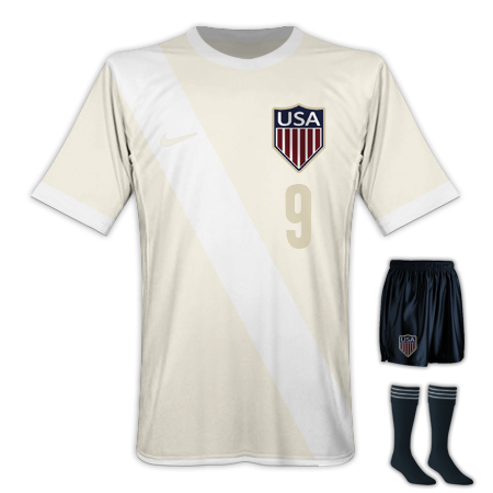
It’s in that spirit that I present a few ideas myself. Remember: I want the US to standardize around rock-solid design concepts for their first and second kits, but have fun with their third kit. Third kits are allowed to be fun. So here you go. First, the New Throwback:
and second, the Gadsden (aka, Don’t Tread On Me Redux):
Let’s take these one at a time. First, the New Throwback.
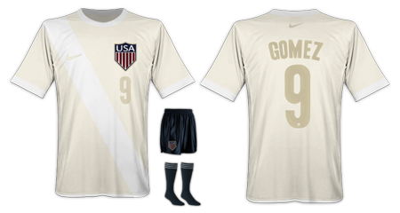
This is a look I’d like to see the US break out for special occasions. Anniversaries of big victories, holidays, sentimental matches – anything where there’s a sense of history in the air. There are a few touches I enjoy here; first, the shield is the classic Captain America version that our oldest national sides used. The “heritage white” color I discussed adding to the palette is employed as the primary color here, giving the jersey a well-worn, vintage feel. The crisp white sash cuts through, maintaining another emerging US tradition without spoiling the simplicity. Pale gold numbers and lettering also come over from the first and change kits, but feel just as comfortable in a throwback setting. The entire look evokes the team’s history without losing the current touches and visual language we’re trying to establish. I would own this kit in a heartbeat.
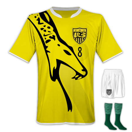
And then, we have the most interesting kit the US has ever worn (and the most enjoyable part of this little project to design): the Gadsden Kit.
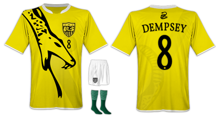
This is a huge departure for the US, and something like this probably won’t happen for quite some time, but I’d not only love to see it, I’d love to own one. First, let’s give a little context for those who might need it.
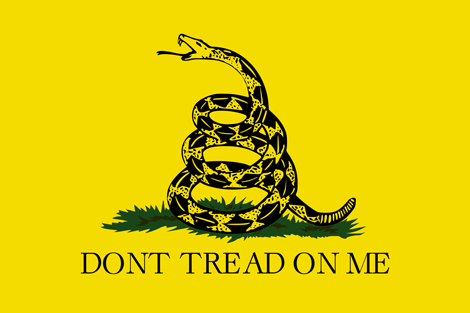
As most probably know, this is the Gadsden flag, flown first by continental marines during the American revolution. It’s had a storied history since then, getting pulled off the shelf any time anybody feels like they need to back up their American bona-fides with a little visual punch. Nike smartly capitalized on grassroots use of the flag by US supporters and turned the snake and the “Don’t Tread On Me” motto into a very well-received secondary brand for the US team.
I’d like to take that identity a step further. Where Nike took visual and verbal cues from the Gadsden flag, I’d like to actually use its striking graphic identity to cut right through the typical red/white/blue same-old, same-old US national teams always employ. So in this version, the jersey is “warning” yellow and midnight black. There’s not a trace of red, or blue to be found – even the US shield is rendered in one-color black. The socks subtly pick up the only other color on the flag, green grass.
And the snake – yes, the snake is the sash. I thought this was a little too perfect not to try. This version of the Gadsden rattlesnake is taken directly from the iconic version of the flag, not Nike’s re-imagining (which I like, but which is a bit less potent). Where the fangs and tongue leave off, a very faded sash continues to the base of the jersey, and on the back, the snake’s rattle and a hint of a sash give a bit more personality. I chose a different lettering typeface for this kit – Vollkorn – to evoke the serifed motto that’s usually printed on the flag. A few final touches – Nike’s own “Don’t Tread” snake takes the centered logo spot above the name on the back, and on the front, the swoosh is nicely woven into the hand-drawn texture of the snake itself.
Yes, this jersey is over the top. Yes, it’s not something you could wear more than a few times. We’re not talking about making this the first-choice jersey. This would be one of those one-off third kits – but imagine how fun it would be for that one game. Can you imagine playing Mexico in Columbus (home of the yellow and black) in this kit? Madness. I’d also make a slight prediction – a kit like this would instantly become one of the most popular US supporter’s kits of all time. Again, I’d buy one as fast as they could charge my card. It’s just too fun (at least in my humble opinion) not to try.
And one last note about colors: I love red, white and blue, but it’s ok to get creative once in a while, and to forget trying to rope everything back to the colors of the flag. The Gadsden imagery is powerful and American almost because it is so jarringly different – and every so often, that’s what we should be going for.
OK – if you got this far, thanks for reading. Tomorrow we’ll try to tie a few of these ideas together and wrap things up. See you then. Update: you can read it here.
Update: March 2013
I’m considering producing the shirt below. Interested? Let me know @m_willis or at m@mwillis.com.
OK #USMNT & soccer fans. Working on a generic Gadsden flag T. If I have enough interest I’ll produce ‘em: twitter.com/M_Willis/statu…
2https://media.tumblr.com/de7a22b85459a6a0126206e3ae72465e/tumblr_inline_mkbri0A9fZ1qz4rgp.pMark Willis writes about art, design, soccer and web stuff here on mwillis.com, and on Twitter. If you like soccer, read about rebooting the Revs, or how the Revs work in the age of mutual love. If you like tech and Apple stuff, read “A Couple Things I Wish Apple Did Better”, or “Being a Commodity”. And if you like sweet t-shirts, check out some stuff to buy. Drop him a line about anything at mark@mwillis.com.