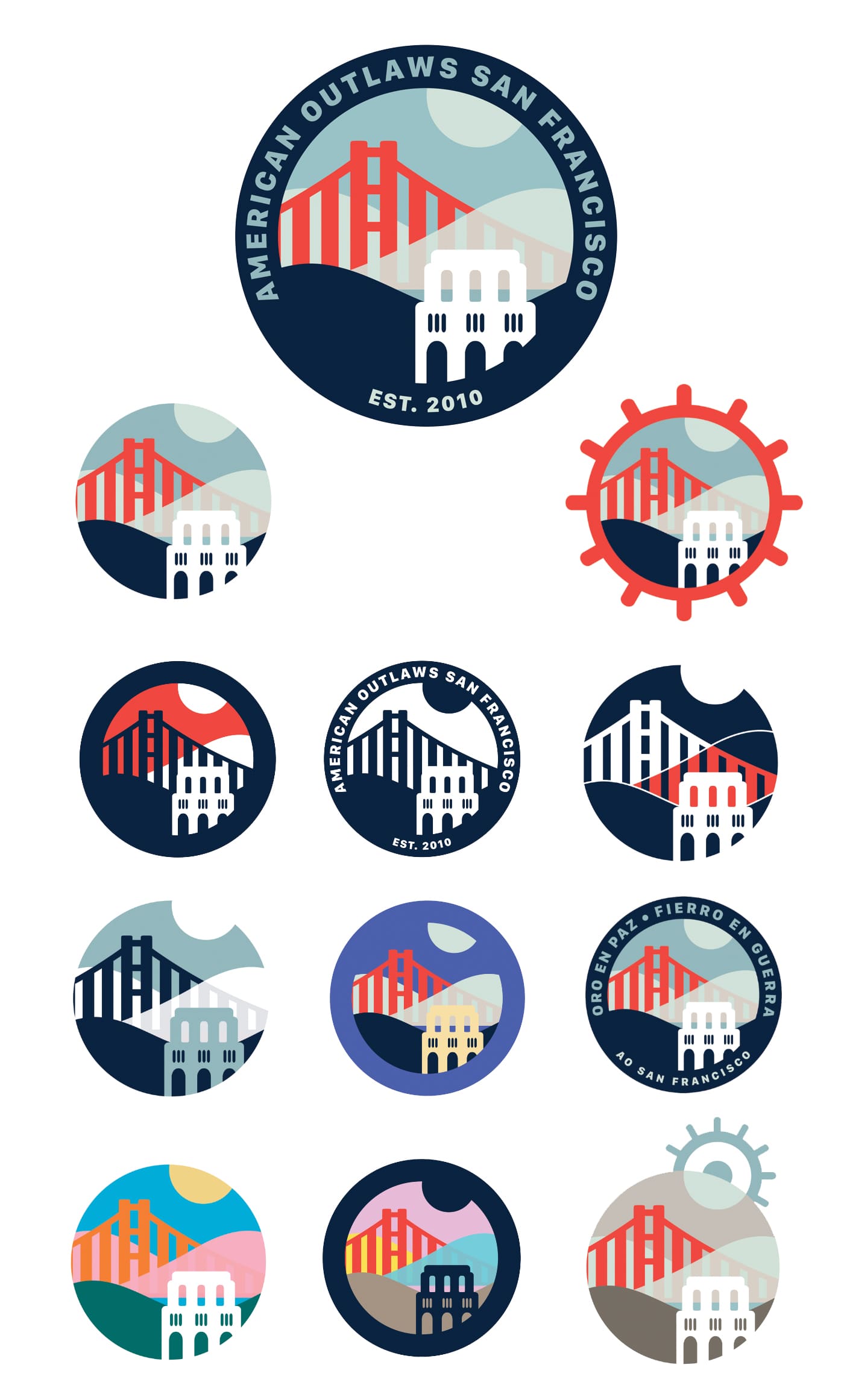
AO San Francisco
An identity for a thriving American soccer supporters' group.
The American soccer landscape is diverse. At every level, there are organizations who need public-facing brands: clubs, leagues, compeitions, and, notably, supporters groups.
I've been fortunate to work with several prominent supporters groups, and the American Outlaws are one of the coolest. A national organization, they have chapters in cities and towns all across the country. The unifying goal: support the U.S. national soccer teams through thick and thin.
I worked with AO's San Francisco chapter, one of the largest in the country, to create an identity for the group. The idea was to capture aspects of San Francisco in a way that seemed obvious without being cliche, and to create a mark that felt at home in the soccer universe. AOSF also wanted some flexibility to adapt the mark to different contexts, including options that supported multilingual messaging.
Once the basic composition was ready–including landmarks like the Golden Gate Bridge and the Coit Tower, as well as San Francisco's famous hills and rolling fog–I created a variety of interpretations that brought the identity to life. (A few of the alternate versions even reference the famous "captain's wheel" motif found in the signage around Fisherman's Wharf.)
The primary color scheme, of rusty reds, greyish blues and navy, finds a common ground between San Francisco colors (the bridge, the fog, and the hills at night) and traditional American red, white and blue. Importantly, the identity is modular: the elements in the mark can be separated and remixed independently to create new visual ideas that connect to the primary brand.
AO San Francisco has embraced the new mark, and it proudly graces apparel and digital media.

South 2 Snow
More detail coming soon.
Additional information is being added. Please stand by.
Seabunny Company
More detail coming soon.
Additional information is being added. Please stand by.
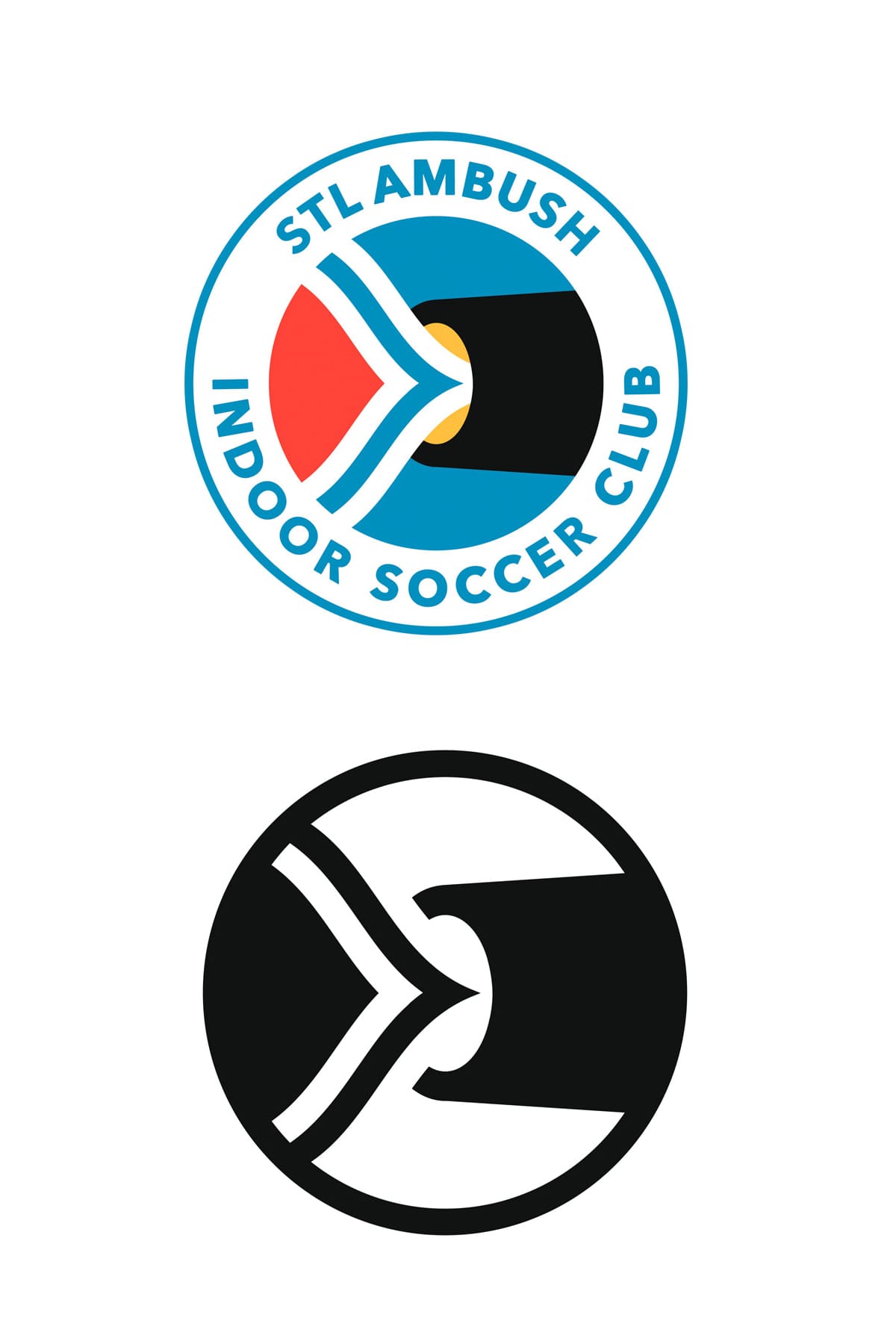
St. Louis Ambush
Re-branding a successful indoor soccer club.
I’ve had some preliminary conversations with the St. Louis Ambush, a prominent indoor soccer club, about redeveloping their brand. This logo (and a brand built around it) is the result of thinking through what the Ambush could be.
The logo combines elements that the team currently uses – blue and black “hoop” stripes, and a cannon motif – and combines it with the distinctive Three Rivers inspired-flag of St. Louis.
Discussions with the club are ongoing; I hope to see this brand mark in service one day soon.
Glenside Graduate Pool League
More detail coming soon.
Additional information is being added. Please stand by.
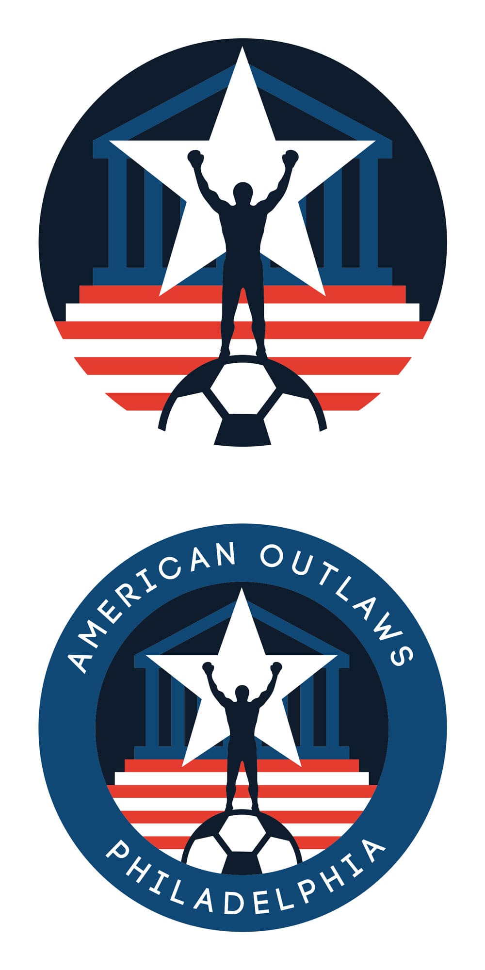
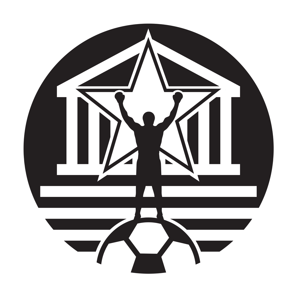
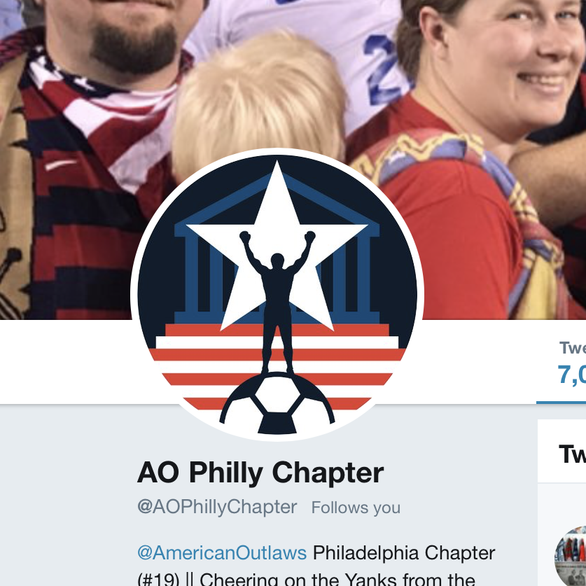
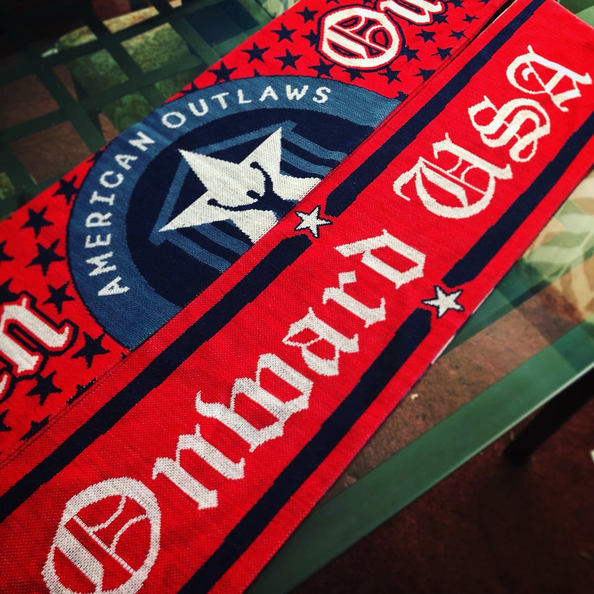
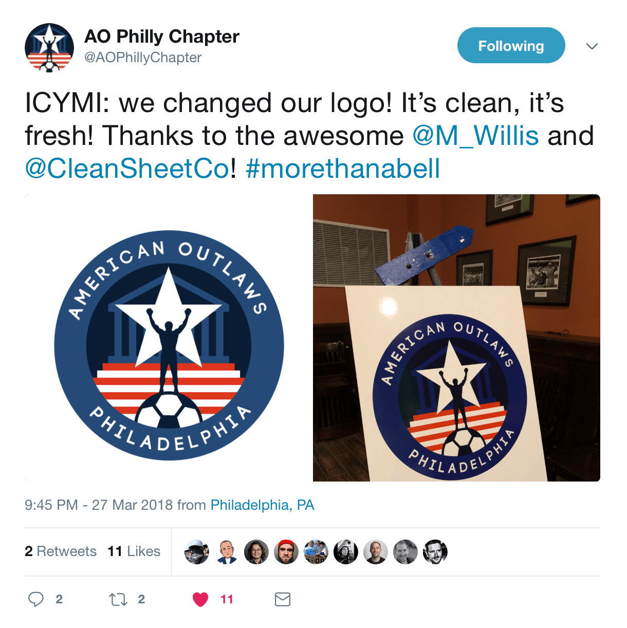
AO Philadelphia
Philly + Soccer + America
With thousands of members across the country, the American Outlaws organization is known for two things: die-hard, dedicated support of the U.S. Men’s and Women’s national soccer teams, and incredibly generous charity work in local communities. I’m a huge American soccer fan, and Philadelphia is my home. When the American Outlaw Philadelphia chapter asked for my help with a new logo, I was thrilled to oblige.
The logo needed to communicate American patriotism, Philadelphia, and soccer in a singular way. The previous logo had used the Liberty Bell and text to get these messages across; I wanted to do something more surprising and energetic.
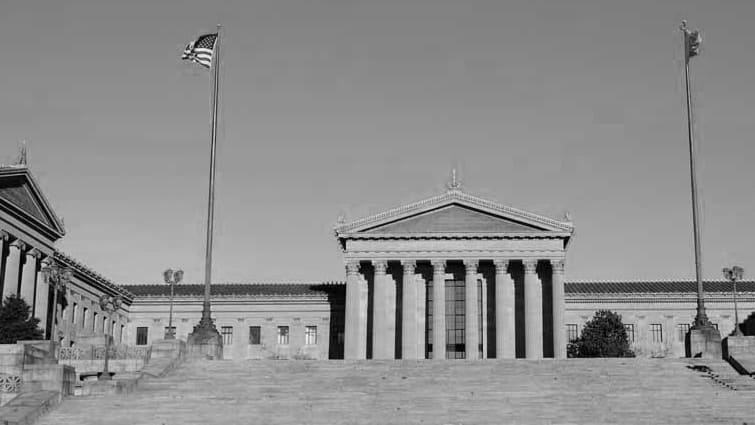
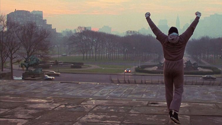
The choice seems obvious in retrospect: represent the Philadelphia Museum of Art building’s iconic facade and steps, and depict of a triumphant champion atop them. (A million conquering poses have been inspired by those steps’ most famous ascendent, Rocky Balboa.) Integrating an American color scheme and some basic symbols (a star and a soccer ball) rounds out and balances the identity. The mark works well because it checks all the boxes – Philly, America and soccer – in an energetic, exciting (and still visually balanced) way.
For applications that need more explicit branding, I also developed a roundel ring version that can communicate AO Philly’s name.
Delivery also included one-color versions that can be used in situations that call for reduced color (like bulk-printed t-shirts, posters, fliers, and even stencils).
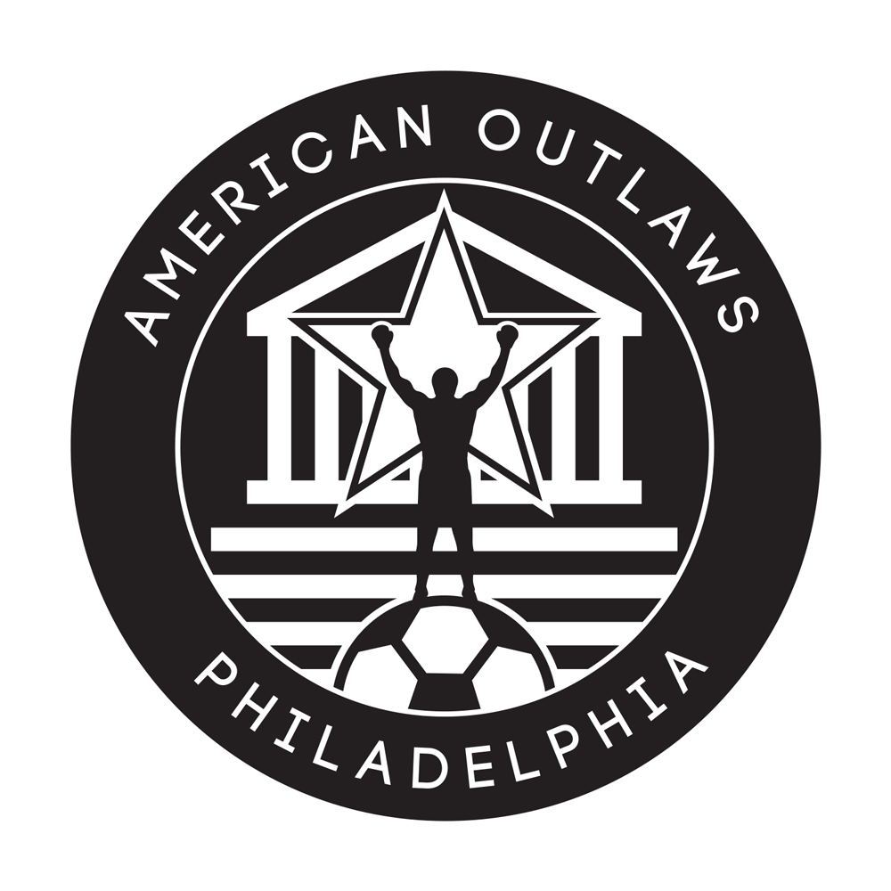
AO Philly immediately integrated the new identity into its core properties, including social media and apparel.
I’m proud of this identity – and will wear it with pride as I cheer on American soccer.
Purple Paper Co.
More detail coming soon.
Additional information is being added. Please stand by.
Bay State Soccer League
More detail coming soon.
Additional information is being added. Please stand by.
Ball 4 Beth
More detail coming soon.
Additional information is being added. Please stand by.
Crossfit Brick & Mortar
More detail coming soon.
Additional information is being added. Please stand by.
Clean Sheet Co.
More detail coming soon.
Additional information is being added. Please stand by.
Warwick Farms
More detail coming soon.
Additional information is being added. Please stand by.
Brookline High School
More detail coming soon.
Additional information is being added. Please stand by.
Fun Sign Co.
More detail coming soon.
Additional information is being added. Please stand by.
logo suite for AO San Francisco, a regional soccer supporters’ club