When even the Revolution are teasing swatches and releasing well-received jersey designs, it’s obvious that MLS kits are seeing good days. Sales are up, sponsors are taking real estate away from awkward team names, badges are common, third kits are garish and beautiful, and little embellishments are actually adding soul to a league identity once formed from scratch by an apparel company’s marketing division.
But there’s still a problem. Major League Soccer’s uniform font persists, blocking the orderly progression of good design.
The idea that the entire league would use the same font lockups is interesting to begin with. North American leagues largely allow teams leeway in customizing the look of their numbers and letters; that’s how you get Red Sox “3”s, Laker “3”s old Blue Jay “3”s and Steeler “3”s. Thousands of colleges and minor league teams have unique takes too. On the world stage, soccer is far from uniform, and international competitions showcase a range of interesting font design. Conversely, the English Premier League has been perfecting the font lockup for at least 15 years; any international soccer fan will recognize the word “Scholes” set in the Premier Leage’s first universal font (a squeezed Optima, in fact), and “Rooney” set in the present version. These aren’t just Manchester United fonts, of course – they’re league-wide, regardless of club or jersey maker. That “Premier League look” – a classy, professional font, topped off by the lion logo “bug” at the base of each jersey numeral, has gone some way towards giving the league a certain distinction and a somewhat regal air.
In some respects, the first 15 years of MLS is best described as a collection of emulated behaviors; many came from the domestic sports landscape (often the NFL) and some from international sport. When it came to typeface design, MLS chose to model the English game, right down to the logo-enhanced numerals. This is a pretty good idea, in my estimation; anything that builds league-wide identity and promotes professionalism was and is good for the league. But MLS picked a very different style for the execution.
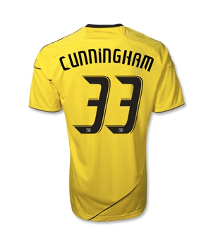
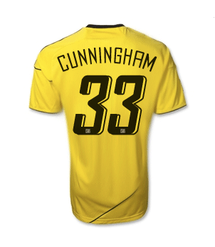
I don’t know the name of the font, so I’ll call it “Camaro Sans”. It’s fast – so fast, the wind is sweeping over every character, shearing off fore-facing corners and connectors, and even blowing the numerals backwards into italics. The “N"s and "M"s are playfully lowercase even in uppercase applications, and the "I"s have it both ways, with a cute slash that could denote a tittle. Half-piping around the numerals look more like racing stripes. And the numeral logos – not a lion, but the old MLS boot-meets-ball model – are proudly there like license plates at the bottom of each number where you’d expect them.
In short, it is the Camaro of fonts – it’s souped up and sleek and if you’re MLS, maybe you hope it ends up in a poster on an impressionable kid’s bedroom wall. But that same appeal dates quickly and now, after a few years of growing up, when the kid is 25 and wants an S-Class, it’s a bit laughable. MLS design choices may have, in the past, been necessarily bold, but at this point in the league’s history, the font presents a somewhat tacky look.
In today’s MLS, there are teams trying to be modern and sleek – and also classic, and traditional, and brazenly original. While the Premier League found a look that blends into its teams’ identities, the MLS lockup aggressively pushes an aesthetic onto every team that, today, rarely fits. Soccer isn’t a new idea on the American landscape anymore; the public doesn’t need to be hit over the head with "sport of the future” or “soccer is super cool!” metaphors any longer. American soccer fans are ready to accept more refined design ideas.
I think the league-wide lockup should stay. But it’s time to iterate. My ideal?
How about a look that’s distinctive, but a little less jarring and single-minded? This is set in Mentone, and it’s a simple, professional look. I really like how the x-height of the nameplate is far less pronounced, and the numerals are flat and simple – much more timeless and adaptable.
Or,
Here’s a sportier style, set in Cuprum, which gives the name a bit more prominence and allows the numerals some spring (with the offset shadows) without going too far down the racing-stripe path.
Or perhaps:
Here’s a very all-American, almost collegiate look, set in a combination of Dezen Pro (for the letters) and Inconsolata (for the numerals). The numbers retain a bit of definition with a very subtle knockout-offset.
And finally, the compromise. If you must retain that sport-of-the-future feel (or just evolve slowly from today’s look),
Update the current look with a lockup that retains the italics (as much as I dislike that idea), but brightens everything up and brings it forward to a more modern era of design. (This is set in Agency, by the way.) I don’t much enjoy this part of the design spectrum, but it may be a more practical iterative direction for MLS if they are irretrievably hooked on the idea of a speedy, brandable design.
MLS has some great individual identities, and they continue to get better. I think that their instinct to follow the Premier League’s uniform font-lockup is inspired, and appropriately unique for North American soccer. I’d even keep the logo bugs in each and every uniform numeral (the MLS logo itself is another topic). And beyond this very cursory exploration, there is plenty of theory on legibility, weight and balance to help get it right. I hope MLS is thinking of doing just that.
The days of appealing to some vague notion of speedy, futuristic, teenage coolness are over for MLS. They need to concentrate on fostering tradition, connection, and professionalism. One easy way to do that is with a new, league-wide font that leaves today’s model out in the parking lot to rust.