My favorite thing about the World Cup? It encourages bold, pattern-breaking behavior.
Skip work and hit the pub at 2 in the afternoon.
High five, maybe even hug, a stranger.
Buy a plane ticket and fly halfway around the globe.
Start an apparel company.
As far as I’m concerned, the World Cup is an excuse to try, learn and do big new things. It’s the most important sporting event on my calendar. And that means it presents an audacious challenge.
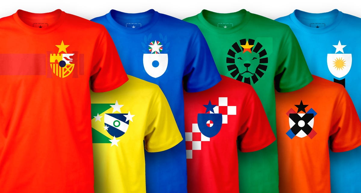
Last time around, in 2014, I designed a t-shirt for all 32 participating nations and created Clean Sheet Co. to sell them. It was a lot of work, but the best kind.
Four years on, Clean Sheet Co. and I are taking up the challenge again. We’re about to drop 32 new shirt designs for the 2018 World Cup.
But a few things are different this time around. Last time, we created 32 independent designs. Cameroon’s lion, Switzerland’s mountains, Brazil’s southern cross constellation and 29 others each got their own specific moment to shine. It was a free-form design project, constrained only by a few rules (solid shapes, no more than four colors; the Clean Sheet Co. crest had to be incorporated) and held together by style and technique.
This time, I wanted to tighten the design constraints so that all 32 countries would share a very specific design language. The goal: amazing variation within a tightly defined structure.
So we started with a few simple questions: Could we find a visual common denominator that all countries — from Iceland to Nigeria to Peru — could share? Was there a simple concept that could act as a vessel, to express nationality across all 32 World Cup nations?
I think we’ve found a way. What’s more, I think our new approach actually makes the project feel both more cohesive, and more diverse, than it did in 2014.
So what’s the constraint? The vessel? The common denominator?
The Ribbon.
When it comes to visual traits that all countries share, you can count on a surprisingly small number of things. Even flags, which are usually visually straightforward, and which every country has (in one form or another) are wildly divergent and often very intricate. Our approach had to be even simpler.
If you work backwords from flags, there’s really only one thing left: color. Every country has at least one national color.
Take Switzerland. Can we boil the Swiss identity down to one color?

Almost. Enough to explore further, anyhow. We decided to give every country in the World Cup a simple stripe of color. What would stripes for all 32 World Cup countries look like? Give or take, something like this:

Even this straightforward exercise quickly hits practical boundaries. For one, most countries use more than one color to create a distinctive identity. Narrowing it to just one makes it difficult, if not impossible, to portray distinct national identities.
But what if each stripe showed more than just a solid color? What if we opened the concept up slightly, and introduce some simple design? Could we confidently portray national identity?

I think so. With some basic visual additions, we can clearly and powerfully communicate any country’s national identity.
This concept is the Ribbon: a distinct, linear pattern that clearly communicates energy and identity. And we’ve made one for each nation in the World Cup. Imagine a roll of tape with a repeating design printed on it. We’ve made 32 of those.
The Ribbon is the basis of our 2018 identity project.
Actually, we designed 33 ribbons. And I’m going to demonstrate the concept here, with our extra design.
(This happened last time too. We had an Iceland design ready to go, and they lost out on the 2014 World Cup by the barest of margins. We debuted the design as a bonus and it became one of our most popular shirts. Things have only gone right for Iceland since then. They made waves at Euro ’16 and they’re in the 2018 finals.)
Once again, we made a design we didn’t have to. One of the nations in Group H is Senegal — who are an incredibly exciting team to have in the tournament. As I was putting this project together, I worked from a list of 2-character ISO country abbreviations. I got to SN, and had forgotten about Senegal’s qualification — but I had recently seen some news about a new uniform for Slovenia. I blindly assumed that Slovenia were the “SN” in the World Cup and didn’t bother to double check until I was completely done working on the concept. Long story short: a) don’t sleep on Senegal, who will probably make some noise in Russia, and b) we have a Slovenia design just sitting here.
Let me show it to you, as a way to illustrate the Ribbon concept.

This repeating pattern is designed to feature Slovenia’s national symbol, Triglav, a three-peaked mountain. The tri-peak shape is so distinctively Slovenian that it’s used on everything from soccer jerseys to the country’s coat of arms. Here, we’ve applied just a bit of tonal layering to create a pattern that verges on plaid, and styled it in the light blue of the national team’s current kit.
So we have a ribbon that expresses Slovenian identity. Now what?
First, let’s make a t-shirt.
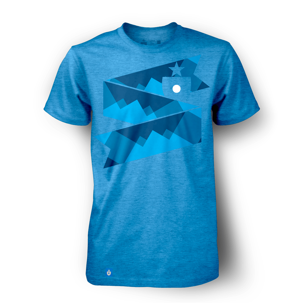
There are a bunch of ways we could have approached this, but I enjoy this one the most. We align the Slovenia ribbon in a zig-zag pattern and wrap it around the Clean Sheet Co. crest (which is rendered in negative space). Pop that design on a soft, light blue tri-blend shirt, add a few finishing details, and we have something pretty special. (Heck, if you think we should make this one, let us know.)
But what else could we do?
I am partial to poster design — perhaps the purest form of graphic/artistic expression. What if we could use the ribbon concept to make a Slovenia poster?
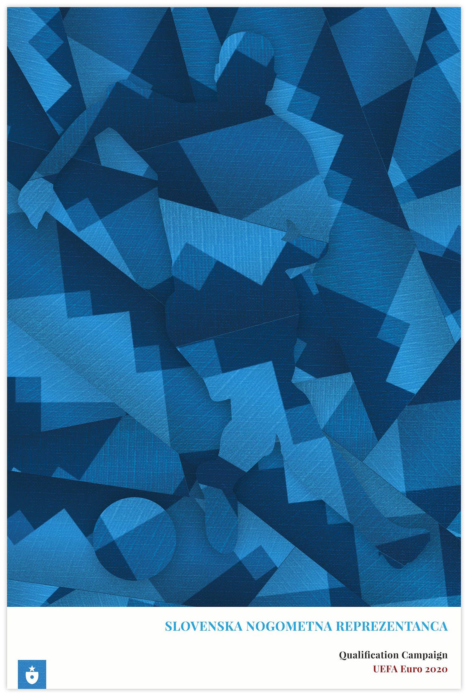
The countours of the stripe and a simple silhouette can create a powerful poster. In this case, Slovenia can anticipate qualifying for the next big tournament — and that’s commemorated here.
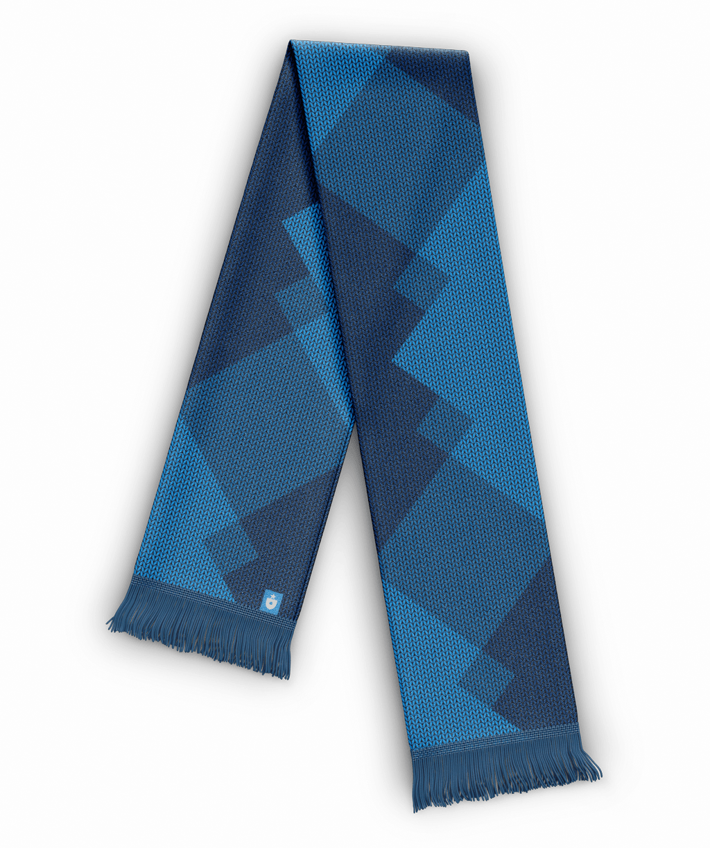
One more application, to demonstrate how versatile and exciting this system is. Does this shape…
…suggest any particular form of apparel? One that soccer fans might, perhaps, be partial to?
It’s a no-brainer:
All told, it’s a pretty solid system. And all of this is before we’ve even discussed how ribbons can interact with each other — which can create some amazingly explosive visuals. (We have to save something for the next piece, after all.)
We’re going to apply this Ribbon concept and framework to the 32 nations that qualified for the 2018 World Cup. Not everything we show off will be immediately for sale; t-shirts (our bread and butter) will, but we’re going to rely on your feedback to see what else we should produce. Since country identities don’t change too much, I’m pretty confident we can keep making this stuff through, and after, this year’s tournament.
Come back and join me for our next piece — the four teams of Group A (Russia, Saudi Arabia, Egypt and Uruguay). Note: the Group A piece is now live!
Until then, get excited. The World Cup is here. It’s time to get bold — and to create some new patterns.