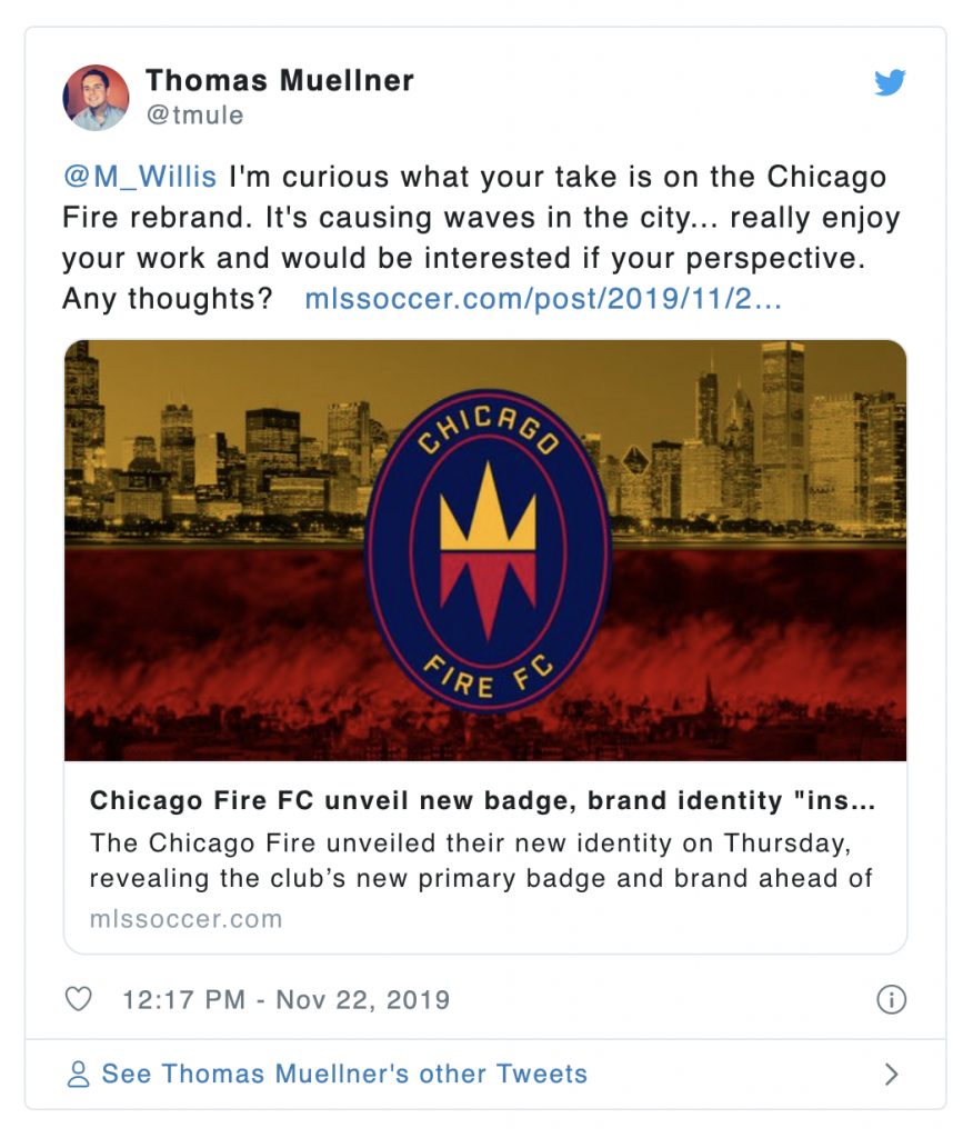
The Chicago Fire updated their identity this week. As the news hit and reactions poured in, I kept some distance.
I used to weigh in on this stuff all the time. Things are a little different now. I have less time to devote to completely from-scratch brand re-imaginings. (Paying clients come first, after all.) And MLS has more or less gotten its act together, design wise. They’ve made a series of strong choices with respect to branding and visual identity over the past five years.
But this Fire news seemed big. The new identity was inspiring (inflaming?) passionate response. I tried to resist. But I couldn’t stay away. (Honestly, it only took a few tweets like this one to get me #firedup too.)
Here are my visual thoughts on an approach the Fire could have taken, and the context I used to get there. (Applications are a bit light, but I hope the spirit of it comes through.)
Where the Fire were
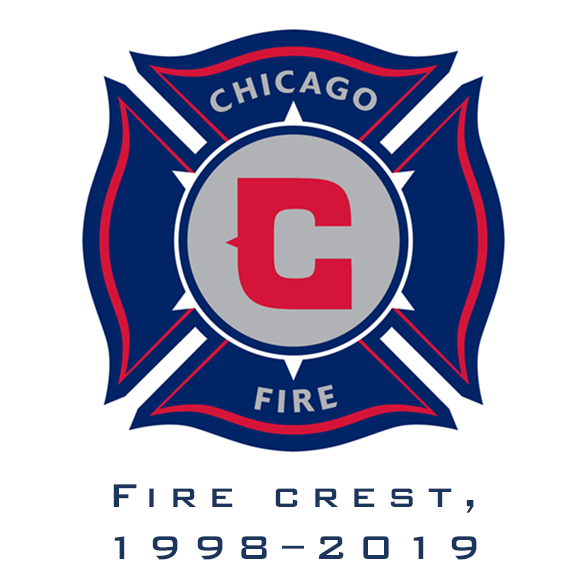 Chicago had one of the better logos in the league, back when that actually meant a lot. MLS was not spitting out memorable brand identities back in 1998. Nobody was, really; it was kind of a dark time in American sports design. But the Fire managed to end up with a logo that not only bucked the trends of the moment (Xxxxxxtreme attitude! Crazy collective nounz! Cartoon logos!), it very clearly communicated something special to prospective fans. The logo was based on the Florian Cross, a symbol adopted by firefighters the world over, and very well-ingrained in the public consciousness. Not every choice was perfect (the C), but even little touches (like the six points of a Chicago-flag star peaking out behind the roundel) worked. The logo debuted with built-in meaning; twenty years later, it had built up a decent amount of its own.
I liked the old logo. It wasn’t perfect, but it was improbably good. Like a wildflower growing out of a crack in the huge parking lot of terrible original MLS identities, the mark was welcome. It worked, it was known, and it had endured for twenty years.
Where the Fire are now
 It all changed last week when the Fire revealed their new mark. Listen, when you invest time and passion in any relationship, change is hard. Most Fire fans, and plenty of impartial observers, weighed in on the identity. As you might expect, there was a decent amount of pushback. I’m of a few minds about this. On one hand, the fans’ voice is crucially important. Any rebrand has to respect the time and passion fans have poured into the team. And on the other, design professionals generally get a lot of undeserved static, because they’re looking for out for things the average fan isn’t. Do fans care if a logo is readable at various sizes, represents well at various colors, or is own-able intellectual property? Not often.
However: it is important to pull apart reactions based on resistance to change, and criticisms couched in solid observation. And there are more than a few of the latter.
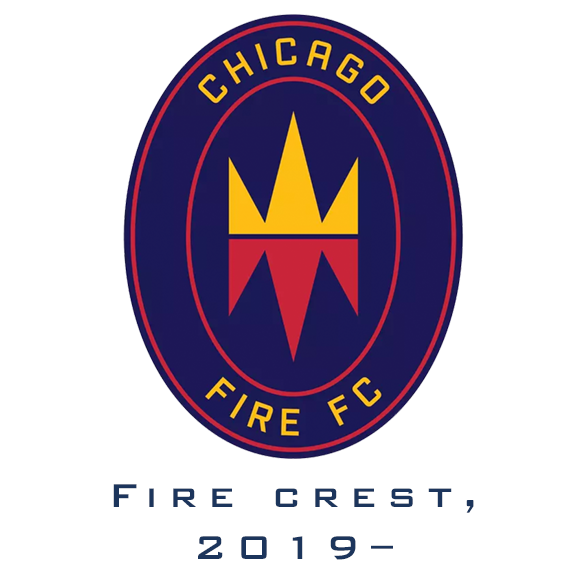
My stance on the new logo: I actually think it’s an ok generic soccer crest. I’m a huge believer in simple shapes and straightforward visual ideas, because you can take them anywhere. The enclosing shape, a vertically-aligned oval, is unique. The color palette, taken in a vacuum, is great. And the entire package shows improvements to ancillary things like typography.
But. The mark misses in a few spots.
First, it doesn’t represent the concept of “Fire” in any way. You can say the shape is a flame, but I simply don’t think that registers. I like the shape, but it’s not a flame to me.
Second, the new identity glorifies fire itself (and we all know about the great Chicago Fire, Mrs. O’Leary’s cow, etc) instead of the squad who deals with the fire (and is beloved in the community to boot). This, to me, is a big miss. The idea of the Chicago Fire brand was never (to my understanding) that the club embodied the abstract danger of fire itself. It was a stronger idea: that the team was named after something important to the city’s sense of community. Overcoming the fire is what made Chicago into Chicago. This new identity misses that.
Third, there are no civic call-outs in the mark. No representation of anything to do with the city, no nods to existing Chicago visual identity. The badge could represent the Topeka Fire or the Honolulu Fire with a simple text edit. That’s ok in some contexts, but for soccer clubs who make a big deal about civic identity, that’s a tough sell.
Fourth, the Fire’s famous red has been demoted, the navy is now purplish, and gold has arrived. I love when colors are fluid, especially in soccer branding, but the Fire have traditionally been the reddest team MLS has. Redder than the Red Bulls (with whom they now, along with Real Salt Lake, share a color palette). Gold should be at best an accent. Navy should be on the blue side. And red should dominate.
(There is also an issue with gang symbolism that I’m, frankly, not qualified to weigh in on. Avoiding getting to a place where this discussion matters is probably advisable.)
An alternative approach
What if we could respect the instincts that led to the new identity, but weave in a lot more Chicago, and do justice to the Fire’s visual history?
Let’s start with the old logo. The Florian Cross, so well-known as a fire department symbol, is hard to turn away from. It’s got a specific, un-reproducible energy, especially after two decades of use as a club mark. It’s got problems, too, though. First, the way it was adapted to be the Fire’s crest was never perfect, and was starting to feel dated. And second, despite its long-held standing in the world of firefighting, the mark has an obvious religious origin, something the club might want to play down.
What if we start by trying to clean it up a bit?
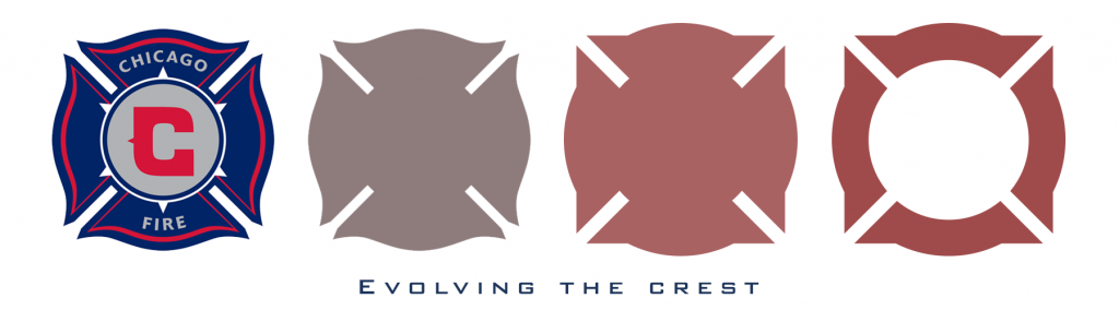
This approach has a few benefits. Reducing the waviness and irregularity in the old crest shows just how powerful a symbol the Fire have to work with. No need to invent something – they already had a strong and unique visual shape. As a part of this process, we can also evolve the shape into something new – removing the religious “cross” connotations, and moving towards something closer to a geometric roundel. This has a ton of benefits for clarity and representation, but crucially, meaningful visual references to the past are retained.
This also unlocks something pretty cool.
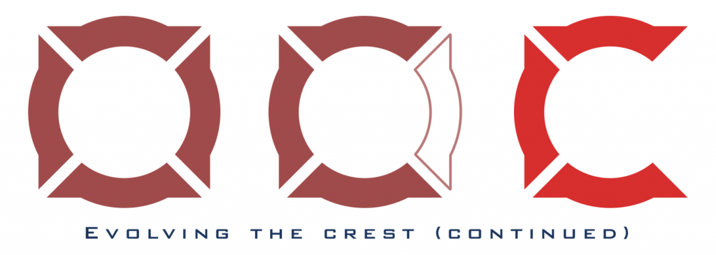
That’s right! We have an honest-to-goodness “C” waiting for us here! And not just any C – one that resonates incredibly well with a bunch of existing Chicago references (as we’ll see in a moment).
But we’re not done. We need a final component to make this something only Chicagoans could own. And thankfully, it’s no secret where to find that. You’re way ahead of me, right?
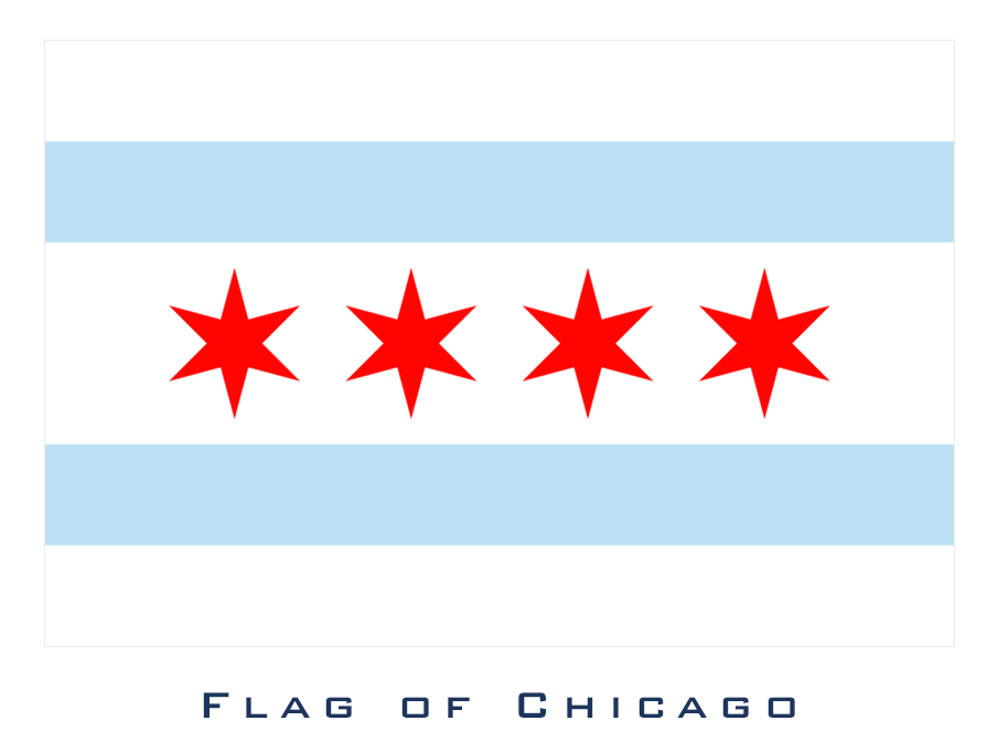
Yep, the famous city flag. It’s hard to think of a city with a more positive and overt relationship with its flag than Chicago. And why wouldn’t they love it? It’s incredible. The colors, the striking visuals, and the meaning are all there. The city’s other soccer club, the Red Stars, know this. It’s why the flag forms the basis for their identity. The Fire have referenced this in places (see: those six points on the old logo). The shape on the new mark is said to be using the stars as inspiration though I think it’s a stretch. But the Fire should dive in more fully.
So,

It’s modern, new, own-able, lovable, nondenominational, purely Chicago, and tips its cap to the city and the club in a number of ways. I think it’s pretty bad-ass too.
Why this mark?
The new official Chicago Fire mark gets something very right: simple, unmistakeable visuals are where sports identity is going. Gone are the days of the fussy, detailed logo or the historic, heraldic crest. Those will persist, where they already exist, but clubs that are focused on building brands have already moved on. The questions is: can a mark fit both modern branding needs and embrace a messy, organic, specific visual past? I say yes. And I think this approach does that for Chicago.
Let’s look at some specifics.
Is it Chicago?
Ideally, a new mark will fit right in to the city’s existing visual sports vernacular. Does this approach accomplish that?
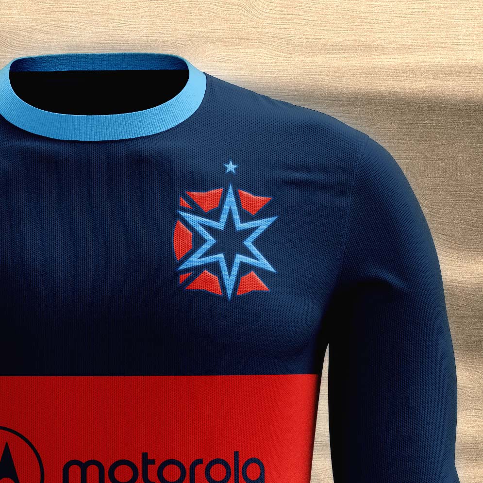
![]()
I’d say it slots right in. We’ve covered the influence (and evolution) from the previous Fire badge. But it’s cognizant of the larger Chicago sports landscape.
Like the Cubs’ famous logo, it features a concentric shape, nested circles and a chunky, red Chicago “C”.
Like the Blackhawks’ popular C with crossed tomahawks, the C in this proposed Fire logo has a negative-space X breaking up the letter shape.
The Bears’ elongated C logo famously features a pointy “median spur” – a flourish found on plenty of enduring sports identities. While it’s not intentional, the points on the C shape here happen to evoke something similar. Call it an homage. The C’s tone of red is ever so slightly on the orange side, and the blues are deep and dark, bridging Chicago’s prominent “red and blue” and “orange and navy” sports color palettes.
And finally, the Red Stars’ branding has long been tied directly to the colors and shapes of the Chicago flag. The identity is wildly successful. This mark acknowledges that – and intends form the basis of a respectful neighboring brand. Importantly, this means featuring a six-pointed star that (in its primary formulation) is blue instead of red. The hope is that the two brands could co-exist and work together.
Is it flexible?
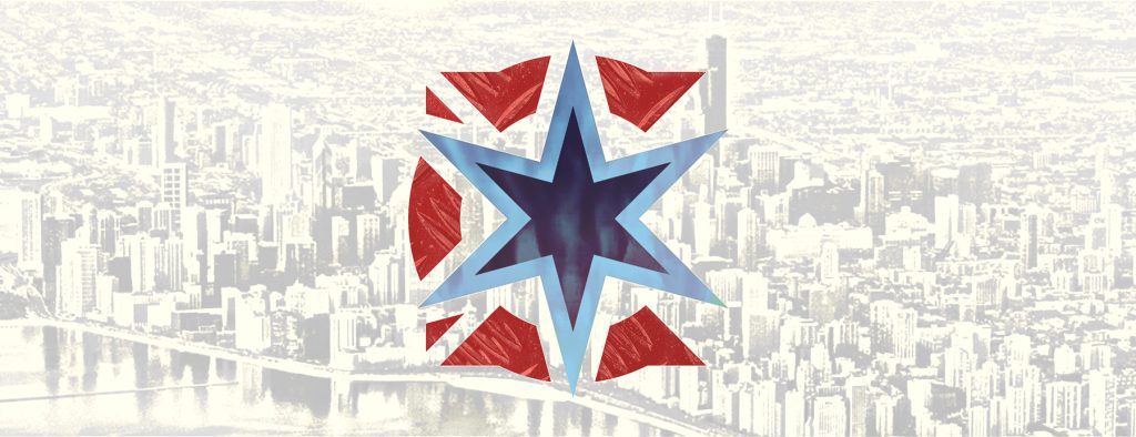
A brand is an idea, not a single perfect visual mark. Evoking the emotions behind the brand identity idea is the point of the visual mark. To do that, a mark needs to be flexible. It has to exist in lots of contexts, at lots of sizes, and in lots of applications. To demonstrate the variability, here are just a few.
![]()
As you can see, the mark works in one, two or three color versions. It can work against dark or light backgrounds, act a window or an enclosed shape, and contain tonal variation and textures. It also looks great as a uniform badge.
It’s a simple, straightforward visual that fits a future where sports identities need to embody everything from “civic totem” to “abstract lifestyle brand”.
Does it feel right?
I’ll say this: creating this mark was a satisfying exercise. Good design is problem-solving, and this mark solves for a few specific issues. It honors the club’s visual heritage. It’s thoroughly about both Chicago and “fire”. It fits easily into the existing Chicago and American soccer landscapes. It’s flexible and specific. It’s energetic and exciting. (And if nothing else, it’ll make a great Clean Sheet Co. t-shirt.)
Good luck, Fire! Thanks for inspiring us designers to chime in.
Update!
After I published this post, it got attention. Supporters’ groups like Section 8 and Sirens reached out with kind words, and tweeted it to the attention of Fire leadership. (They also asked for t-shirts with the logo, which I was happy to oblige – Clean Sheet Co. produced several hundred that went out to Fire fans.) I’d like to think that this logo contributed to the Fire’s decision, after one year with their then-new logo, to re-calibrate. American soccer designer extraordinare Matthew Wolff was brought in to assist. The Fire reached out to me, and I served on several oversight panels while designs were prepared and vetted with key supporters. Where the club ultimately ended up was a needed improvement, and the design thinking wasn’t far from what I had proposed. I was thrilled to be involved, first as an outsider, and then in an official capacity, in helping the Fire level up their brand.