Belgium, Panama, Tunisia and England
The penultimate group! If you haven’t already, check out our introduction to the Ribbon concept, which drives this project, and our pieces on designs for Group A, Group B, Group C, Group D, Group E and Group F. Here we go…
Belgium
Belgium and Germany are neighbors. They’re both world footballing powers and heavy favorites to go far at the World Cup. They share (partially) a language. And they share the same three national colors: red, gold and black.
But their identities couldn’t be more different. Where Germany is sparse, modern, clean, efficient and minimalist, Belgium has always seemed the opposite: indulgent, traditional and richly decorated. While our Germany ribbon spoke to that country’s perceived minimalism, with Belgium, we took a very similar color scheme and went for a much more ornate approach.
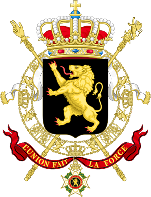
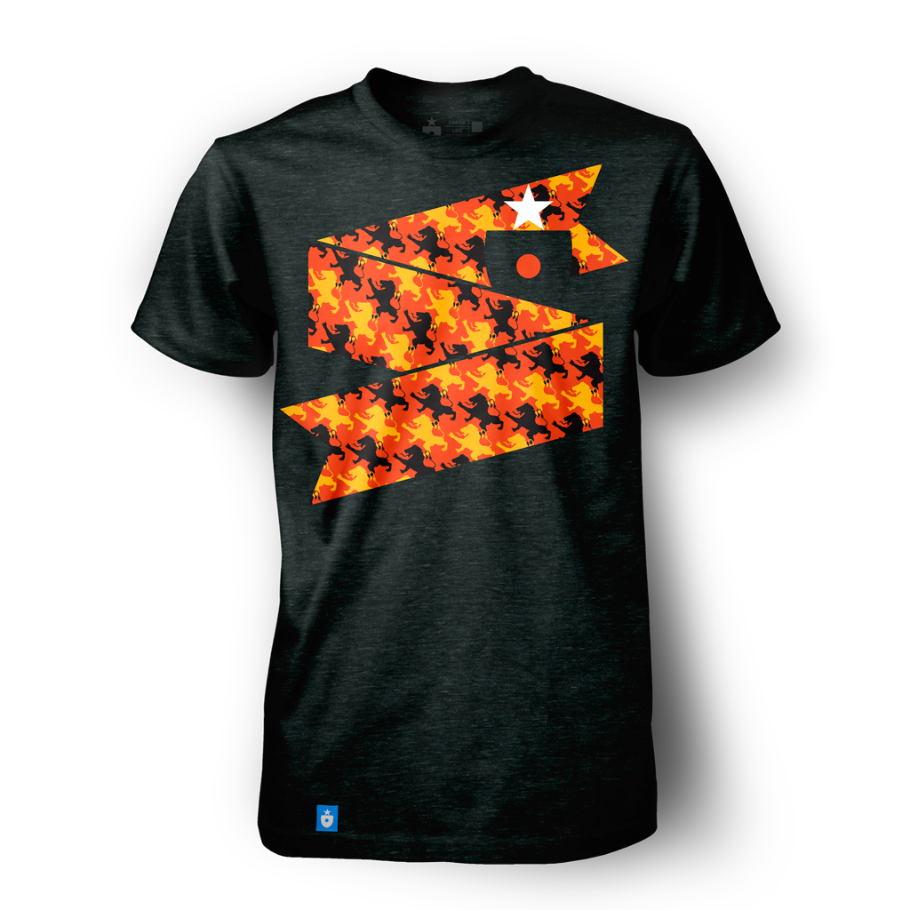
The lion rampant, that mainstay of many European crests and coats of arms, is the featured element here. The lion — Leo Belgicus if you want to be official about it— is an important national symbol, and we’ve turned it into a decorative repeating pattern. Gold and black lions alternate across a fire-red field.
This one really pops on a black heather t-shirt:
This pattern also created our favorite scarf in the project. It’s an absolutely stunning application for this pattern. The poster looks great too.
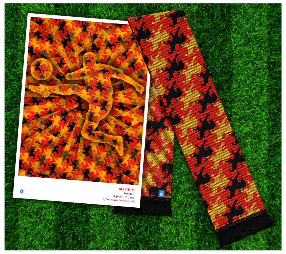
Belgium was an opportunity to indulge — to create a ribbon pattern that didn’t have to restrain itself. It wouldn’t work for every country, but it works here.
Panama
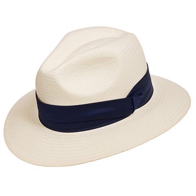
Panama’s identity on the international stage is defined by two things: the Panama Canal and the Panama hat. Building a graphic identity around these items brings up interesting issues. Though the soccer team is affectionately known as the Canaleros (and the canal is a point of pride for the country) it’s not the most straightforward visual symbol to build around. And the Panama hat… well, that’s another story.
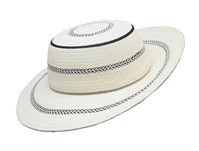
What we think of as the quintessential Panama hat — a white hat with a dark band and a stubby, rounded brim, often paired with a linen suit and a tropical beverage — is not really from Panama at all. The hat in question — the toquilla — is really an Ecuadorian invention, and likely acquired a Panamanian connotation when gold prospectors traveled through both countries (and intermingled the local items they acquired) on the way to California in the mid-19th century.
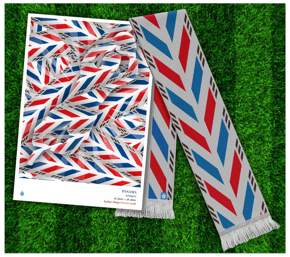
So, is there a real Panama hat? Yes. It’s the pintao — the painted hat. Comprised of plant fibers that are dried, braided and yes, painted, the pintao is made completely by hand in Panama by skilled artisans. And it is a beautiful piece of traditional craftwork.
For our Panama ribbon, we’ve recreated the distinctive pattern woven into the pintao and dressed it in national colors.

Against the base of a red shirt, the pattern creates a beautiful, frenetic energy:

That energy is amplified in applications like the poster; the scarf’s linear format keeps the design more constrained. Both work.
Much to our chagrin, Panama (and not the United States) is the third Concacaf team in the 2018 World Cup. To be clear: Panama earned and deserve the trip. Now it’s time to pull for the Canaleros in the spirit of regional brotherhood — and support them with a beautiful, truly Panamanian identity.
Tunisia
The national flower of Tunisia is the uniquely beautiful jasmine. The flower has meaning that transcends the visual; the flower’s identity provides the basis for fragrances, artwork and traditional customs (Tunisian bachelors put a jasmine flower behind their right ear; those happily betrothed place it behind their left.) It’s even been the namesake of social change.
We took inspiration from the culturally consequential jasmine flower to create our Tunisia ribbon.
The flower repeats in tones of red and white; at the center of each white flower is a small crescent moon and five-pointed star, as found on the country’s flag.
White heather was the perfect base for this design:
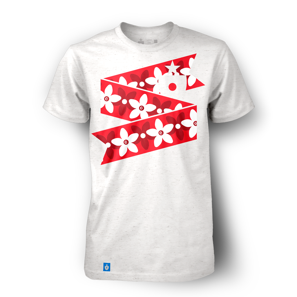
When the ribbon is allowed to fully define the space, the deep red colors begin to balance and overtake the white. The scarf is particularly nice.

Jasmine means more to Tunisia than most national flowers mean to their respective countries. Here’s hoping the flower is a good luck charm for the team and the nation.
England
England has so many potential visual directions to choose from for a project like this, there’s a risk of design paralysis. We had that for a while — so many options, and none of them feeling more right than the next. And then, while working on a different national identity, we hit on it.
Quite a few of our ribbons in this project have taken inspiration from national textiles. Almost every culture has some kind of traditional, distinctive woven pattern that can be used as a foundation to build up a design that evokes national identity.
We had overlooked this with England. Becasue of the richness of other English cultural symbols, but also because England isn’t the first place that comes to mind when one thinks of distinctive national textiles. The English don’t make trademark rugs. Their historic dress isn’t known for elaborate patterns (though some Scottish influence occurs naturally). Elaborate, colorful weaving isn’t a notable part of their visual history.
England does have an incredibly rich tradition in textiles — it just happens to be in a different kind of fabric. The English know how to make some of the best textiles in the world. They know how to cut and tailor them. And they have perfected the art of using understated, but distinctive and luxurious fabrics to create beautiful garments.
Fine wool. Tailord suits. Saville Row.

The English have a way with fine fabrics — but their signature textile patterns are more subtle than might be found in other cultures. Yes, tweed has a history that includes Scottish and Irish influence, but from plus fours to Sherlock Holmes it has been thoroughly established as an English trademark for more than a century now. Once we realized what a perfect fit wool tweed was, we got to work on our England ribbon:
We chose to emulate a herringbone tweed pattern in two-toned blue — navy blue for the base, and light blue for the patterned weave. This allowed us to introduce two common colors used by the English soccer team, while reserving their two most famous colors (red and white). We also introduced the idea of a stitch, in classic English red, down the center of each herringbone row (and we have two full rows — a double decker, perhaps?). Each has an added flourish — a vertical cross-stitch that turns each stitch into a mini St. George’s cross.
We debated using a white shirt, but in the end, it had to be red. This allows white to make a show-stealing appearance in the elements of the crest, and the whole thing really works.
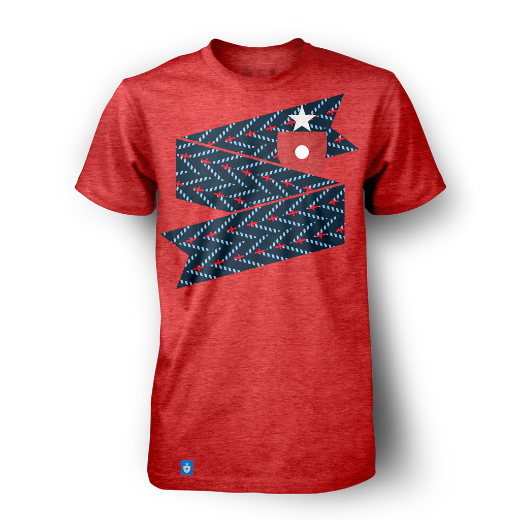
The applications end up looking really great as well — to our eyes, the scarf (with a bit of extra weight on the light blue, an underrated English national team color) looks quite attractive.
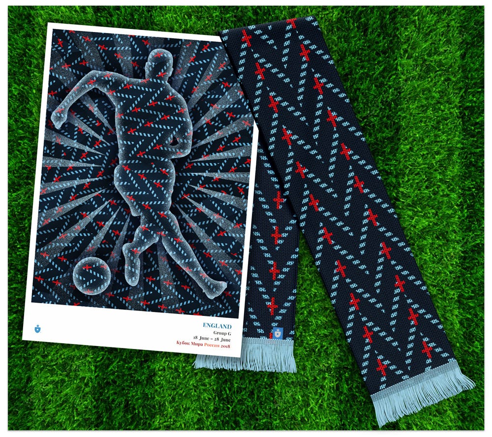
The textile history was there — we just didn’t realize it at first. We hope England, and the fine textile history it’s known for, is well-repesented by this ribbon.
Group G is in the bag! We’re almost through the field now.
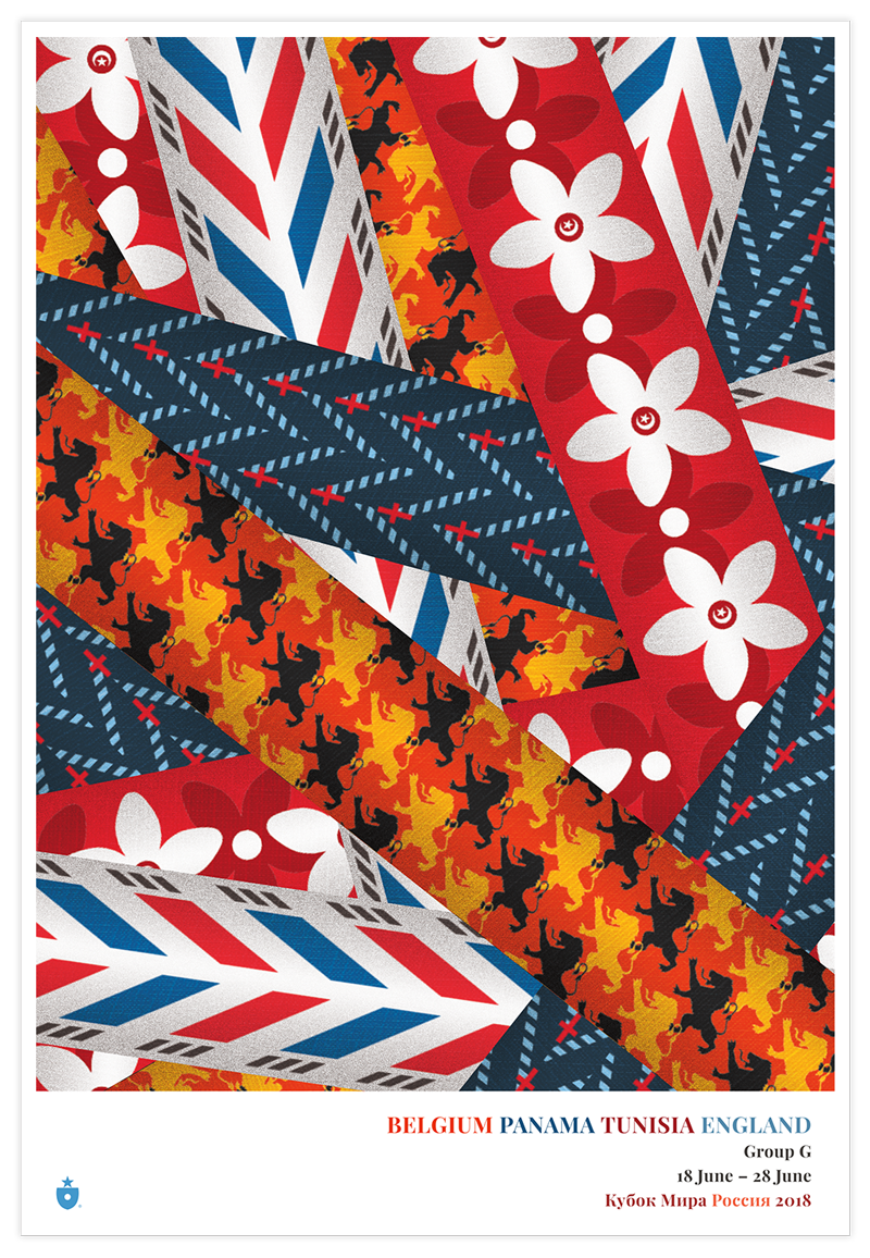
Once again, we’ve made a group print for Group G. Like the national posters, these 11″ x 16″ group poster prints created with a gorgeous gicleé process and printed on your choice of stock (we prefer heavy photo rag, but you can’t go wrong). I can attest they look stunning.
This is why we made the ribbons — to have them interact! This, to me, is the best part of the project — watching the identities bounce off each other.
Seven groups down. One last group to go.
(Want to keep reading? Check out our designs for Group H.)

Mark Willis (@m_willis) is an artist, designer, digital strategist and the founder of Clean Sheet Co. (@cleansheetco) a soccer-obsessed, design and apparel shop based in the Philadelphia metro area.

