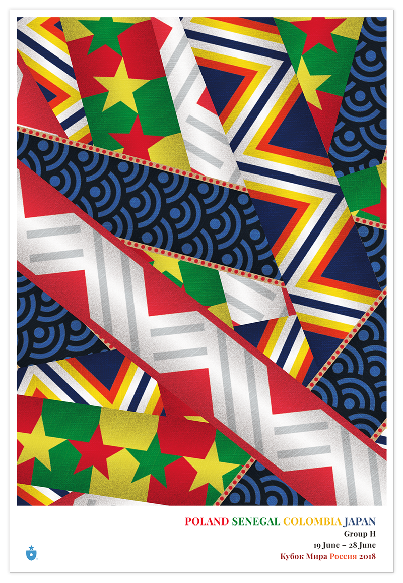
Poland, Senegal, Colombia and Japan
We made it! Group H rounds out our field of 32. We’ll recap the project later, but for now, if you haven’t already, check out our introduction to the Ribbon concept, which drives this project, and our pieces on designs for Group A, Group B, Group C, Group D, Group E, Group F and Group G. Once more, with feeling…
Poland
Poland posesses a very straightforward identity. Like the Polish flag, the national team’s look is minimalist. White and red. And, despite plenty ofcompetition, Poland do the white-and-red thing as well as anyone.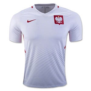
What sets Poland apart, just slightly, is the way the Polish national soccer team has expanded what it means to wear white. They’ve pushed their white look to include a range of greys and silvers. And that makes all the difference for our Poland ribbon. We’ve incorporated some greyish silver tones as well.
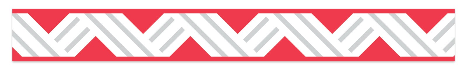
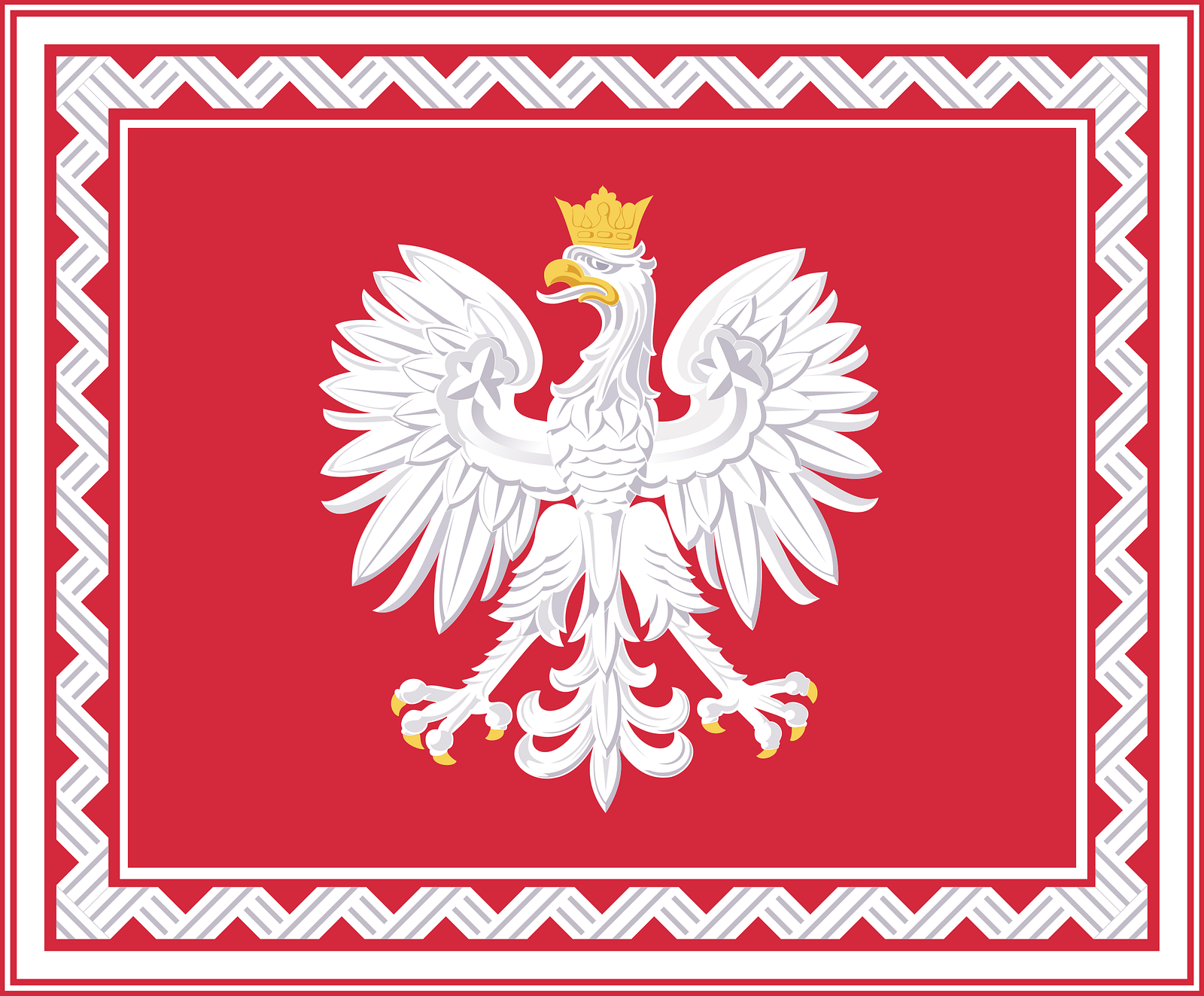
Inspired directly by the ribbon that borders the presidential standard, and the silver tones on the current Poland jersey, we’ve embraced the idea that silver and grey can be a beautiful accompanying color for Poland.
For the resulting shirt, we wanted to keep that embrace of grey going — and gave Poland the only grey heather shirt in the collection. It’s different, and quite distinctive.
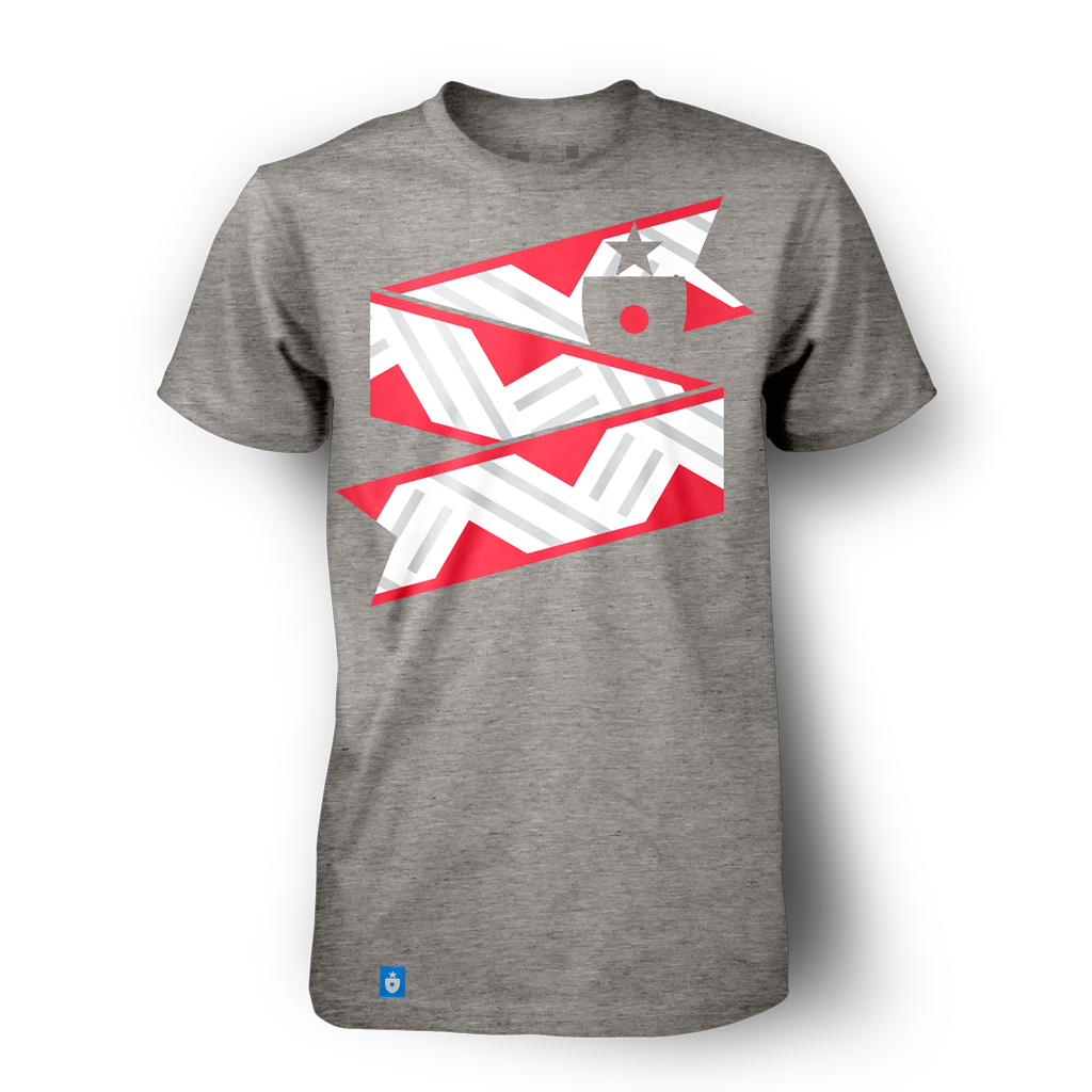

The poster and scarf applications contain a nice balance of red and lighter tones — and the poster, particularly, has a very appealing retro look to it.
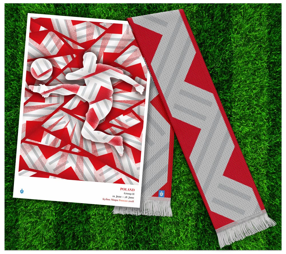

As a pre-existing soccer brand goes, Poland is a bit of a nondescript entity. Embracing silver and grey gives them just a little bit of extra individuality — something they’ll need to forge an identity worthy of taking on more established powers.
Senegal
As you may remember from our introductory piece, eight groups ago, we originally forgot to design a Senegal ribbon. Circling back and working on a that Senegal identity as the last ribbon turned out to be an absolute joy — the colors and tones of the countries identity are just brimming with life and energy. It felt like the perfect final piece to this project.
In the end, it came down to the flag.
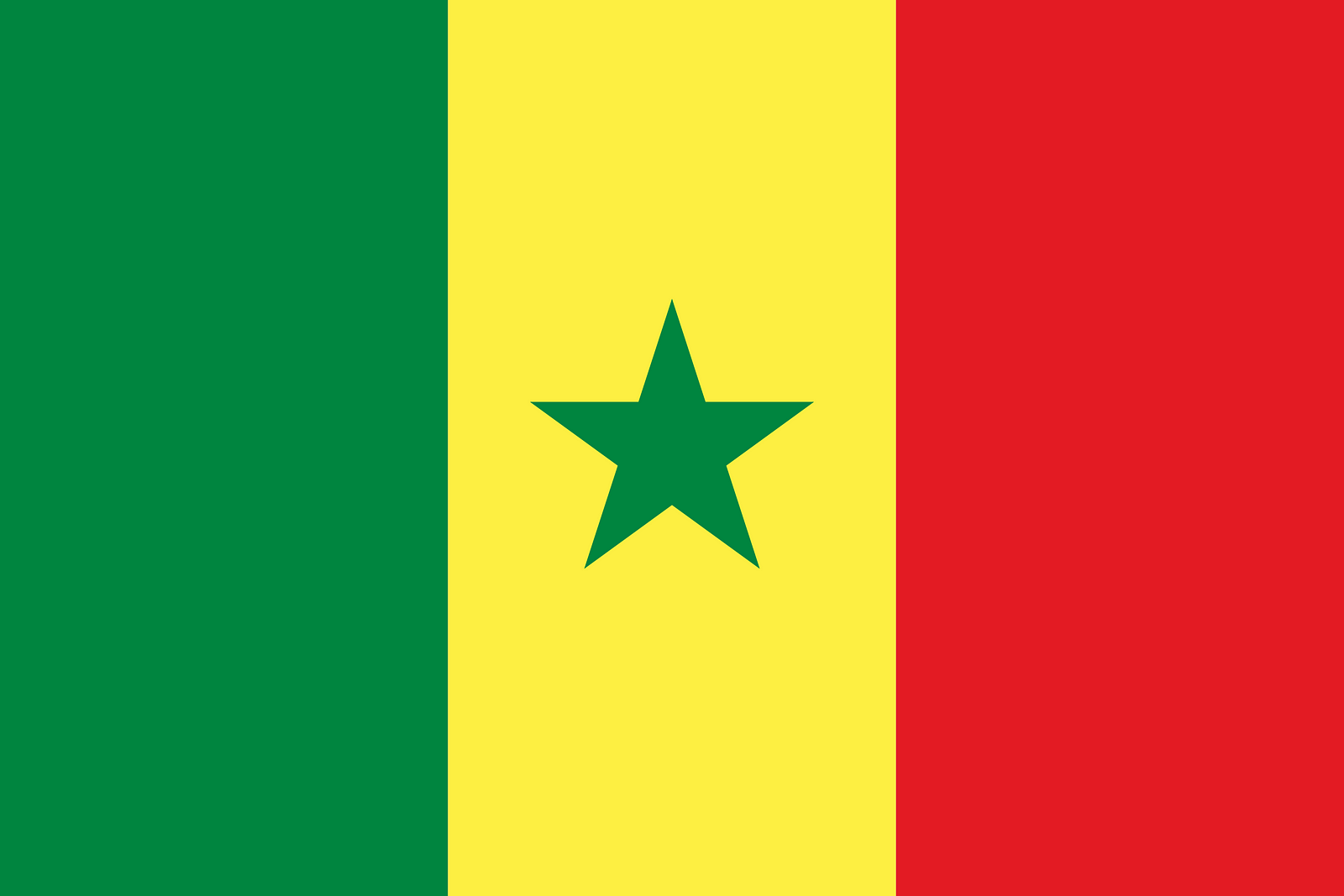
We used the beautiful Senegalese flag as an inspiration for our ribbon:
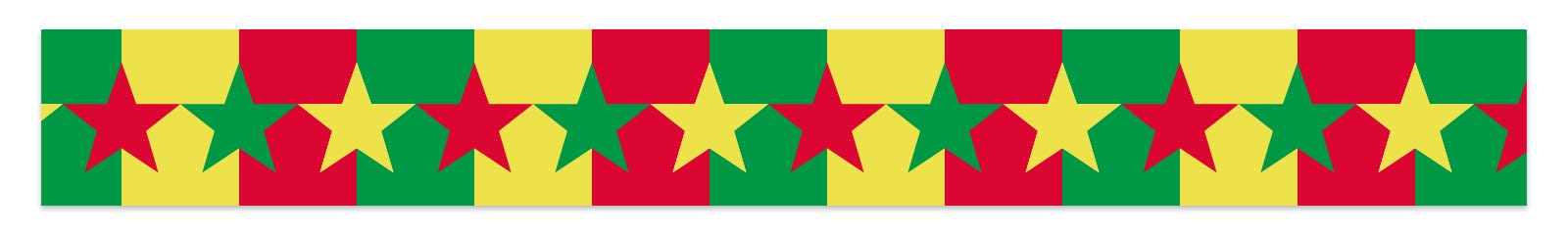
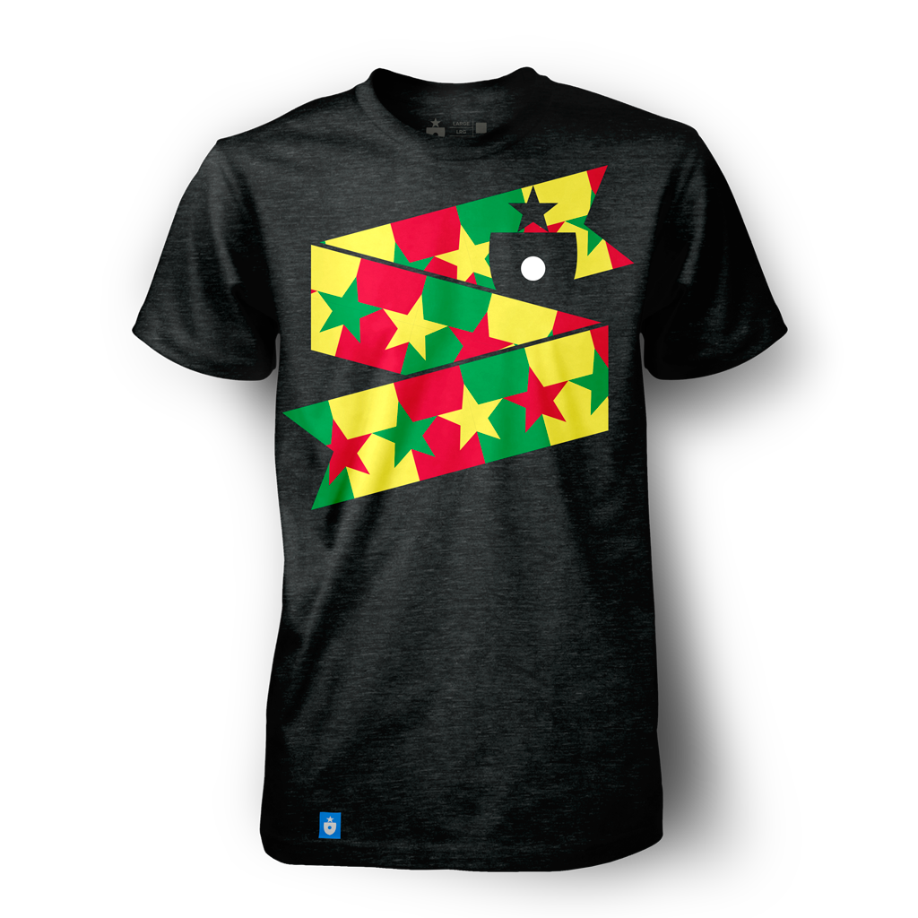
Expanding the star conceit into a repeating, color-bridging element works incredibly well. The design feels potent and alive. To ensure it really pops on a t-shirt, we’re placing it against a black base — and the result is pretty stunning.
The poster is completely wild — it looks like an ad for fireworks. We love it. The scarf is more staid, but still completely celebratory.
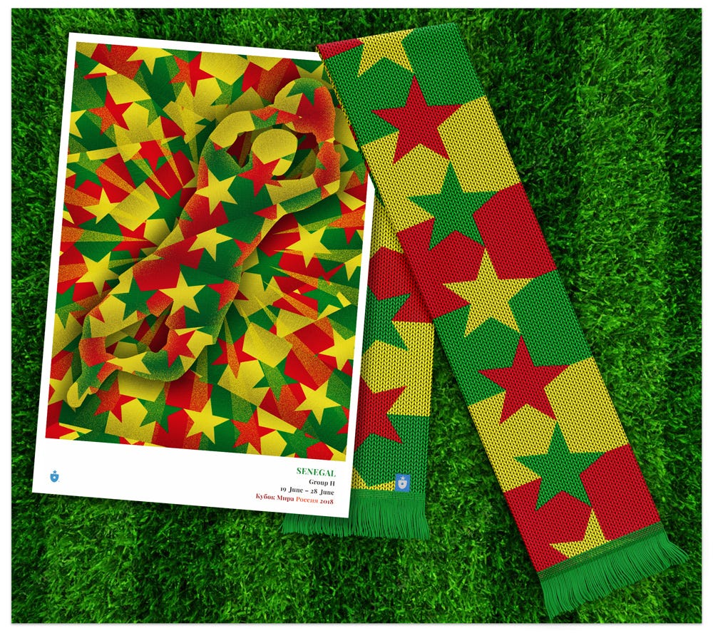
After sweating so many intricate and specifically nuanced designs, it felt right to find Senegal waiting for us at the end of this project. When a beautiful concept just clicks — we live for that feeling. We hope it does Senegal proud.
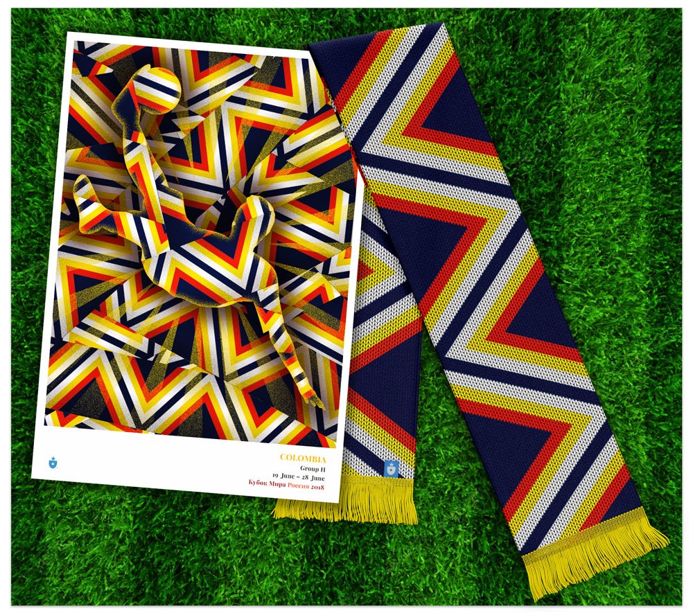
Colombia
Colombia has a very specifically beautiful national color scheme. Deep blue, fire red, sun yellow and white combine in incredible ways, but it’s the latter three colors — red, yellow and white — which fascinate us. When placed side by side, they can connote the appearance of a heat gradient, moving from red hot to white hot. The radiation from those colors together is almost palpable — and the effect is heightened when the cool blue arrives contain and channel the energy.
We wanted this energy to define the Colombia ribbon:
Our specific inspiration for the pattern comes from a style of indigenous Colombian jewelry — and specifically a beautiful necklace.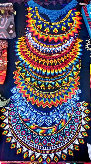
The collar pectoral, a wide, beaded collar style necklace, is a traditional product of the Emberá, an indigenous Amerindian culture that calls northern South America, and primarily Colombia, home. Emberá live in a tribal culture, largely unmodified by modern society. Their lives include ceremonies for which these traditional beaded necklaces are woven and worn. The repeating triangle and rhombus patterns are completely arresting — as are the colors used (including gradients that seem to give off that same visual heat).
When it came time to put this design on a shirt, we used a navy base to corral and define the ribbon. We think it works well.
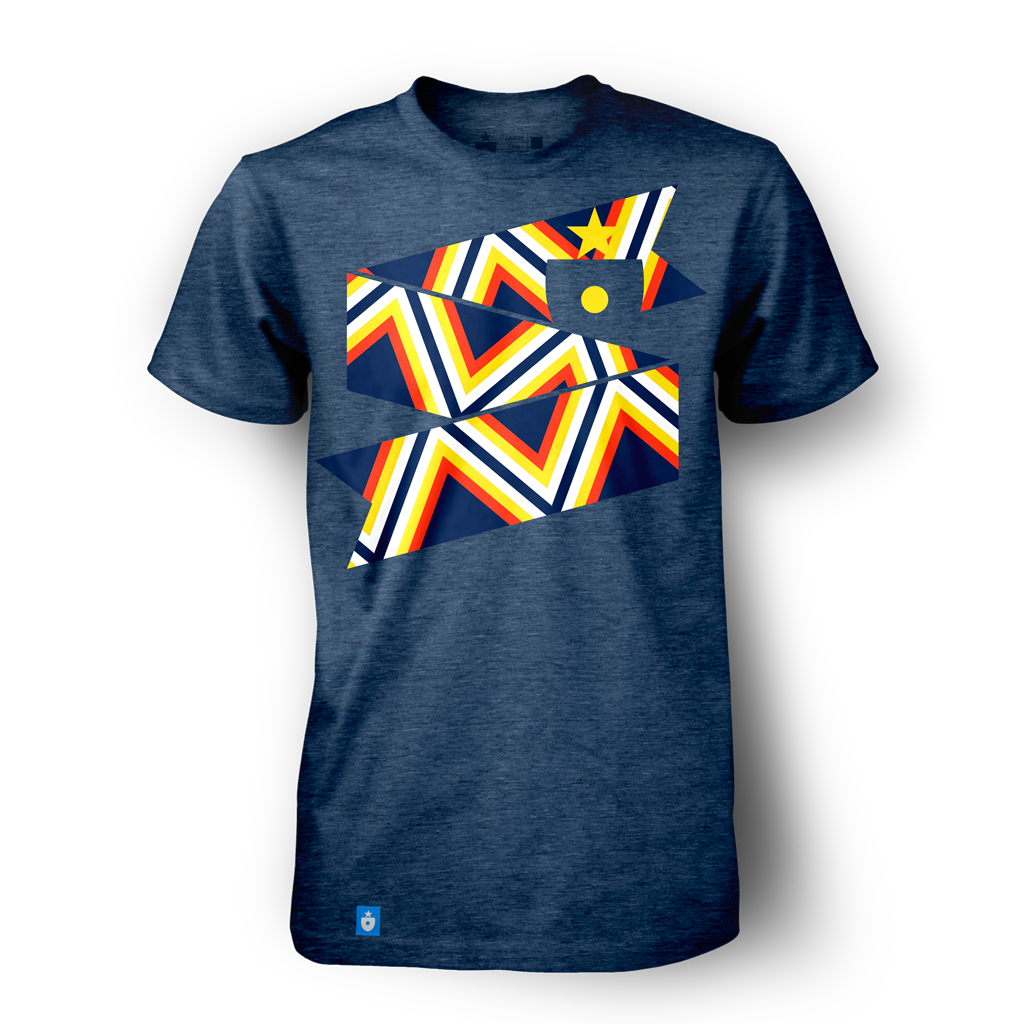
Traditional Colombian yellow sneaks through in a few key places — such as the t-shirt’s crest, the fringes of the scarf and the accent vectors inside the poster. The overall result is frenetic and arresting. (Both the poster and the scarf are defnitely in our project top 5.)
Colombia is poised to make some noise at the 2018 World Cup — and they’ need every bit of heat they can muster.
Japan
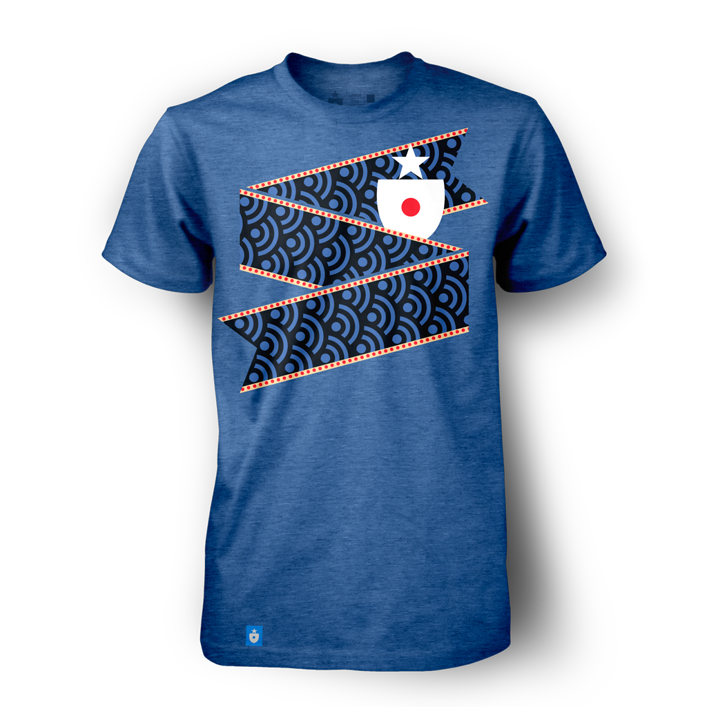
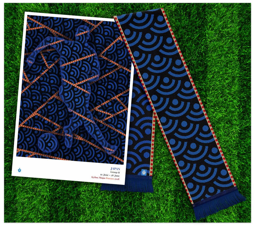
Japan presented us with the opportunity to use several distinct concepts; in the end, we went with a combination of two: The repeating seigaiha wave and the small rising sun that’s repeated, endlessly, along the top and bottom of the ribbon.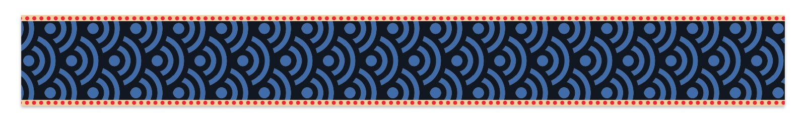
First, the wave. The seigaiha is a pattern with a rich cultural history in Japan.
Originally used on regional maps for centuries by Chinese and Japanese explorers, the seigaiha (literally, “blue sea and waves”) pattern developed into a specific style — concentric circles placed one atop the next, repeating ad infinitum. This pattern and the waves it represented came to connote good luck (specifically, a wave-like surge in good fortune) as well as resilience. The pattern was often found on clothing, especially kimonos, dating all the way back to the 6th century.
The rising sun motif, meanwhile, most likely needs little introduction to most. Japan’s flag, still so beautifully simple (a red circle against a white field), deserves to be honored somewhere in this endeavor.
Applying a repeated sun-as-dot effect to the ribbon’s edges yeilds a finished product that looks almost like a piece of fine Japanese washi paperstationery.
The light color behind the dots is an organic, orangey white to further give the impression of parchment or paper.
It all comes together perfectly on a royal blue t-shirt:
The waves really stand out on both the poster and the scarf. The scarf, in particular, seems vibrant and energetic, even when most of the body is taken up with dark tones.
With some luck (perhaps a surge of it?), Japan has a fighting chance to make it out of the round robin and into the knockout rounds. If Japan’s talented team makes it out of the group, it seems like the blue wave could take them anywhere.
Once again, we’ve made a poster for Group H. Like the national posters, these 11″ x 16″ group poster prints created with a gorgeous gicleé process and printed on your choice of stock (we prefer heavy photo rag, but you can’t go wrong). I can attest they look stunning.
This is why we made the ribbons — to have them interact! This, to me, is the best part of the project — watching the identities bounce off each other.
Eight groups down. We’re done! Thank you for joining us during this incredibly enjoyable trip through the 2018 World Cup field.
This was fun. Have a great Cup! We’ll talk soon.

Mark Willis (@m_willis) is an artist, designer, digital strategist and the founder of Clean Sheet Co. (@cleansheetco) a soccer-obsessed, design and apparel shop based in the Philadelphia metro area.