That was a fun, illustrated swing through US Soccer’s visual personality. We covered some history, looked at colors and palettes, introduced some first choice kits, a few wild variations, and discussed the need for both consistency and creativity in our national identity.
What I’m hoping for, in the end, is an identity that doesn’t seem pieced together from the scraps that other nations leave for us. The US has a soccer history as long (if not as storied) as anyone else’s, and a national history full of symbolism and visual strength to draw from. Right now, it seems like we’ve taken our team’s identity from clip art to sophistication – but with a notable exception here and there, we haven’t tapped into anything deep about being American with our designs. I keep referencing the Dutch in these pieces as a model for an American identity – this isn’t because they have a better team than we do (though they do), or because their coaches and playing philosophies are the envy of the world (they are), or because their on-field visual identity is so perfectly iconic and unique (it is). It’s because I remember passing through Amsterdam during World Cup ‘06 on my way to Germany. In short, the entire city looked like a work by Christo – whole city blocks seemed to be wrapped in orange, and banners hung above every available doorway. I stopped into a bar to watch the Netherlands play their first group game – it was against a stubborn Serbia & Montenegro – and it was nothing but a pulsating ocean of oranje (with a bit of black trim and beer thrown in). It was exhilarating.
Author’s note: This is part of a series on US Soccer’s visual identity. When you’re done here, feel free to read on.
Intro: What Makes a USA Kit?
Part I: Colors & Combinations
Part II: Third Kits & Special Occasions
Final Thoughts: American Expression
Thanks for reading!
So was marching, a few days later, with the US contingent through K-Town to a stadium on a hill to play Italy, and singing our national anthem inside that stadium. And participating in patriotic moments in Nuremburg and even Munich throughout the US’s run. The anthem, in particular, will always be one of my proudest American memories – it felt powerful and authentic when so often American patriotic moments can seem rote and even a bit plastic. I think that might be why I love US Soccer so much – it seems to bring out a kind of emotional patriotism that I don’t find in many other corners of my life.
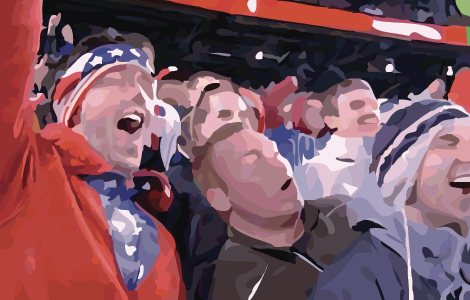
The only difference between the US fans in that cauldron of a stadium in Kaiserslautern, and the Dutch fans in their Amsterdam bar was that every Dutchman was wearing exactly the color the players were wearing on the field, which was the color of the banners that hung over every door, which was the color that was painted on every face. There was exactly one way to express yourself as a Dutch patriot. The Americans, on the other hand, wore hundreds of variations of red, white and blue – there was a lot of red, but there were stripes and stars and different uniforms from different eras. And costumes. Did I mention the costumes? Everybody had their own take on patriotic expression.
But there was one, interesting unified trend in the American camp. The most sought-after article of clothing by Americans in Germany wasn’t a jersey or a t-shirt of a particular color. It was the flag. Everyone seemed to have one – some waved it as you’d expect, but most wrapped it around them like a cape and wore it over (or instead of) their attire. And if you pan back from the American wall of sound at Fritz Walter Stadion that night, the symbol you pick out is horizontal red-and-white stripes. These aren’t jerseys, of course – our guys wore white that day – it’s our flag.
That’s our American fanship. Unlike some cultures, we Yanks can’t help but express ourselves diversely, and we thrive on variation. But we clamor to wrap ourselves in something universal, something that binds us.
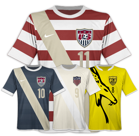
Let’s build a lasting visual identity around that. Use the red-and-white hoops to bring everyone together – to unite the fans, the flag, and the players on the field – and then build a secondary roster of looks that celebrate the individual ways we like to express ourselves as fans. Sometimes we’re all business, sometimes nostalgic, sometimes way riled up. These looks give us the vocabulary to express ourselves, but they hold together as a family with a clear unifying symbol: the red-and-white stripes of our flag.
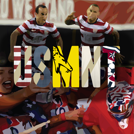
It’s exciting to think about where identities like this could lead; I’m not trying to rebrand the team (I mean, “America” is about the strongest brand you could have) – I’m just trying to think a bit about how our particular kind fanship can be translated into visuals. And I like where this family of identities leads us.
I think being an American soccer fan is just about the best deal going in sports. You get to be patriotic, you get to party, you get to travel (if you’re lucky enough) to great places and be an ambassador for our country. You get to sing and chant – traditions that have fallen by the wayside in other popular US sports. You get to be an underdog – something that I think most US fans relish. When you win, you get to beat the world at their game – something that I know most US fans relish. And you have a great white whale – lifting the World Cup – that’s still out there to be captured.
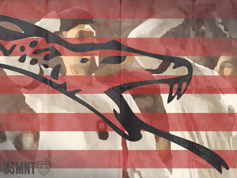
Somehow, I want our national identity to express all of that, with style. It’s not an easy task, but it is a fun one to think about.
Mark Willis writes about art, design, soccer and web stuff here on mwillis.com, and on Twitter. If you like soccer, read about rebooting the Revs, or how the Revs work in the age of mutual love. If you like tech and Apple stuff, read “A Couple Things I Wish Apple Did Better”, or “Being a Commodity”. And if you like sweet t-shirts, check out some stuff to buy. Drop him a line about anything at mark@mwillis.com.