I still get asked about it all the time.
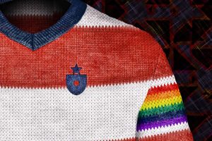
Seven or so years ago, I published the Soccer Out of Context project. I was just coming into an obsession with soccer aesthetics (update: it hasn’t abated).  Baseball, the sport I grew up loving, seemed so different than soccer, the sport I had more recently fallen for. I started to mash them together in my mind. Take, say, the Red Sox and Liverpool. Both have storied traditions, famous colors, and even (now) the same owner. What if the Red Sox were a Liverpool-style soccer club–what would it look like?
I started playing around in Photoshop. And then…
And I didn’t stop until I’d covered the entire major leagues (and a few extra teams, to boot).
Today, I’m going to publish the Preface from a new edition of the Soccer Out of Context series. That should fill in a little more of the back story. The entire series–six articles covering every Major League club, plus a few more covering older teams–remains one of the most popular things I’ve ever created. Along the way I discovered how satisfying it was to research each design, draw connections, and learn about both baseball and soccer. I also received a ton of gratifying feedback, including real-time reactions that influenced my designs and my thought process. The entire experience was wonderful.
But, as things published online do, the series quickly started to age. Players changed teams and retired. Clubs changed their actual jerseys. Links to articles and images that I’d relied on to help tell the story started to break. 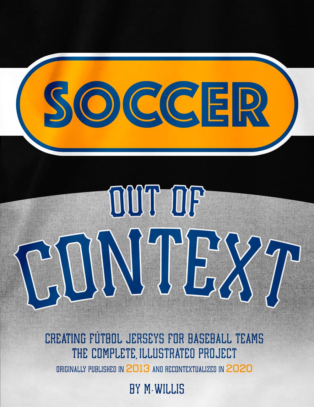 Eventually, I moved my website to a new platform, and the pieces didn’t transfer over perfectly. Broken images and strange formatting crept in. My writing style continued to evolve.
This year, with sports in turmoil, I started to think about the project again. What if I took another look, got it back into shape, and even added updated commentary from a 2020 perspective? Could I, for lack of a better term, recontextualize Soccer Out of Context?
I ended up doing just that. The entire series has been reviewed, re-formatted, and, yes, recontextualized with modern meta-commentary for every design.
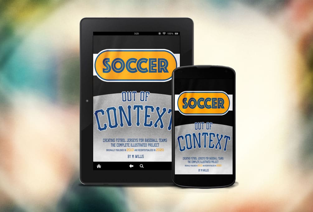
Today, I’m pleased to announce that the complete illustrated project is back. I’m making it available as an e-book, Soccer Out of Context: Creating Fútbol Jerseys for Baseball Teams, for the Kindle platforms, as well as a PDF that should work on any device. It’s $5.
Buy for Amazon Kindle • Buy the PDF edition
Check out the preface to the 2020 edition below. (The color block is how all the new comments look in the book, to separate them from the original commentary.)
I know I use sports to escape, and that’s not easy right now. I hope this helps.
 Preface to the 2020 Edition of Soccer Out of Context
Hey folks! It’s me, 2020 Mark. This Preface serves a very specific purpose: to show you exactly what it’s going to look like when present-day, all-knowing 2020 me interjects to provide some additional color and context for these very 2013-era musings. I know, I know–why bother? It’s not like much has changed since then. Sports, society… all just humming along unremarkably. (We haven’t developed a universal sarcasm emoji yet either.)
I now live in Philadelphia, having moved from Boston in 2016. I’m 42 now. I’ve made a ton of stuff that’s “crossed over into reality”, mostly via Clean Sheet Co., the apparel company I founded just after this project originally concluded. And Uni-Watch is still a daily must-read.The idea for the Soccer Out of Context project began whimsically, during the 2012 holiday season. I’d recently started to enjoy designing soccer jerseys in Photoshop, almost as a zen exercise or a time-killer; kind of like how you might doodle in a notebook to relax your brain. One day I decided to stretch my creative muscles by mashing up Major League baseball team identities with soccer / fútbol jerseys and aesthetics. The first few (Red Sox and Yankees) came out better than I expected, so I finished the division (A.L. East), wrote up my thought process, and threw it on my website.
And then: people found it. They read it, shared it, talked about it and wanted more. I was happy to oblige. Soon, I’d covered the whole M.L.B., the writing and research and ambition growing as I went along. Uni-Watch, social media, and a few other prominent websites pointed thousands of readers to the project. The reaction was so thoroughly positive–for the internet, anyway–that it kept me laser-focussed on finishing and then even extending it a bit.
These “X, but in aesthetic style of Y” sports design projects have become more common in the years since, but I don’t think anyone in 2013 was a) dropping this exact type of American/soccer culture crossover, or b) taking my, shall we say, detail-oriented approach to researching and explaining each design. Better designers than me have done some very interesting work in this space. But nobody, that I’m aware of, has turned a visual exercise like this into an excuse to learn about design, history and sport minutiae quite like I presented it.
The complete, illustrated Soccer Out of Context project follows below–every M.L.B. club, plus a few extra entries for good measure. Any time you see text boxes like this one, that’s present-day me jumping in to add some wisdom. I’ll most likely be explaining why 2013 me was wrong (or, every so often, why I was right), what I should have improved upon, how our frame of reference has changed since the piece was written, and crucially, what happened to the ballplayer whose name I used for the jersey name-on-back. (You won’t believe this, but some guys are not with the same clubs.) I’ll also try to put the seven-plus years of knowledge I’ve theoretically gained about baseball, soccer, apparel design, and life into play where it might be able to help. I’ve left pretty much all of the first-run text and imagery intact, and added original publish dates where it might be contextually helpful.
I was not, however, above cleaning up formatting issues / typos / references to outdated ideas as necessary. (I do think it’s important to note that as a society, we’re all upping our standards, and that’s a good thing. I thoroughly support and welcome the re-examination of past expressions. It’s honestly not that different than the push to rename racist teams. It’s my hope that the process of re-examination goes hand in hand with extending the author the chance to be better.) Luckily (?), I’m pretty sure the awkward, inert dad jokes I cracked in 2013 continue to transcend time and space. Let me know if you see anything I need to update; I’m listening.
Also, I’ve tried to make sure hyperlinks work where possible. (Thank goodness Wikipedia, Twitter and SportsLogos.net are all still around, and Archive.org exists.) I can’t show third-party images in running e-book text for a slew of reasons, so links are in many cases the best I can do. I appreciate your bearing with me. To my utter thrill, all the links documenting Detroit’s insane logo history still function perfectly. (And it’s almost like the “Aww, What Did I Say” Tiger is reacting to life in 2020.)
This intro is also a chance to tell you just how much writing this series has meant to my life. A couple hundred thousand people read these pieces. The series opened a few doors and jump-started several side projects that have become real things, and those things have changed my life. Beyond that, Soccer Out of Context became the turning point for my own self confidence as a designer. I received enough positive reaction from this project, not merely to keep going, but to believe I had the right to keep going. And I’ve never stopped. That was an incredible gift, and you gave it to me. So: thank you.
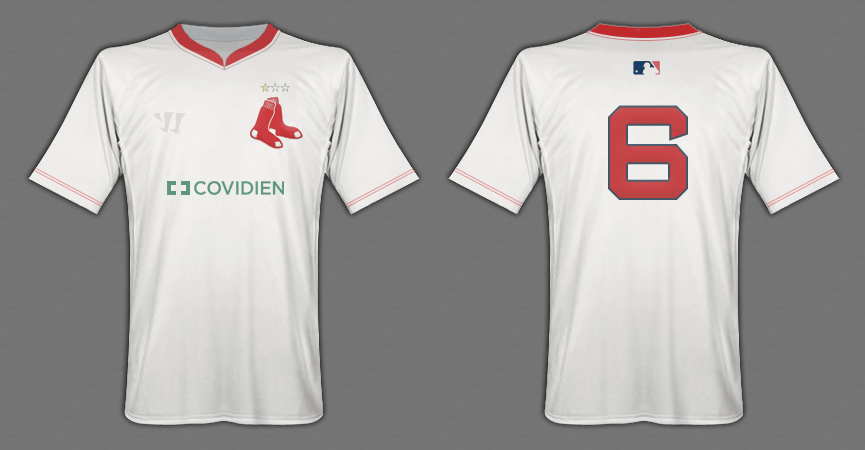
Life can be poetic. As mentioned, a few years after I wrote Soccer Out of Context, I moved from Boston to Philly. The Red Sox are the first entry; the Phillies are the last. I chose Wawa as the Phillies’ shirt sponsor; as a now-resident, I can confirm: there could not have been a more correct choice. I chose “Covidien” for the Sox; I don’t even think that company exists any more, and given how their name reads in 2020, that may not be a bad thing. Win some, lose some, call some of it poetry, keep moving.
That’s all to say: welcome (back) to Soccer Out of Context. As always, it’s a great day to talk about sports and design. See you in the margins.
-M.
July 2020

