I recently finished a big, text-heavy project and needed something frivolous to clear my head. Something fun, you know: visual, sports-y, design-y, kind of interesting to think about, quick and most importantly, completely hypothetical, non-sensical, and pointless.
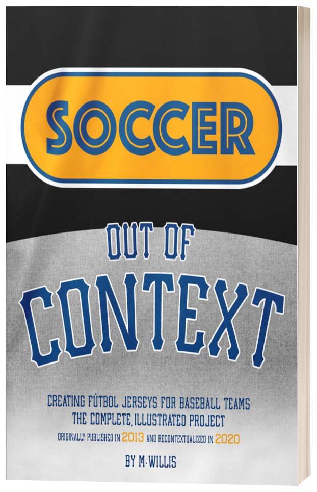
And so I give you the first (only?) edition of Soccer Out of Context – a look at how other identities and brand properties would appear in the soccer / fútbol aesthetic, instead of their own. For the introductory exercise, I chose my first sporting love, the Boston Red Sox, and their neighbor clubs in the baseball division they call home, the American League East. How would AL East teams be represented in a soccer context?
Here are my rules.
- I’m not reinventing club histories, or pretending clubs were soccer teams all along, just translating their brands to the soccer “universe”.
- I’m not changing logos, colors or visual properties – just trying to play within existing boundaries.
- Today I’m using soccer kits – jersey shirts only, really, as this was a quick exercise – as the visual output. One per team, too – no away designs this time.
- Where I can, I’m making guesses about the identities to fill in blank spots that don’t map easily over to soccer.
- I’m trying to have fun, and I don’t take this seriously as anything more than palate-cleansing design exercise.
Here’s what I ended up with, in the order I think about the division:
Soccer Out of Context is now an e-Book! The complete illustrated project, with new 2020 commentary and bonus content, is available here for all platforms and devices.
