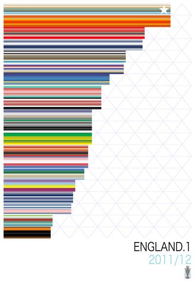
A few weeks ago I got inspired by a simple idea – take a season’s worth of clubs (say, the 20 in England’s Premier League), break each one down into comparable visual components (I chose stripes of color), and then lay on top of that a bit of data to show the how the clubs performed during the season in question. The result went something like this:

That was fun, and satisfying to make. I took special appreciation in alluding to as much data as possible without naming teams, point totals, or details. I enjoy letting the colors tell the story.
Besides a soccer fan, I’m also a web and information designer. And as compelling as the visuals were, the exercise that created them set off all kinds of bells in my mind – the data I was using to show the visualizations (color stripes, point totals, etc.) was all data that would represent well in a structured database. And if I could get the data into a database, well – I could do almost anything with it using a web canvas.
So, here’s what I decided to do. Seasons.
This little experiment in visualization has made the jump to the web. Here are a few of the features I was able to add to Seasons as a web project:
- Lots of links. Each table shows you historical data for a particular season, including honors won and distinctions qualified for – including trophies, promotions, relegations, and other notable happenings. Hover over the little icons for details. Click on a club’s name to jump over to its Wikipedia entry; click on a point total to see game-by-game results at Alltimesoccer.com.
- Lots of color. In addition to codifying each club’s “deca stripe” (a 10-colored striped swatch that’s an abstraction of the club crest), the table itself is banded do indicate what a clubs’ position means. Hover over the position circles on the left for details.
- Motion and transition. This project was a great excuse to learn and practice a few very modern web-development techniques, like 3D transforms and CSS transitions. If you visit in a good browser, like Safari or Chrome, you should see this behavior. I don’t intend to support every browser with this project, so I strongly suggest you try one of those to take advantage of the new stuff they let web designers do.
- Mobile web app capability. You can check out Seasons on any mobile web browser and it should be optimized for you – on an iPhone, you can even save it as a an app to your homescreen and use it offline.
- Live updating – it’s very beta, but I’ve picked a few current seasons to try to monitor live over the next few months – check out the current Premier League or Bundesliga seasons for updated standings.
- Keyboard shortcuts. As I add seasons to the project, you can easily search through them using keyboard shortcuts – I find that a few good shortcuts (like esc for back, up/down to traverse a list, etc.) really help give a project like this that “web app” feel. Click over to Seasons and visit the “Shortcuts” link for details.
- Expandability. The only limit to how many historical and current seasons this project can represent is time and human attention. I’ve started slow (with about a dozen league seasons, and only a couple live ones) but I’d like that to grow.
If nothing else, it’s been a great excuse to a) learn a ton about new web technology and b) learn a ton about soccer at the global level. Did I know how to use a web cache manifest, the right way to apply the ease-in-out property, or the history of Banfield before this project? Theoretically, yes – but it took working with that stuff to really understand and appreciate it.
I’d like to keep adding to the project, but most importantly, before I go too much farther I’d love get feedback from soccer fans like you (and if you’ve read to this point, you’re surely one). Talk to me at mark@mwillis.com or @m_willis and I’ll see if I can keep finding new ways to design for this sport we love.

