MLS identity updates are back. This week, it’s Houston Dynamo.
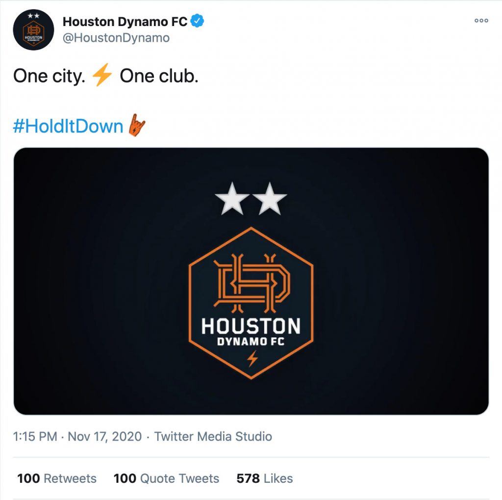
Quick hit on the updated Houston Dynamo (FC!) change. Yes, it’s an improvement. Yes, I’m glad they kept “Dynamo” and I like the addition of FC. (FC is like Inc. for companies or .com for websites at this point – it just tells everybody you’re a soccer team. It doesn’t have to be more complex than that.) They smartly kept the the colors and brand legacy intact.
The monogram is too baseball-y for my taste. If it was alone, or by itself in the hexagon, you’d have something pretty memorable. Instead, most likely as a branding mandate, they crushed a bunch of text in there. I don’t love that. The weights seem thin – and as is visible in the tweet screenshot on this page, this mark doesn’t shrink down to an avatar size very successfully. The lightning bolt is a bit of a non-sequitur… but you need an emoji you can own, so, sure, go with it. Energy. My biggest issue is, much like the Quakes redesign of a few years ago, it’s just a soup of different ingredients inside a container. They don’t really call to each other or suggest a balanced whole.
I like the hex shape, and decided to make a quick response. This isn’t a deep dive, but it was fun to put together:
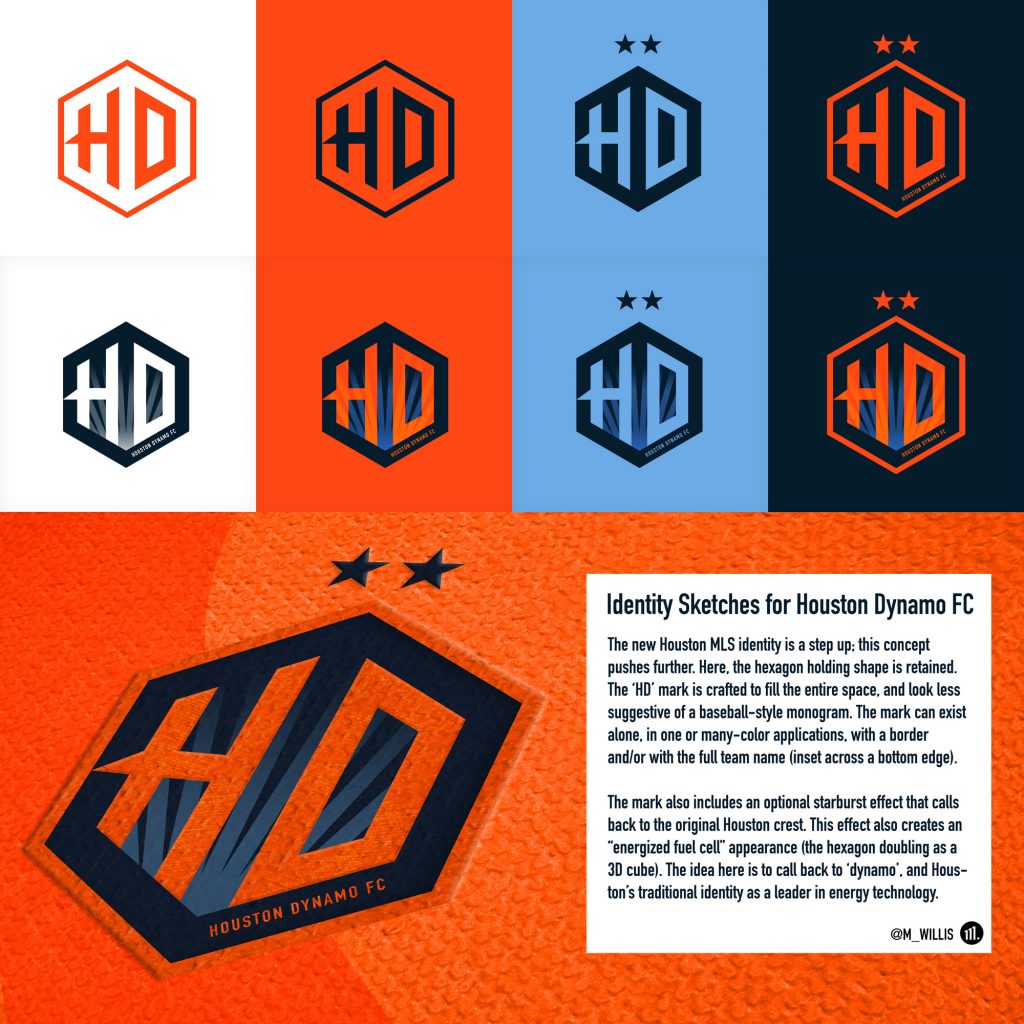
I’ll always opt for a simple, punchy application over a lot of competing elements. Either way, congrats to Houston on their new look. We’ll take progress however it comes.