Germany, Mexico, Sweden and Korea Republic
We’re in the home stretch now. If you haven’t already, check out our introduction to the Ribbon concept, which drives this project, and our pieces on designs for Group A, Group B, Group C, Group D and Group E. Here we go…
Germany
If only there was a way to channel the machine-like grace and efficiency of German soccer in a visual manner. Ideally, we’d find a graphic signifier that would represent the team, the national culuture, and something with historic, arsitic import.
It’s Germany. Of course there’s a way.
For our Germany Ribbon, we chose to take inspiration from rich Teutonic history of philosophy and design. We zeroed in on the Bauhaus movement, particularly.

As automation continued to change the world in the early 20th century, a serious by-product was anxiety. If machines could be created to do anything, where would humanity contribute meaning or value? What was the future of purely expressive human endeavor, like art? Could we shape society to reflect both machine-driven perfection and human expression? The Bauhaus (“build house”) school, which flourished in the early part of the century, attempted to address those questions.
The school, which expanded into a philosophical and visual movement, was centered on the idea that fine arts (painting, sculpture) could be united with practical crafts (graphic design, architecture) as a single discipline. Within that discipline, humans and machines could help perfect one another, to acheive something neither could alone.
A system that unites many disparate parts. Machine-like perfection working hand-in-hand with human expression. It’s hard to think of a better metaphor for the German soccer team.
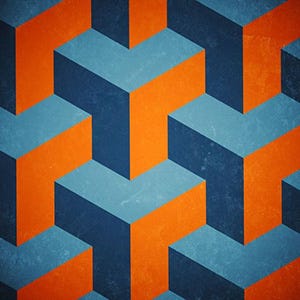
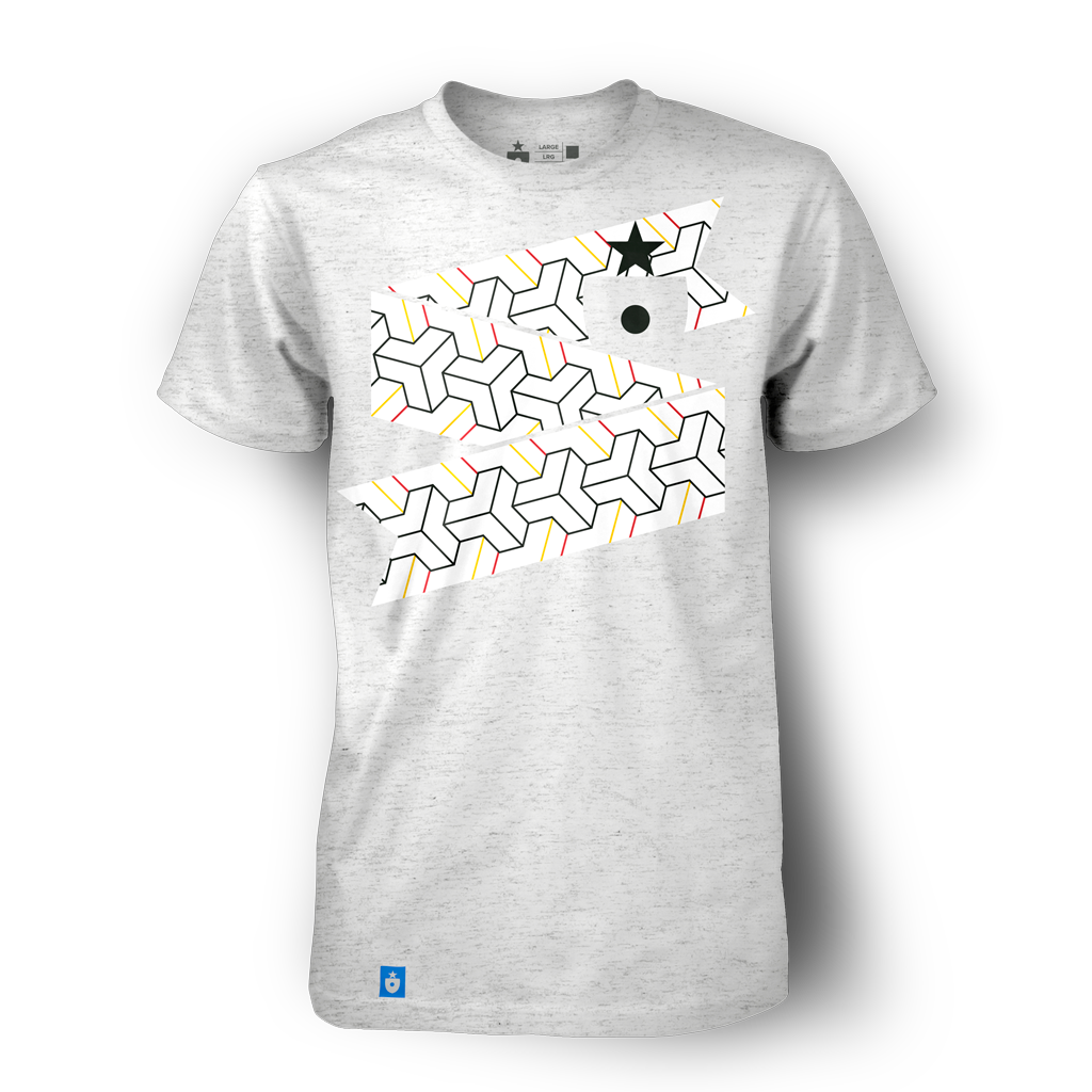
Bauhaus adherents produced an incredible body of visual work. Our ribbon design is one of many famous patterns and design explorations that came out of the movement. We’ve modified it to contain the stark, simple red-yellow-black-white color mscheme of Die Mannschaft.
Here’s our ribbon design applied to a shirt:
It also makes for a fantastically epxressive poster, and a perfectly German scarf.
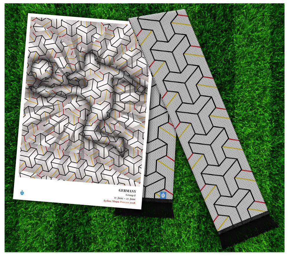
Machine-like precision. Human flourish. A system producing something greater than the sum of its parts. As German soccer prepares to defend its world title, these Bauhaus-inspired cultural traits will no doubt be relied upon. Again.
Mexico
When it came to Mexico, we were singularly inspired:
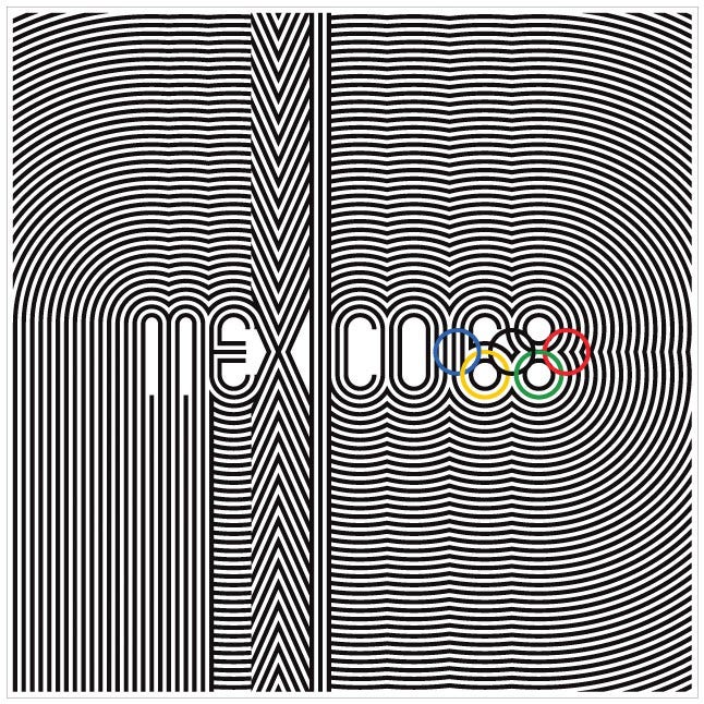
That’s the identity for the 1968 Mexico City Olympics, designed by Lance Wyman (part of a campaign with collaborators Eduardo Terrazas and Pedro Ramírez Vázquez).
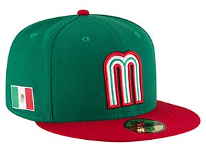
The stark ever-repeating concentric outlines have since gone on to become an iconic and everlasting piece of Mexico’s culture, and the typography has been directly used to represent national sporting identity. For our ribbon, finding inspiration in Wyman’s work was an obvious choice.
We’ve noticed lots of tonal variation in the shades of green Mexico uses in international competition — everything from bright grassy tones to dark
“midnight” greens. We selected light and dark green colors to stand in for white and black, and the result is rich and beautiful. The shirt gains a pop of red and white to signal the other consequential Mexican national colors.
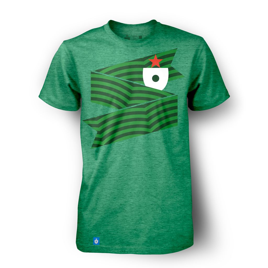
Removing red and white, we reduce the additional applictions to an exercise in verdant layering. The resulting poster and scarf brim with coiled energy:
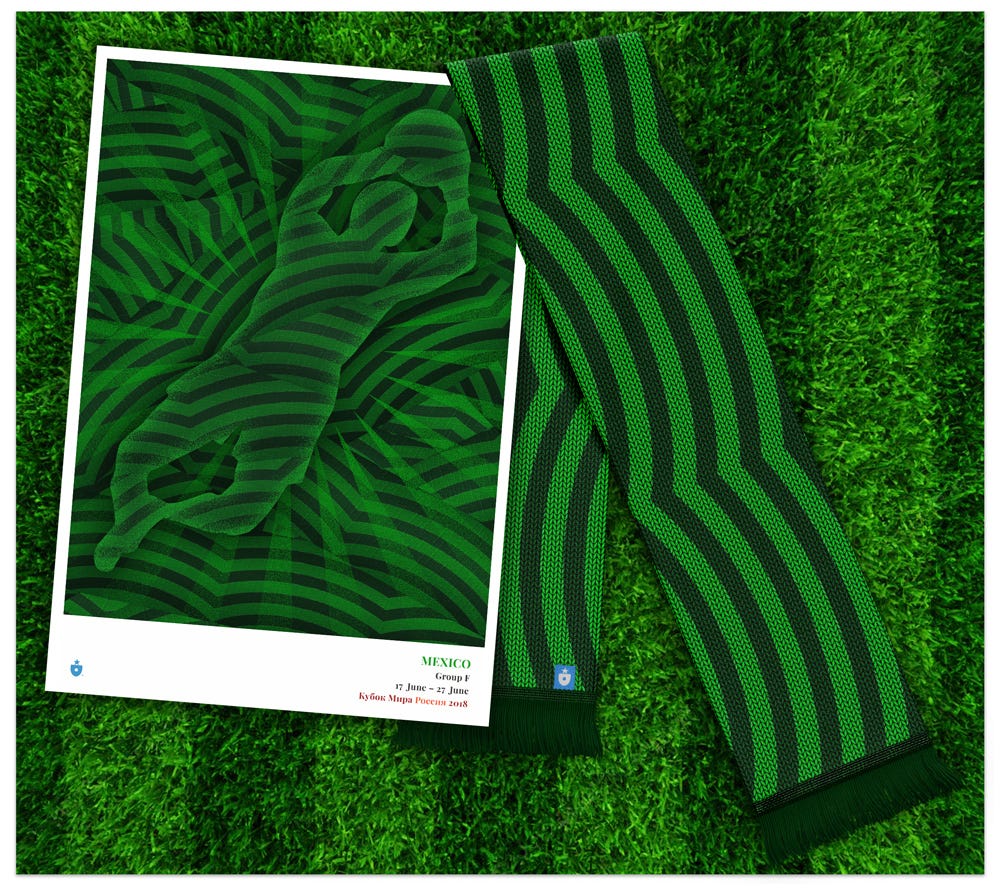
Mexico’s beautiful national colors, strong history of design and confident posture on the international sporting stage made this particular design a wonderful exercise.
Sweden
Follow us on this one.
Yes, Sweden is Scandinavian. And Scandinavian design history (as we covered with our Denmark entry) is rife with beautiful, clean lines and crisp patterns, perfect for an exercise like this.
But we didn’t go that way. Instead, we tracked in the other direction, towards something charmingly old fashioned. Swedish folk art.
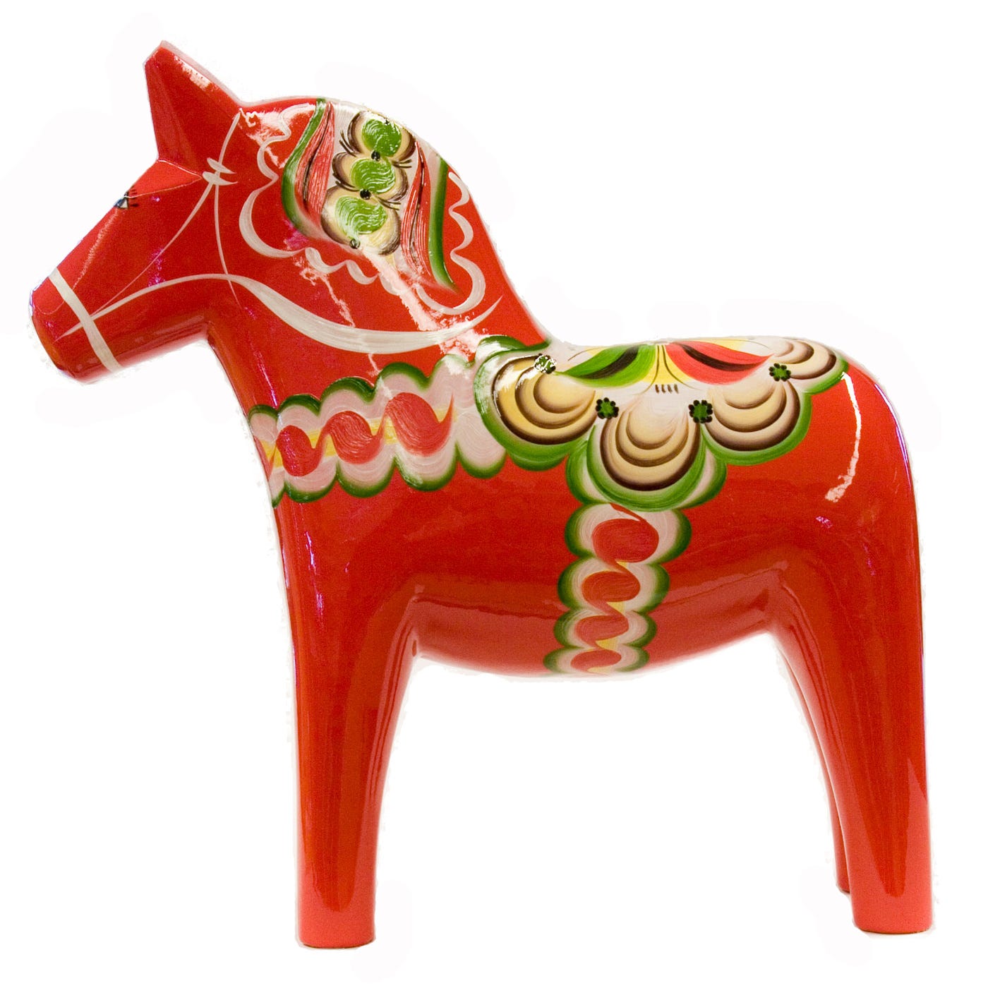
The Dala Horse. These hand-crafted horses, normally toy-sized (but occasionlly much larger) are symbols of Swedish cultural history. Dalecarlian horses were originally produced in Dalarna, a province in the south of the country, and given to children. Over time, their distinctive decorative patterns have come to symbolize the Swedish folk aesthetic. Their rich orange tone is alluring; their stout, sturdy construction is inspiring. And the decorative painting — that usually includes a harness, a saddle, a bridle and a braided mane — is fascinating. The harness bands, in particular, have a repetitive swirl that captivates.
That’s where our Sweden ribbon starts:
We chose to adapt the Dala horse’s harness pattern for the ribbon, rendering it in a two-toned yellow and a deep royal blue. The darker golden yellow nods towards the horse’s traditional orange tone, while the ligher yellow is more typical of the Swedish national identity. On a royal blue shirt, we think it looks fantastic:
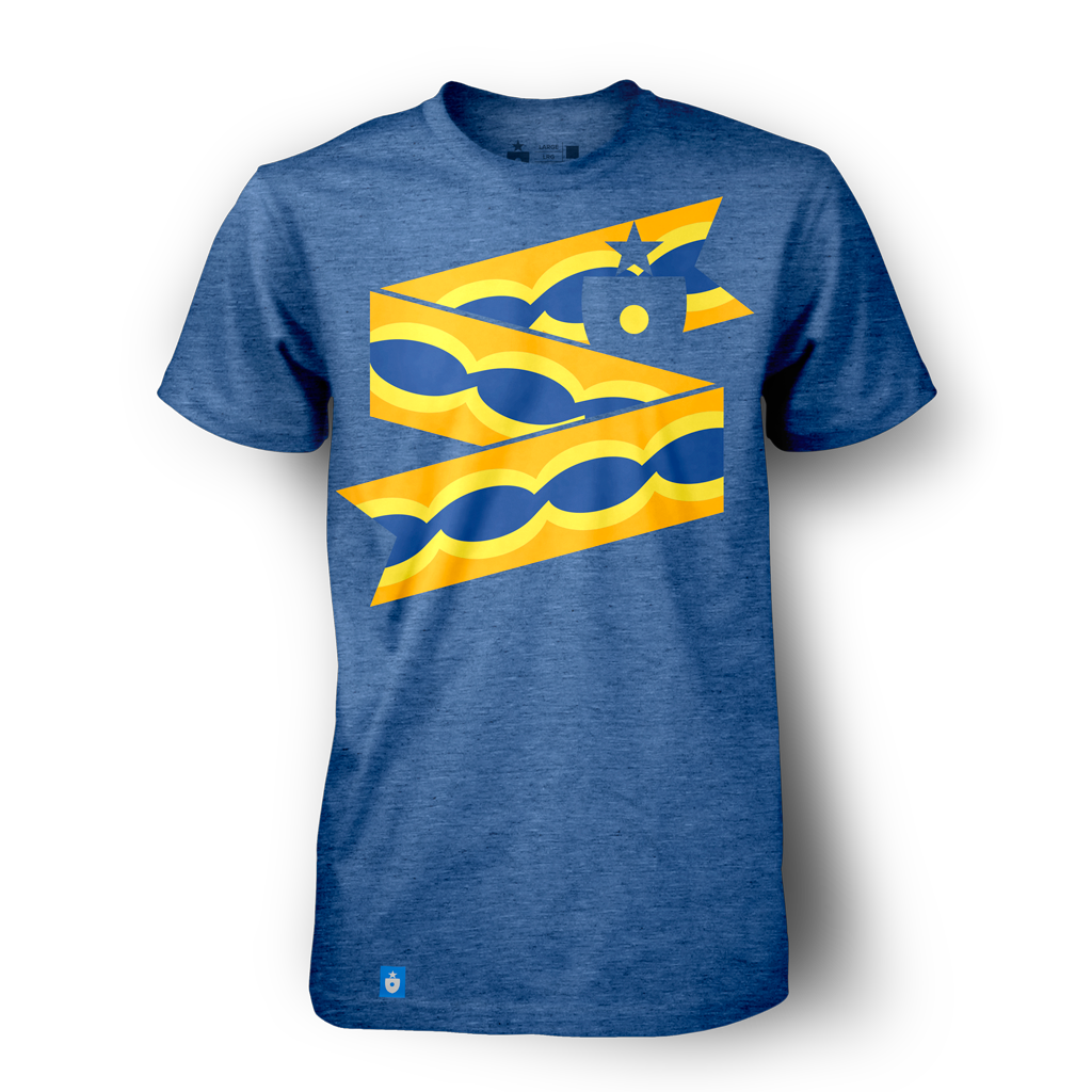
The pattern certainly makes for some interesting secondary applications as well:
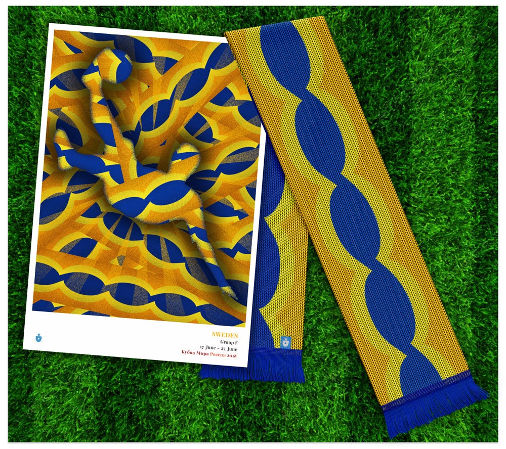
We’re having a ton of fun with this project, and creating identities like this Dala horse-inspired Swedish look is exactly why. We hope it rings true for fans of Sweden, and anyone else who finds inspiration in interesting places.
Korea Republic
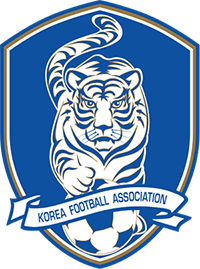
It’s all about the tiger stripes. Korea Republic’s national soccer team is defined by a fierce tiger.
The there may be other national crests more graphically interesting, but few are more direct. We’re inspired by the tiger and its power as a talisman — but also in the opportunity to use its unique stripes as the basis for a recurring pattern. Here’s where we ended up:

The tiger’s stripes are rendered in Korean red and blue, creating a unique result that is both comfortable and a bit striking. We think it looks stunning on a red shirt:
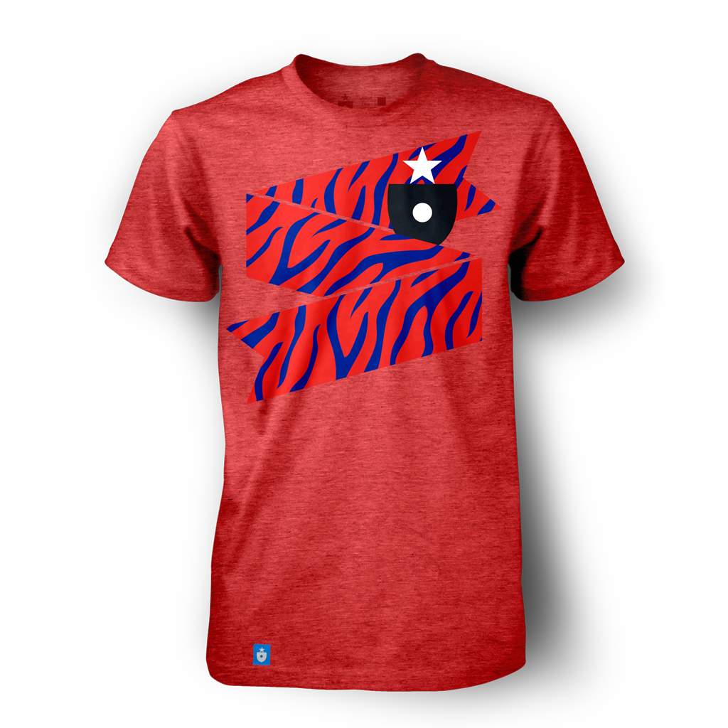
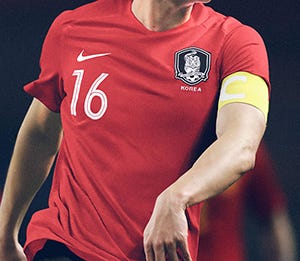
Korea Republic surprised us a bit this year by rendering their tiger crest in black on their World Cup uniforms; this is a new development for a team that has previously lived in red and blue. We used the opportunity to follow suit, and the black crest on our shirt really pops against the red, blue and white. Collateral applications are also very interesting:
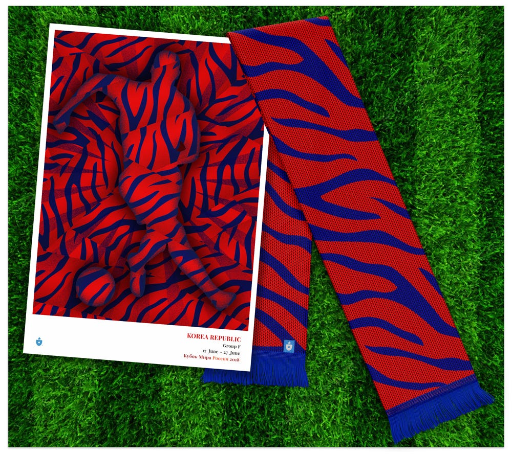
The tiger stripes are an obvious and beautiful inspiration for this project. With luck, the imposing tiger and its stripes will see the Taegeuk Warriors do well this summer in in Russia.
And that’s Group F!

Once again, we’ve created a group poster print for Group F. Like the national posters, these 11″ x 16″ group poster prints created with a gorgeous gicleé process and printed on your choice of stock (we prefer heavy photo rag, but you can’t go wrong). I can attest they look stunning.
This is why we made the ribbons — to have them interact! This, to me, is the best part of the project — watching the identities bounce off each other.
Six groups down. Two to go.
(Want to keep reading? Group G is right here.)

Mark Willis (@m_willis) is an artist, designer, digital strategist and the founder of Clean Sheet Co. (@cleansheetco) a soccer-obsessed, design and apparel shop based in the Philadelphia metro area.

