Brazil, Switzerland, Costa Rica and Serbia
We‘ve reached the back half of the World Cup field. The end is in sight! If you haven’t already, check out our introduction to the Ribbon concept, which drives this project, and our pieces on designs for Group A, Group B, Group Cand Group D. Here we go…
Brazil
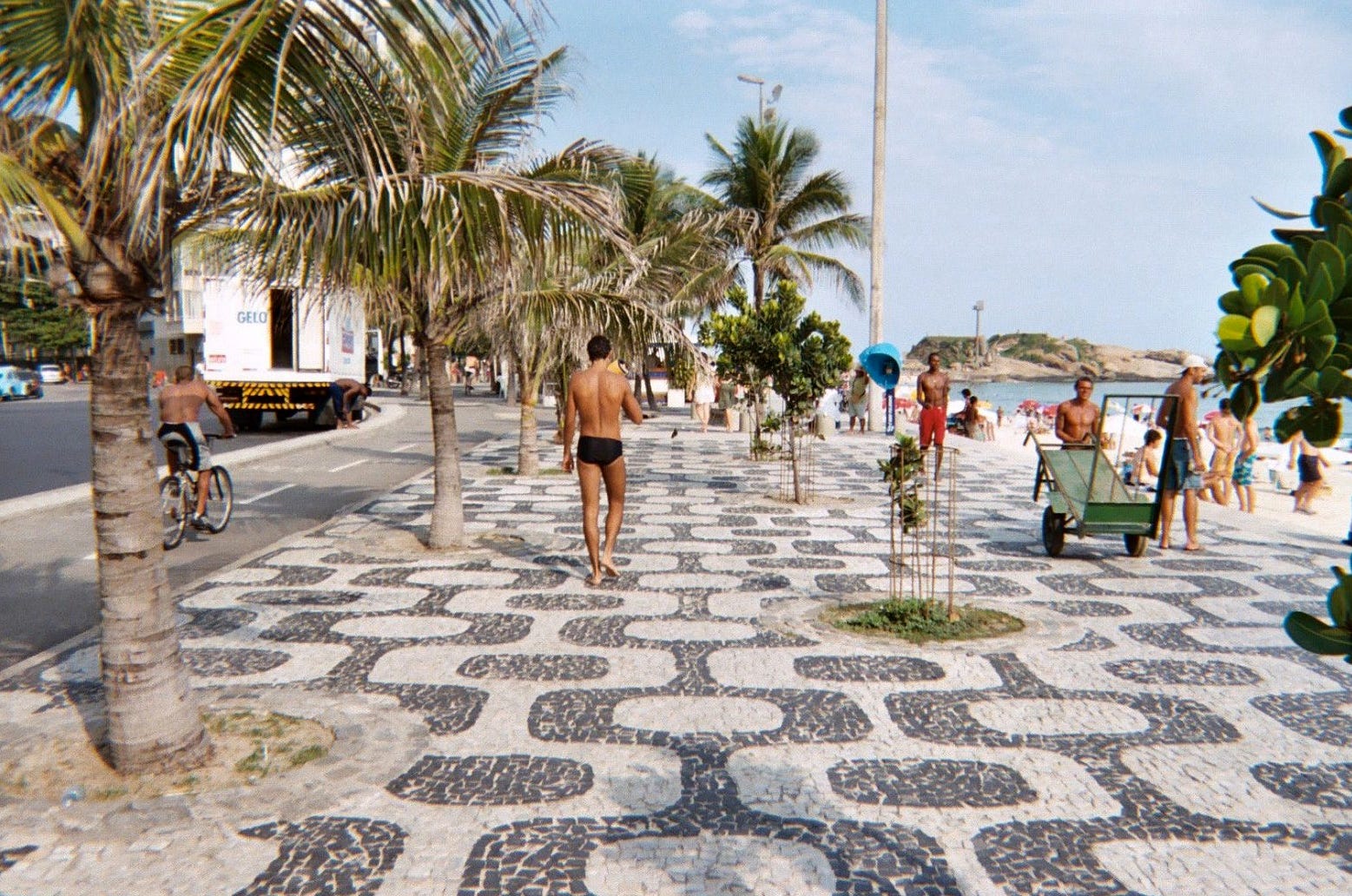
Arriving at this design felt effortless — like watching a Brazil goal. Obvious, inevitable, and with a bit of an artistic flourish. Before doing any research on Brazil, which we have some familiarity with, our inspiration was already established: the sidewalks.
If you’ve ever been to Brazil, or even seen pictures of any Brazilian city, you may have keyed in on the gorgeous black-and-white mosiac sidewalks. It’s not just that the sidewalks are beautiful; it’s not just that they’re geometrically perfect. It’s that there are miles of them, repeating patterns stretching for days along beaches and thoroughfares. Each repeating section has been painstakingly constructed with small black and white stones.
These sidewalks actually date back to Brazil’s ancestral forebearers, the Portuguese. Their sidewalks are a derivative of Portuguese pavement, the art of depicting realistic images and whole murals along city streets. Brazil’s pavement designs are more abstract — more Brazillian, in a way — and seem to follow a small set of basic motifs. For our insiration, we chose the pattern that recurs most famously along the Ipanema beach in Rio de Janeiro.
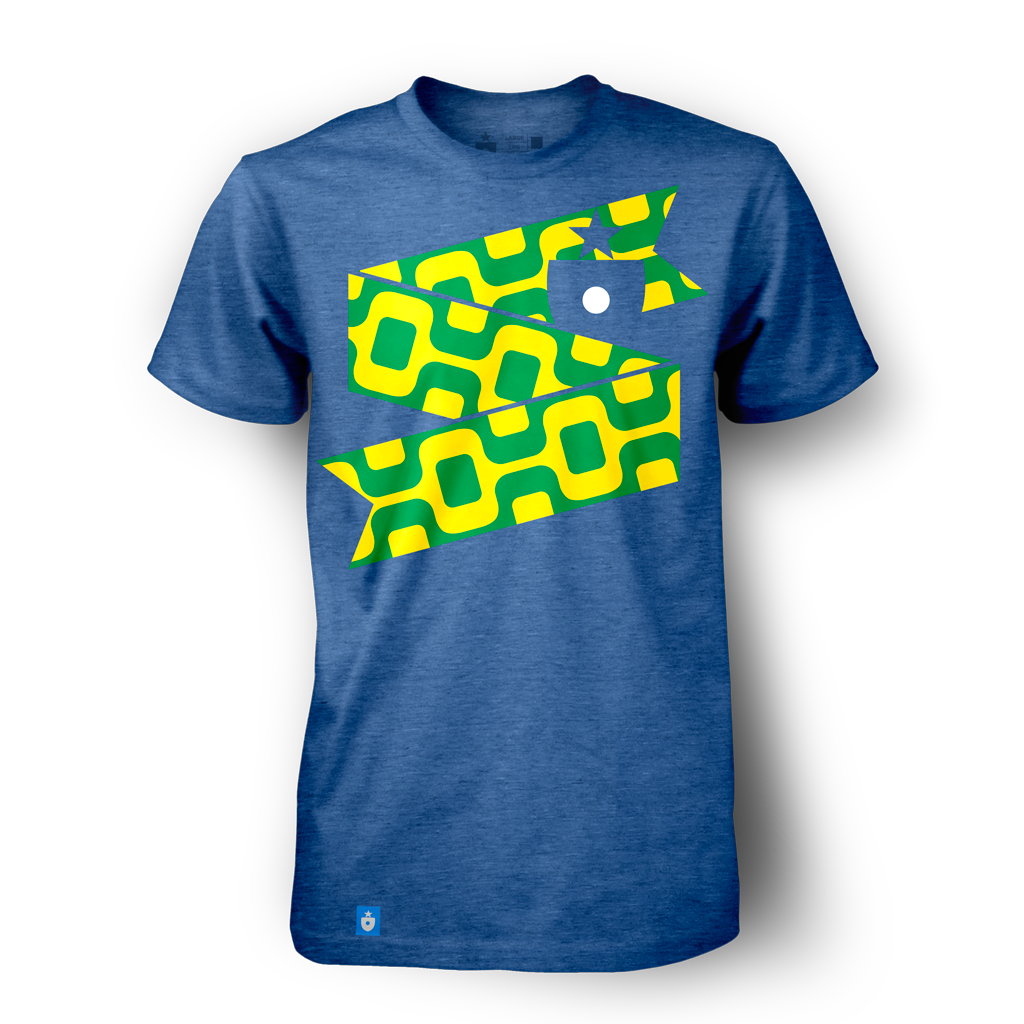
Here’s our Brazil ribbon:
Switching out black and white for green and yellow, the famous national color scheme, we get a design that faithfully reflects the energy and spirit of Brazil. Set against the third national color, royal blue, looks great on a t-shirt:
The pattern looks beautiful overlapping (via our poster design) or standing alone (on, say, a scarf).
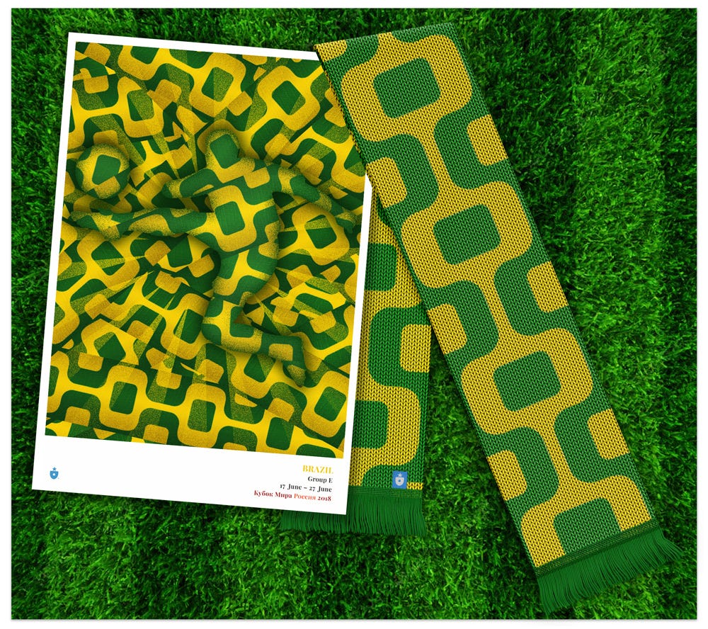
Though there are countless miles already in place, the future of Brazil’s distinctive pavement seems worrisome. Wikipedia states that “very little new paving is done and the entire profession is at risk. The long hours and low wages typical of calceteiros have reduced apprenticeships and thus new pavers.” We’re happy to document and celebrate Brazil’s beautiful paving tradition with this design. Like the play of the national team, there’s an interconnected rhythm to the pavement that makes it irresistable.
Switzerland
We showed you this one a bit early — using it as a demo, in fact, for the entire project. Why? Because no national identity is so perfectly depicted by a simple symbol as is Switzerland by its cross.
We kept it simple, repeating the cross motif along the horizontal ribbon design:

The end product is both straightforward and evocative. With just two colors (or, if you think this way, just one color plus white) and a basic shape, so much can be suggested. Mountains. Chalets. Watches. Care and attention to detail. All from such a simple symbol. The efficiency and elegance is, well, very Swiss.
The Swiss national team uses white as a prominent secondary color, so for our Switzerland shirt, we are too:

For a boxy, static shape, the cross element can effectively suggest energetic, angular motion when put into the proper context:
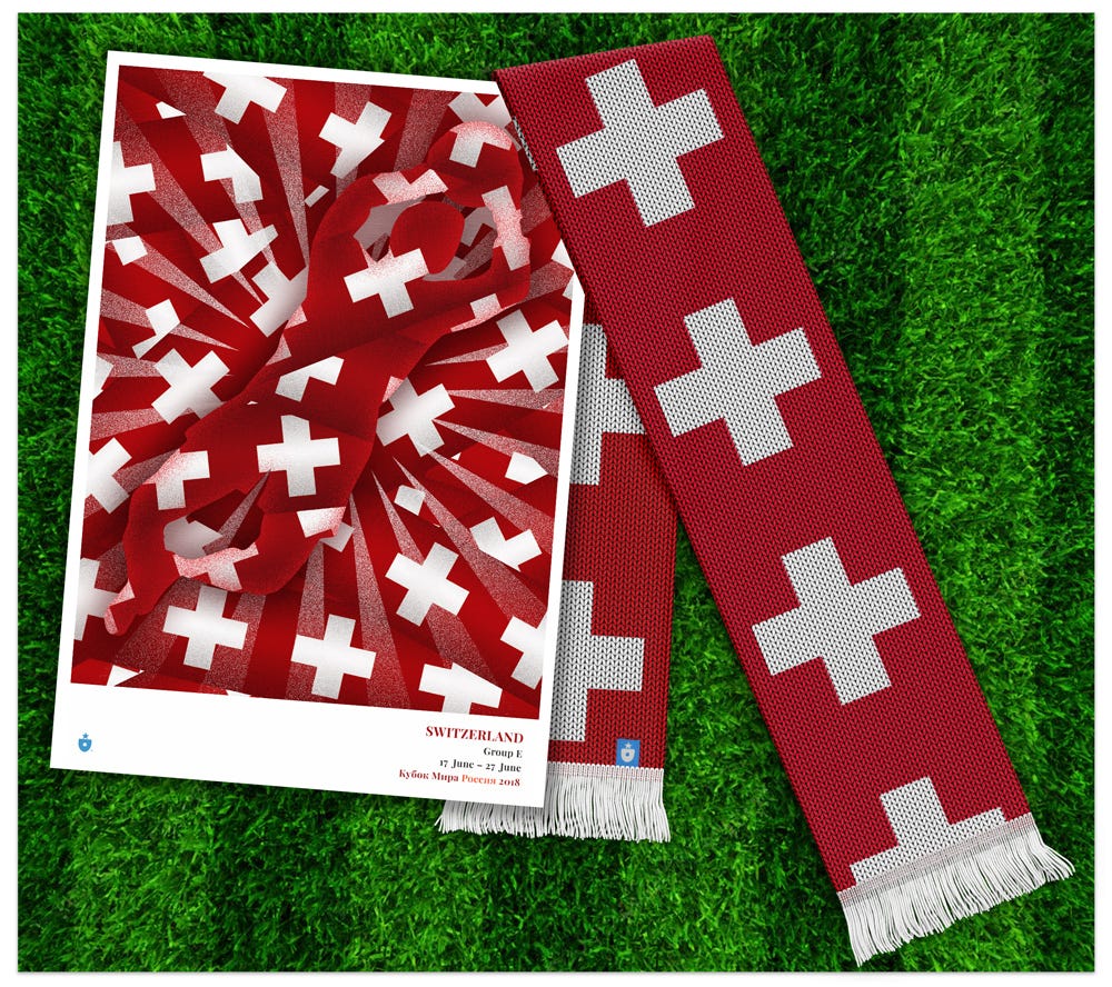
There are other ways to evoke the Swiss national identity, but none so pure as the flag and its beautiful, stoic strength. We’re really pleased at how perfectly the Swiss cross aligned with the Ribbon project.
Costa Rica
Our dive into Costa Rican symbols led us to a familiar place for this project: textiles. But we got there via coffee.
We can explain.
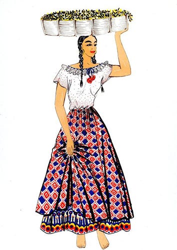
Along with its neighbors in Central and South America, Costa Rica is one of the world’s great coffee producers. Since the coffee bean’s introduction to the country in the late 1700s, its cultivation has come to define Costa Rican agriculture and the lives of many generations of agrarian Costa Ricans.
Our ribbon design takes influence from the beautiful textiles worn by traditional coffee cultivators and farm workers.

The pattern, already reflective of the country’s red, blue and white national flag and the national team’s uniforms, works quite well as the centerpiece of a shirt design:
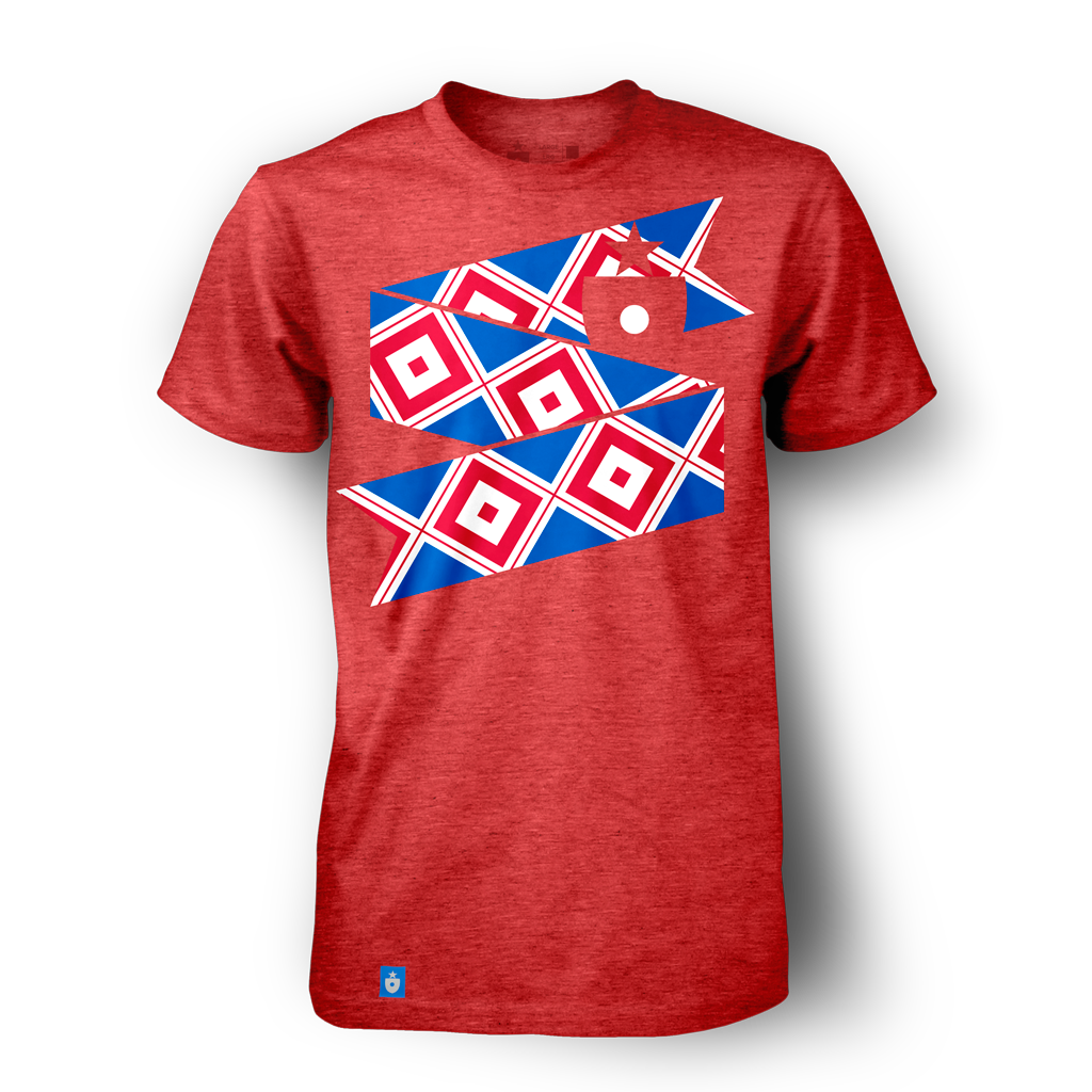
When allowed to stand alone (without a red backing), the pattern’s blue tones seem re-defined and begin to take over the visual language in a very appealing way:
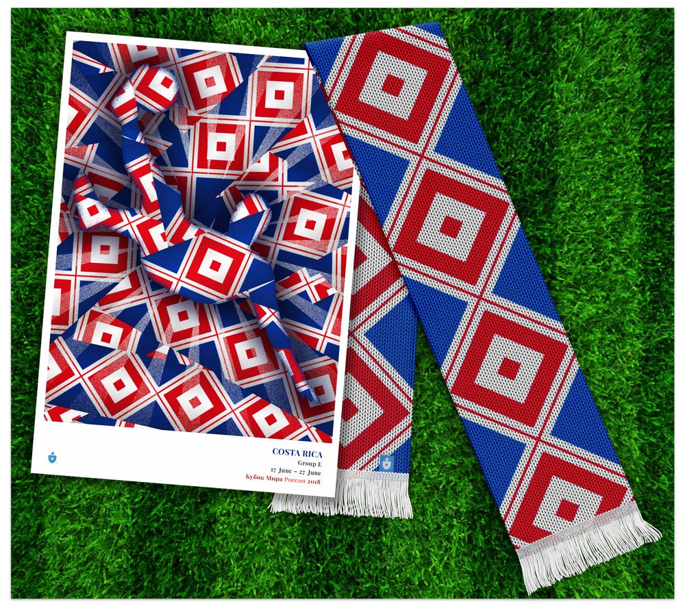
We’re fans of the North and Central American game — and Costa Rica is one of the standard bearers for our preferred region at the 2018 World Cup. With beautiful, historic inspiration (and perhaps a few cups of extra-caffeinated coffee), we wish them well.
Serbia
So far, our Group E inspirational tally includes national flags, traditional dress and pavement. Let’s keep it diverse. Serbia, what do you have for us?
Carpets? Outstanding.
We’ve noticed and taken inspiration from the weavings and tapestries that are part of other national cultures — most notably Iran and Morocco, whose rugmaking is an unquestionable part of national identity. But Serbia has good reason to join those nations — it has a fascinating and visually alluring rugmaking tradition all its own.
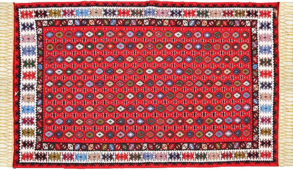
We’re talking specifically here about the Pirot carpet, a distinctive woven rug style found only in the small town of Pirot, Serbia.
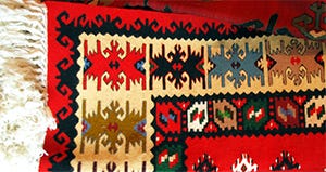
Once incredibly prominent and sought after throughout Europe and beyond, only a small cadre of dedicated weavers in Pirot keep the tradition alive today.
For our ribbon design, we chose to take inspiration from the Pirot carpet — and specifically the shapes that repeat along the carpets’ distinctive border.

Rendered in national Serbian colors, the pattern is quite beautiful:
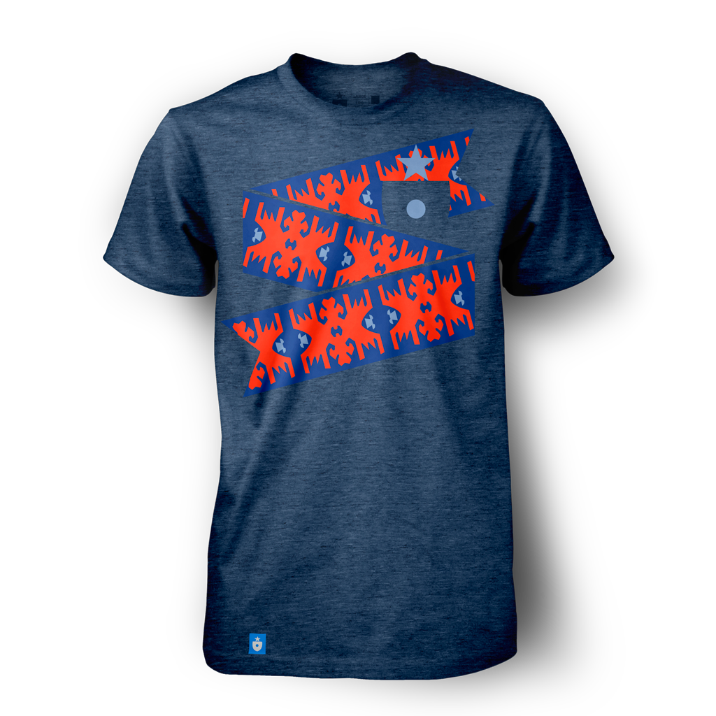
When applied in other contexts, the look is one of the more unique in the entire project:
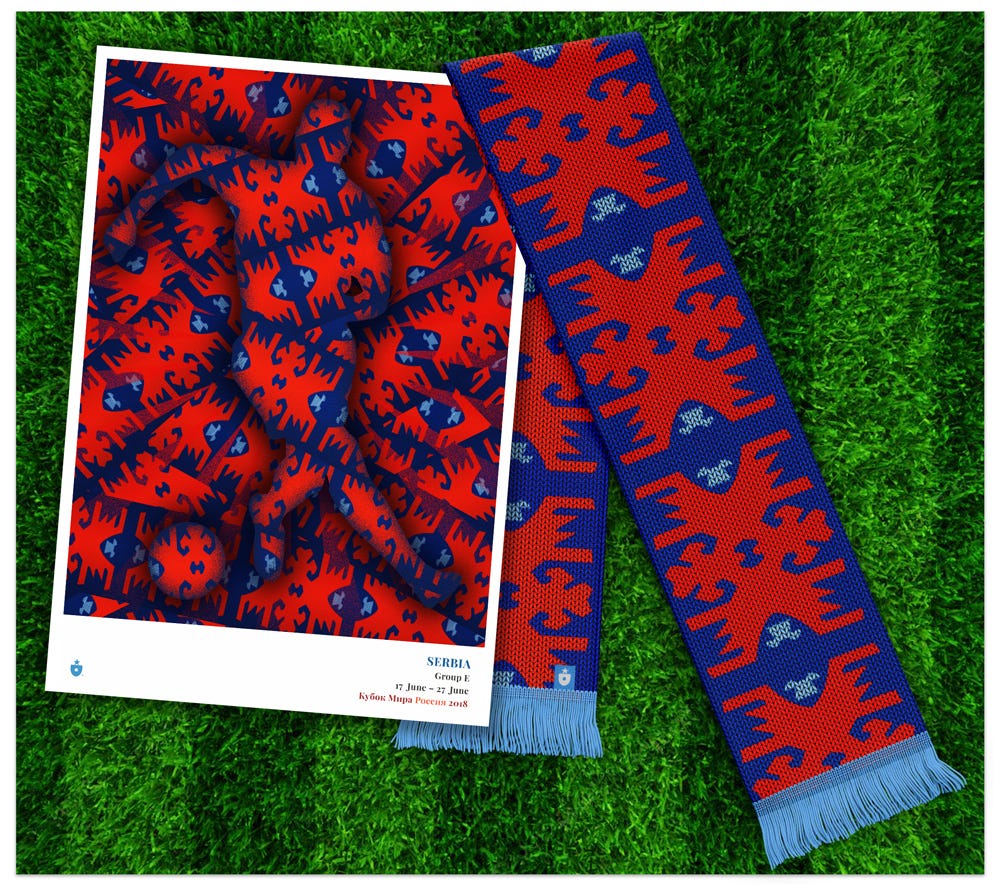
The theme of Group E: traditional elements make for beautiful inspiration—and whether they’re flags or pavement, clothing or carpet, they need to be cherished and cared for so that they can be enjoyed by future generations.
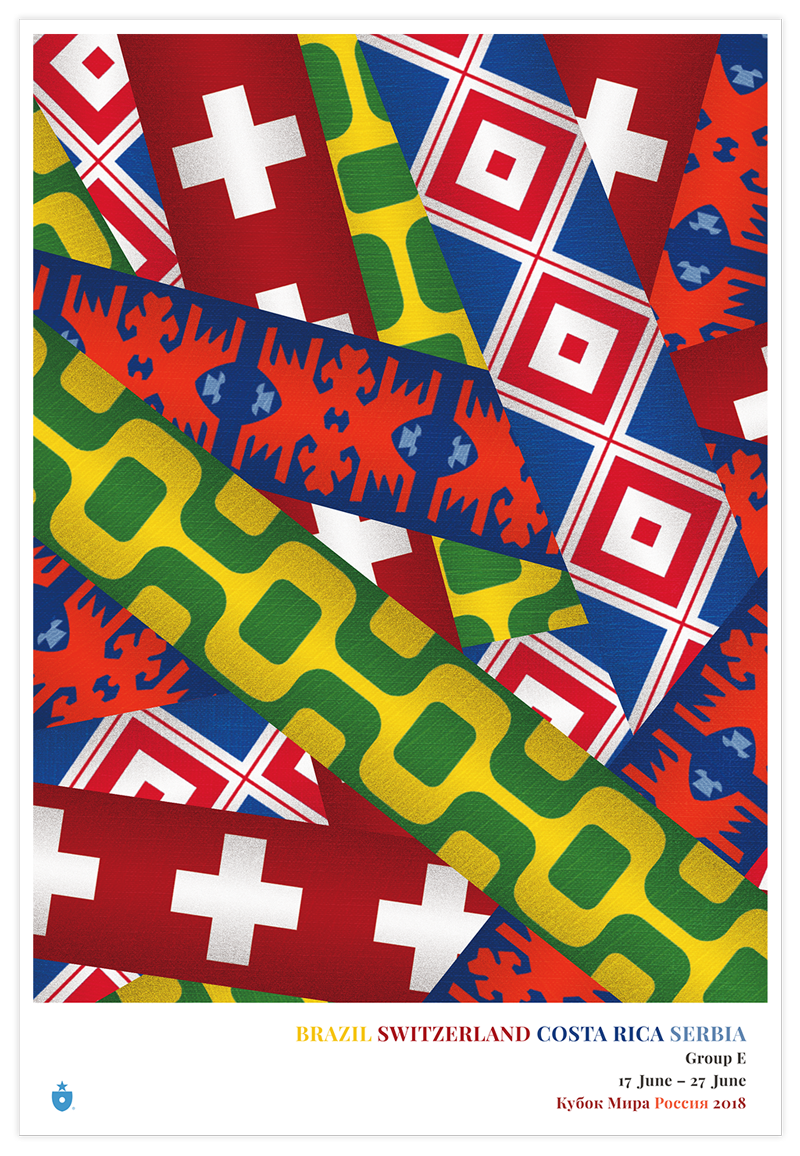
Like the national posters, these 11″ x 16″ group poster prints created with a gorgeous gicleé process and printed on your choice of stock (we prefer heavy photo rag, but you can’t go wrong). I can attest they look stunning.
This is why we made the ribbons — to have them interact! This, to me, is the best part of the project — watching the identities bounce off each other.
Five groups down. Three to go.
(Want to keep reading? Check out our designs for Group F.)

Mark Willis (@m_willis) is an artist, designer, digital strategist and the founder of Clean Sheet Co. (@cleansheetco) a soccer-obsessed, design and apparel shop based in the Philadelphia metro area.

