Argentina, Iceland, Croatia and Nigeria
With Group D, we’re halfway there. If you haven’t already, check out our introduction to the Ribbon concept, which drives this project, and our pieces on designs for Group A, Group B, and Group C. Onward…
Argentina
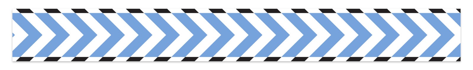
Vertical stripes of sky blue and white. Other teams may be known for iconic colors, but Argentina has what’s probably the most famous pattern in international soccer (although a fellow Group D member might contest this assertion. More on that in a bit.). When paired with black shorts, sports uniforms don’t often get more iconic.
Argentina already has a famous pattern. That made creating a ribbon design an interesting proposition. For our Argentina ribbon, we took the albicelestestripes that the country is famous for, added black and some cultural inspiration, and arrived at a design both familar and new.
The inspiration? When researching Argentina, this primer of native Argentinian textile patterns certainly helped; the one in the center caught our eye for its potential to carry the striped Argentinian identity as well as cultural significance.
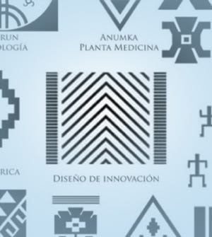 The pattern, one of many designs used by the indiginous Mapuche of Patagonia, is both beautiful and part of a meaningful visual language. Most Mapuche symbols carry specific significance; this one (“diseño de innovaciôn”) is a repeating decorative pattern that binds others together. On a navy t-shirt (Argentina’s oft-used away color), the design looks spectacular.
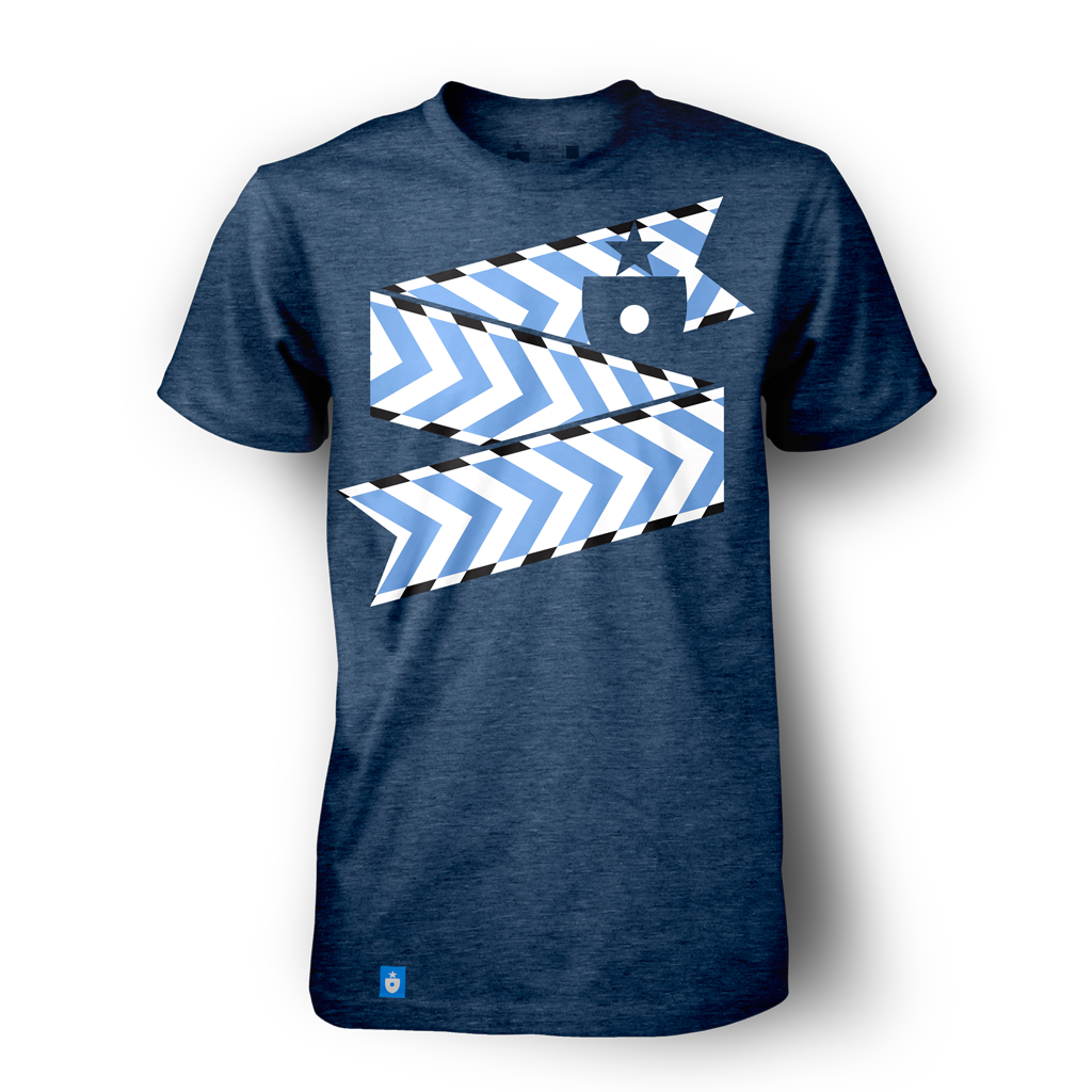

And the repeating motif really works in other contexts, as well.
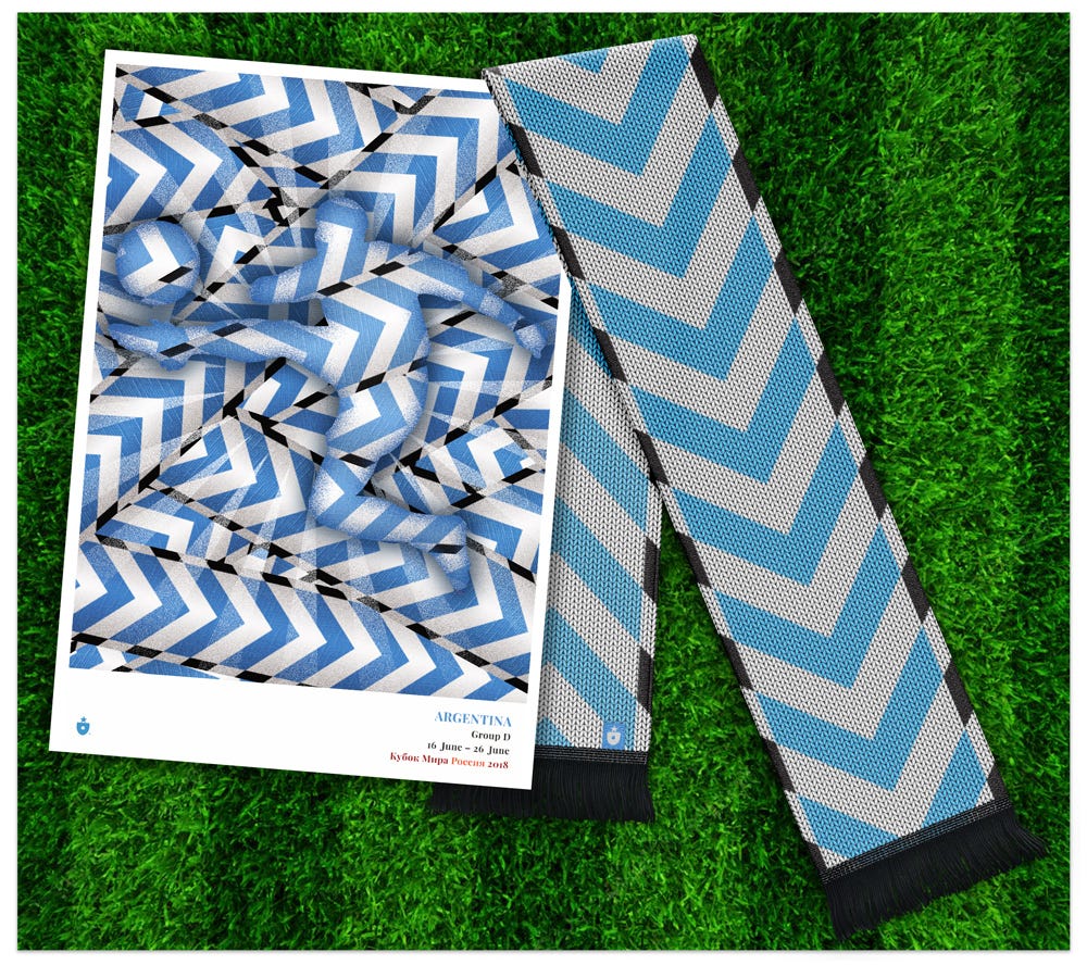

We love the way this ribbon turned out. When a country already has an iconic pattern, it’s gratifying to find a meaningful way to build on it.
Iceland
Iceland is such a fun country to design for. Amazing symbolism, an incredibly potent and unique international brand, and darned if you can’t help but root for the team and the Icelandic people on a stage like the World Cup. There’s something very cool (pun lightly intended) about their inclusion in the field of 32.
Our ribbon aims to capture some of the mythology, fun, and distinctive culture Iceland brings to the tournament: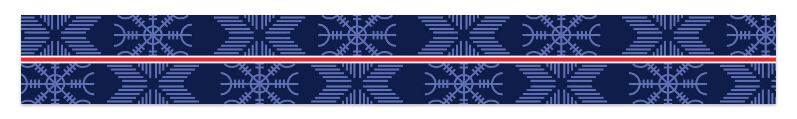
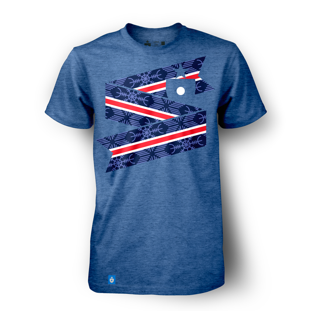
There are several major themes in this design. First and foremost, a red stripe, bordered by white, runs across a deep blue field. This resonates with both the nation’s flag and international sporting color scheme. Second, we have muted light blue iconography incorporated onto the darker blue field — and the significance here is really fun. The icons alternate — they are meant to give the impression of snowflakes or ice crystals. They are cropped, slightly, to fill and envelop the space; the details are what make them interesting.
The first symbol is inspired by the snowflake pattern traditionally used in Icelandic and nordic wool needlework.
The second pattern is much more intriguing. It’s based one of Iceland’s ancient stave symbols — traditional markings made by the island’s earliest inhabitants to encourage, warn or protect. Staves — the word translates as “sticks”, as in stick figures — were drawn and carved all over the island, on property and personal effects. They were thought to have magic, or at least superstitious, powers; there were staves that were said to help with everything from encouraging the affection of a mate to making one’s sheep docile.
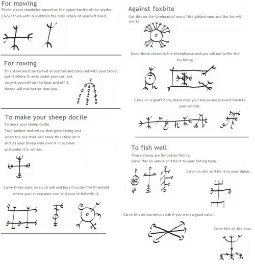
The coolest stave of all, though, is unquestionably Ægishjálmr. Translation: The Helm of Awe. (With a name like that, there can be no debate.) This stave offered protection — even invincibility — to its bearers.
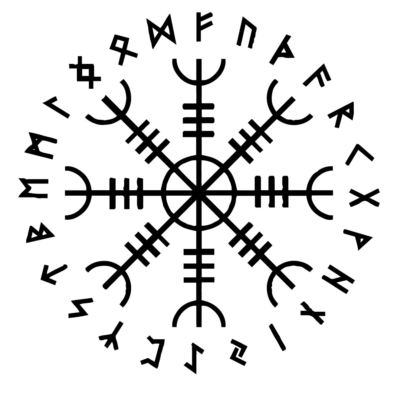
We had to use it. (A case could be made, one might think, that a version of it should be considered for the team’s official crest.) So Ægishjálmr, along with the traditional 8-point snowflake design, are each incorporated. Since they both can read as snowflakes, even without knowing the significance of the symbols, the design works.
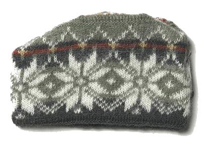
Here’s how the ribbon looks on a shirt:
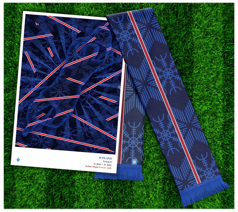
To this point in the project, this our favorite poster and scarf set. The red lines on the poster become almost laser-like here. It’s uncanny.
Iceland will always be fun. Fun to root for, fun to visit (I am told) and fun to design for. Here’s wishing the team, and the nation, a significant amount of success in Russia.
Croatia
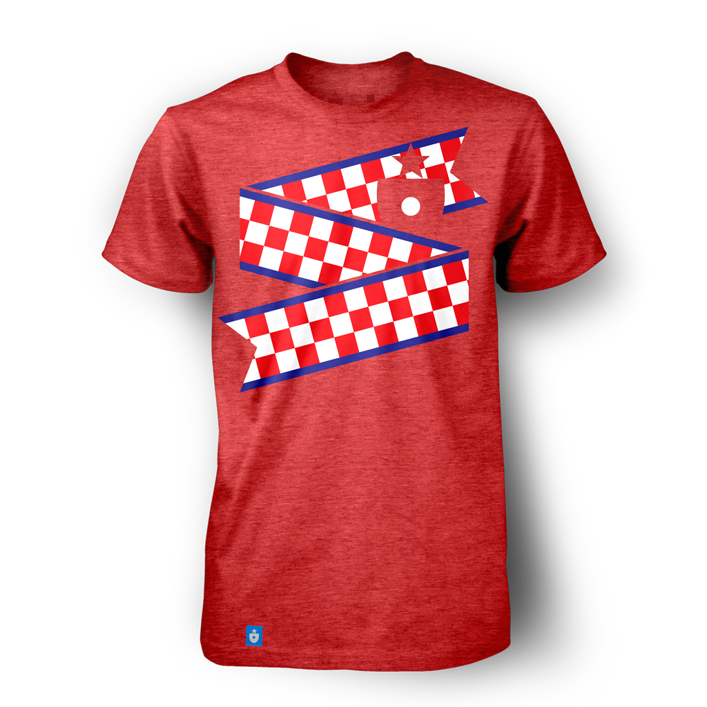
Remember earlier, when we posited that Argentina posessed the most famous visual pattern in international soccer? Let’s check in on their primary competition for the honor. It’s group-mate Croatia, home of the red-and-white checkerboard pattern. While Croatia doesn’t quite have the footballing pedigree that Argentina does, there’s no denying that their red and white checks are universally recognized. We didn’t stand in the way.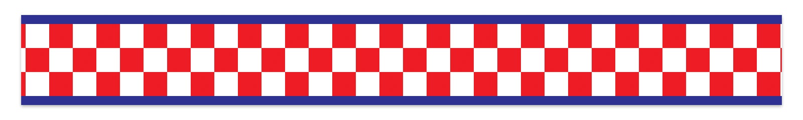
Checkerboards pop up often in soccer’s visual world, but this pattern isn’t just a case of a team adopting a certain soccer style. The chequy, or checkerboard pattern, is a centuries-old national symbol that extends far beyond sports and has deep meaning to Croats.
With a checkerboard pattern already representing a certain amount of visual complexity, there wasn’t too much we wanted to do to Croatia’s trademark look. Adding a blue border allowed us to bring in the other national color and give the checks some extra pop.
This group is chock full of fantastic collateral — and Croatia is a big contributor. The poster and the scarf both work well.
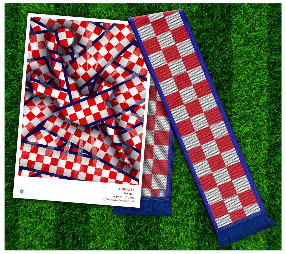
The history and simple power behind this pattern make for a beautiful set of nationally-themed items. With a bit more sustained success on the field, Croatia and the checkerboard could mount a challenge for the title of most recognizable visual brand in international soccer.
Nigeria
Nigerian culture is absolutely brimming with visual symbols, and it wasn’t easy to decide on an approach. In the end, we were inspired by a textile pattern — but what a pattern it is.
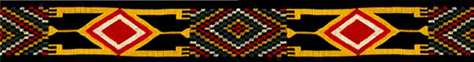
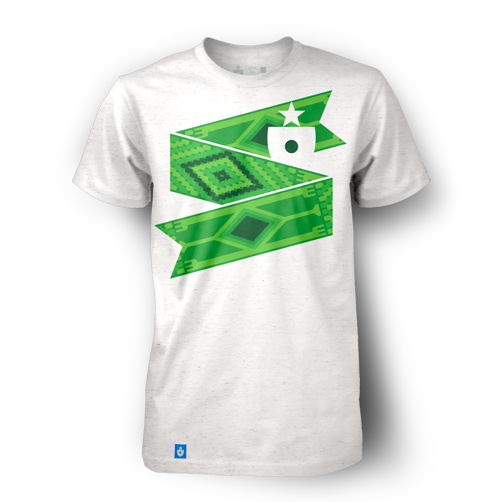
The beautiful, bold, beloved family of ceremonial African attire, including Ghanaian kente and Congolese kuba raffia, is world-renowned and absolutely stunning. Like every African nation, Nigeria has several textile styles that are traditional, indigenous and completely distinctive. In particular, Nigeria is known for akwete cloth— with patterns and traditions unlike any other nation. This akwete sample stopped us in our tracks:
Not only is it striking, but it features some fascinating representations within the patterns. Most intriguing: the fork-like claws that seem to evoke an eagle’s talons.
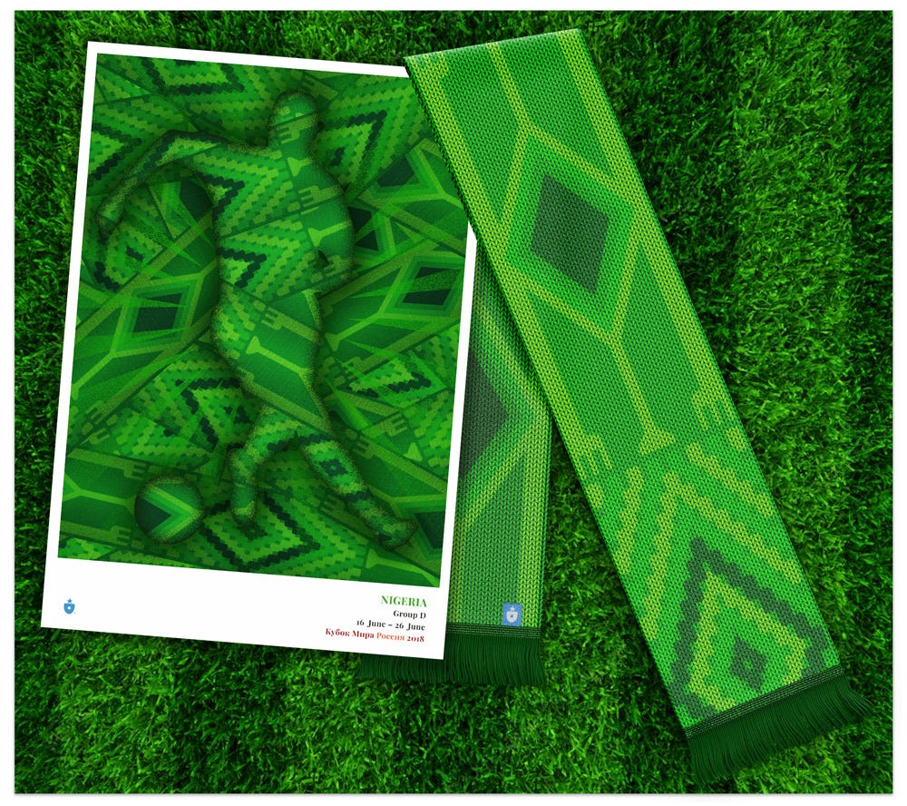
With the eagle (well, the Super Eagle) being the Nigerian national team’s symbol and nickname, the fit seemed perfect. We re-built the repeating akwete pattern to feature tones of green, from light to dark. The complexity and detail able to be represented with just a few colors is a testament to the nature of the akwete patterns themsleves. We think the resulting ribbon, when applied to a vintage, heathered white shirt, is quite beautiful.
Like other textile-inspired ribbon patterns, the scarf (in particular) looks beautiful as well:
With so many fascinating akwete-inspired Nigerian patterns to choose from, it was a pleasure doing reserarch for the Nigerian component to this project. With luck, we’ll have good reason to feature more in the future.
And that’s Group D.
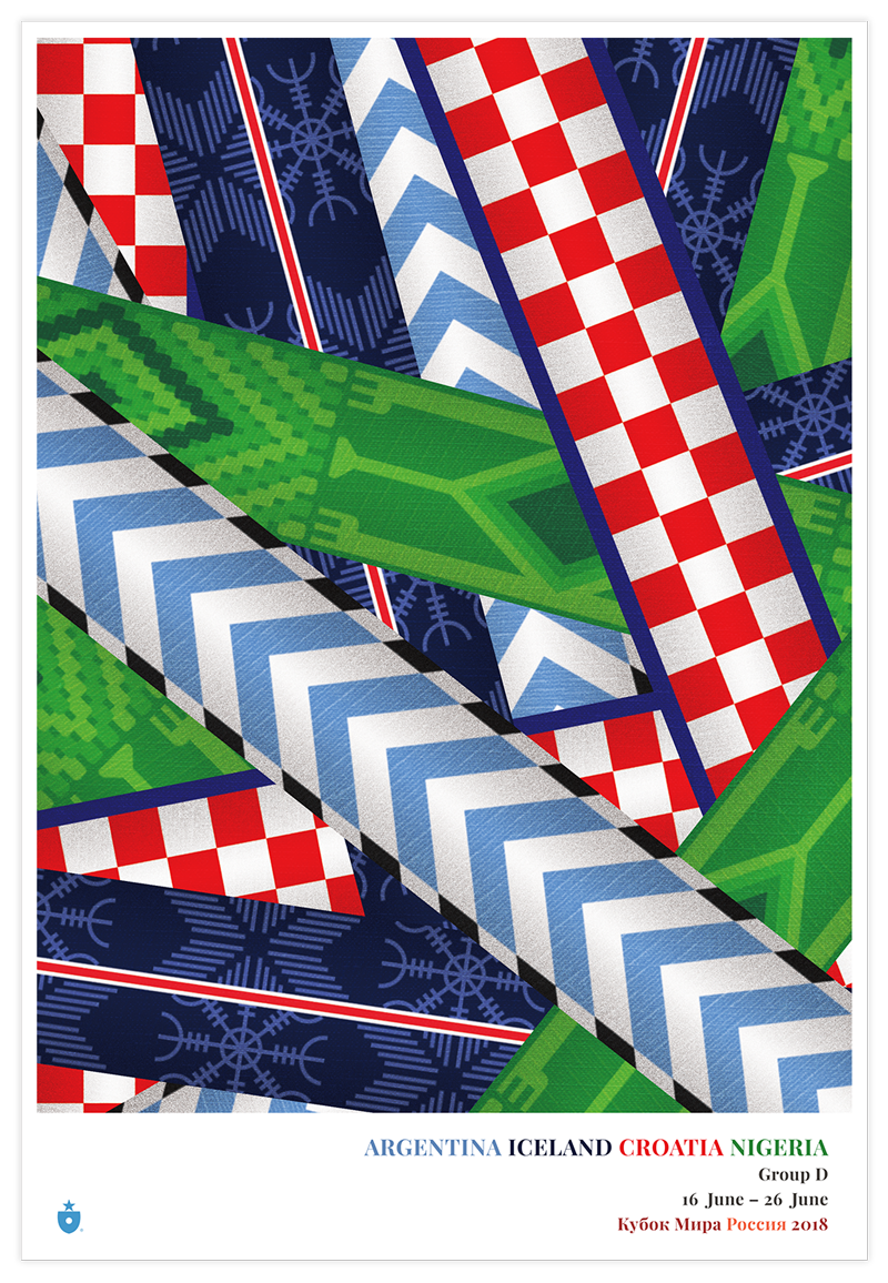
We made a Group D poster that gives these identities an opportunity to mingle, overlap and collide. (Like the national posters, these 11″ x 16″ group poster prints created with a gorgeous gicleé process and printed on your choice of stock (we prefer heavy photo rag, but you can’t go wrong). I can attest they look stunning.)
This, to me, is the best part of the project — watching the identities bounce off each other.
(Want to keep reading? Check out our designs for Group E.)

Mark Willis (@m_willis) is an artist, designer, digital strategist and the founder of Clean Sheet Co. (@cleansheetco) a soccer-obsessed, design and apparel shop based in the Philadelphia metro area.