France, Australia, Peru and Denmark
Let’s keep it going! If you haven’t already, check out our introduction to the Ribbon concept, which drives this project, and our first piece on designs for Group A and Group B. Group C starts… right now.
France
France has an identity that has always beguiled me a bit. There are simply so many visual signifiers and symbols and cultural touchstones to pull from, deciding on a singular design always felt incomplete. With that in mind, for this project we took a simple approach and didn’t look back.

Our France ribbon is inspired by famous French naval attire — specifically the Breton stripe pattern which is normally comprised of deep blue pinstripes on cream (or more accurately, a vintage, wooly off-white).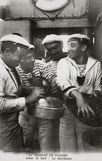
Introduced in the 1800s, French sailors were required by law to wear a derivative of the Breton pattern so they could be more easily spotted if they fell overboard. (Insert France has perfected taking a dive joke here.) There were originally 21 stripes on an official French Breton stripe naval uniform, one for each of Napoleon’s victories. (Insert The perfect inspiration as France heads to Russia this summer! joke here.) As it has evolved from function to fashion, you’ll occasionally find a red (cerise) stripe mixed in to the Breton pattern; that combination works well to represent both the culture and the flag.
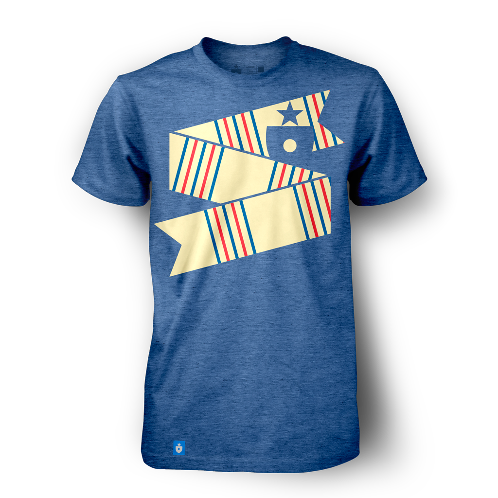
When placed against a French blue fabric, the stripe really pops. We think it looks fantastic.
The poster and scarf came out great too:
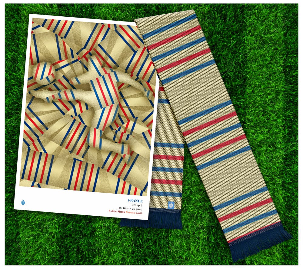
The Breton stripe, and its simple summation of French culture, fashion and history, was a great fit for this project.
Australia
We’re talking patterns here — so big, representative symbols are out. For Australia, that makes things challenging. No Uluru. No kangaroos. No kangaroos wearing boxing gloves.
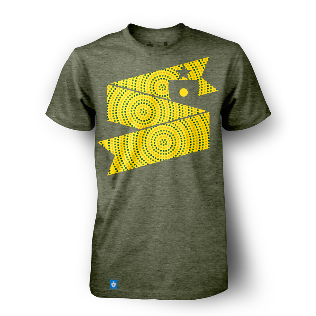
Instead, we turned to an inspirational reference point: aboriginal dot painting.

It wasn’t long ago — less than 50 years ago, in fact — that indigenous Australians began creating beautiful paintings in this distinctive pointillist style. Filled with geometric patterns, represntations both realistic and abstract, and an undeniable rhythm, aboriginal dot paintings have attained world-wide acclaim.
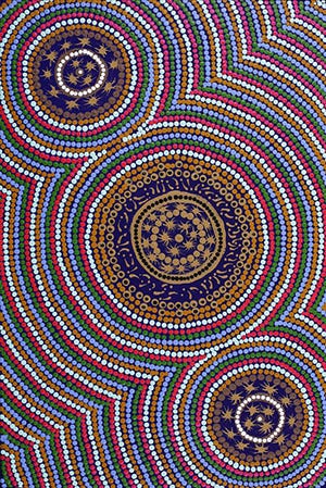
Concentric rows and rings are a particularly frequent recurring motif in the genre, and the repeated effect evokes something that almost feels like sound or music — a complex and unique quality. The Australia ribbon is inspired by these wonderful artists and the work they create. It’s rendered in national colors (a rich, golden yellow with two shades of green, along with some navy blue).
It ends up looking beautiful on a simple, muted green shirt:
The poster and scarf have some of the fine rhythm of the inspiring art:
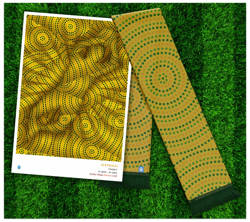
There are patterns in every culture, and new ones emerging all the time. Australia’s talented aboriginal artists are a cultural touchstone and a wonderful muse for this project.
Peru
Peru’s exotic reputation had us excited to search for the perfect inspiration. But we found it quickly. Sometimes, you just know.

This stunning piece of tapestry, now found in the British Museum, is the ideal totem to inspire our Peru ribbon.
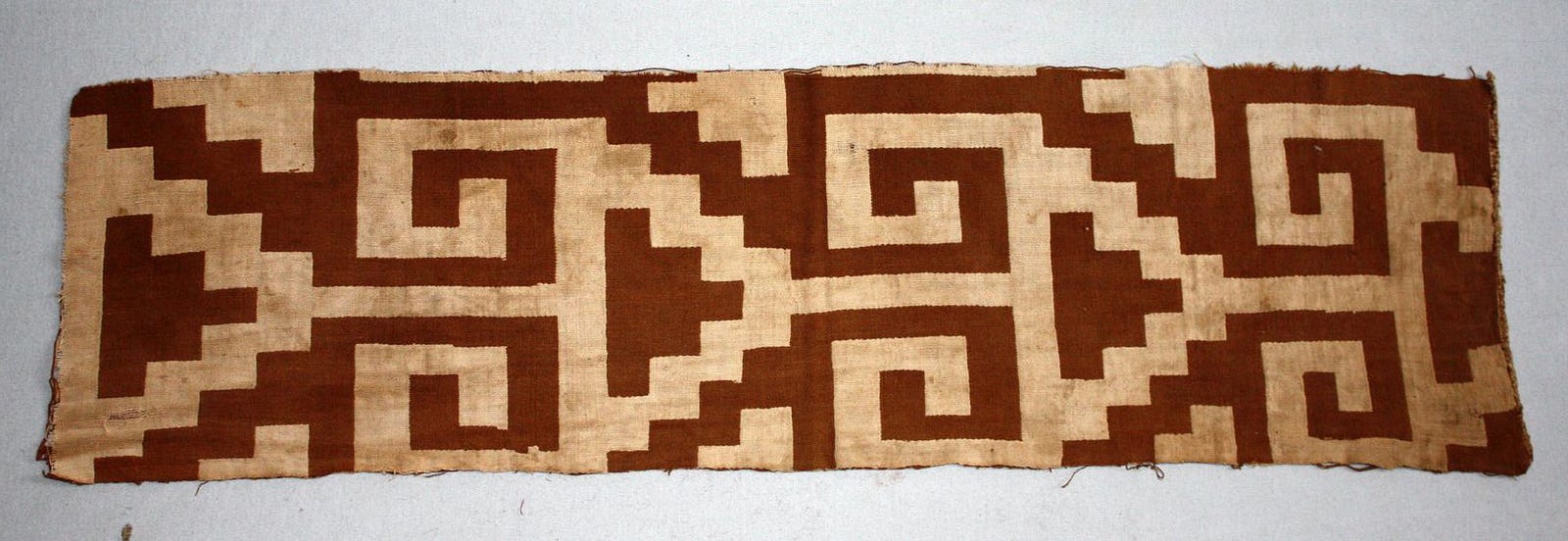
Textiles like this cotton-based one were used in traditional dress; this one was likely created on the country’s north coast. We could have kept looking for inspiration; there’s no shortage of amazing pattern-based Peruvian art and fabric. Something about this one just felt right, though — the two-color simplicity (which the national soccer team shares), the vibrance and the potency just felt correct. We saturated the color scheme, bringing it to red and white to match the national identity. And it just worked.
When the Peru ribbon is applied in different ways, its visual energy just explodes:
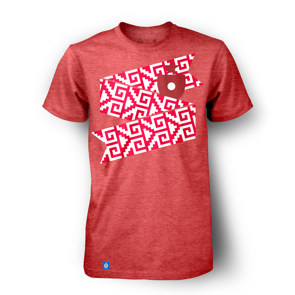
It also makes for one wild poster, and a scarf that harkens back closely to the original inspiration:
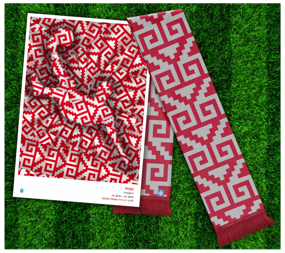
Sometimes, in a project like this, you have to fight to find the perfect fit. Other times, it jumps right out at you. This, happily, was one of the latter occasions. Vamos, Peru!
Denmark
Denmark, however, was not easy. Not only was the country more difficult than expected to research for, but they happened to share the exact, simple two color national identity (red and white) as their group-mates Peru. Denmark took some creative thinking.
Like many Scandinavian countries, Denmark’s reputation includes a history of graphic design excellence. Modern design language, clean, simple lines and bold, contrasting shapes are hallmarks of the Scandinavian style. We wanted to reference those inspirations in our ribbon design.
There was only one problem. Danish visual inspiration proved very difficult to find, because most forms of national visual expression are crowded out by one: furniture design. Every search, every exploration — they all came back the same. 90% chairs.
After a while it became obvious: this wasn’t something to fight through. This was something to embrace. Denmark has produced some of the most iconic modern furniture in the world. Virtually every distinctive modern chair and stool has roots in Danish design. It was perfect — something to celebrate! We just needed to find a way to reference furniture design in the ribbon.
We did. Here’s our Denmark ribbon:

…and here’s our inspiration.
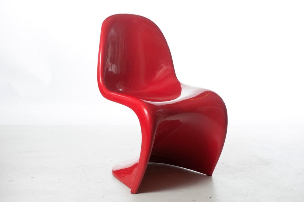
Designed by Dane Verner Panton in the 1960s, the Pantonstolen (Panton Chair) is perhaps the iconic mid-century modern piece of furniture. You’ve seen this chair. You’ve probably sat on it. It was ground-breaking when introduced — comfortable, intrepid and stylish, light and portable, formed from a single molded piece of plastic, with a supporting apron instead of individual legs… it’s a masterpiece of design work. So much so, in fact, that it’s been voted into the official Danish Culture Canon alongside buildings and people.
But the real genius to the Panton chair? Its stackability.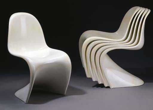
Panton designed the chairs to fit perfectly together, creating a convenient way to stack and transport them — and in the process, creating a pop-art vision than extended from single chair to infinite pattern. The curves produced by a stacked series of Panton chairs became the perfect reference point for our Denmark ribbon design.
Adding black, long a supporting Danish footballing color, as the fabric base, and we have our shirt:
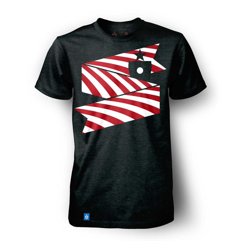
Poster and scarf follow along, picking up that same beautiful, modern simplicity.
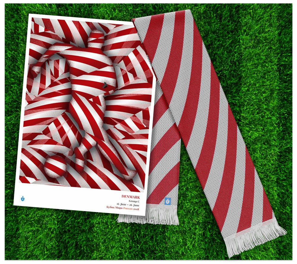
It’s not often simple to distill a country’s identity into a single pattern. Sometimes you really have to fight for it — and, say, get inspired by a plastic chair. But when it works, it’s really satisfying. And we think this one does.
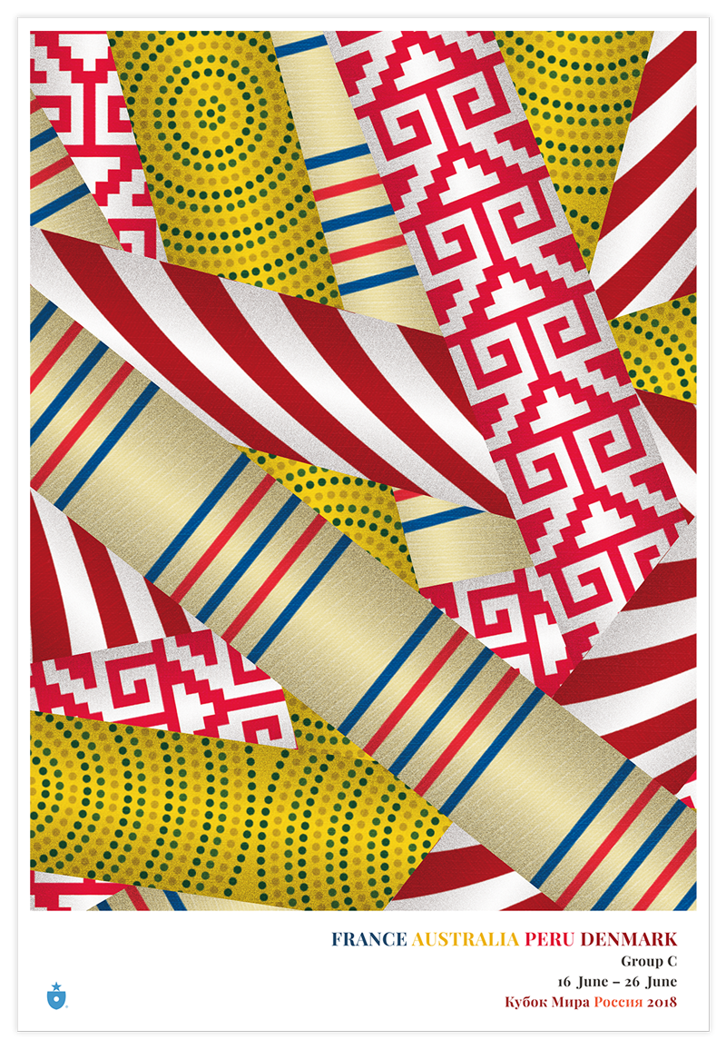
That’s Group C! Once again, we’ve made a group poster, and we’re particularly proud of the visual and cultural interplay on this one. Like the national posters, these group poster prints are created with a gorgeous gicleé process and printed on your choice of stock (we prefer 11″ x 16″ on heavy photo rag, but you can’t go wrong with any choice). I can attest they look stunning.
These ribbons are taking us to some pretty cool places.
Three groups down. Five to go. See you back here for more very soon.
(Want to keep reading? Check out our designs for Group D.)

Mark Willis (@m_willis) is an artist, designer, digital strategist and the founder of Clean Sheet Co. (@cleansheetco) a soccer-obsessed, design and apparel shop based in the metro Philadelphia area.

