Portugal, Spain, Morocco and Iran
Now we’re rolling. Time to introduce our Group B designs. If you haven’t already, check out our introduciton to the Ribbon concept, which drives this project, and our first piece on designs for Group A. And with that, we’re set to dive into Group B.
Portugal
After the U.S. beat tied outplayed Portugal in the 2014 World Cup, I thought the Portuguese national team was about to enter a rebuilding phase. Portugal went out of that Cup during the group stage, its one otherworldly player was entering the back half of his career, and the supporting cast seemed to be fraying. Two summers later, Portugal were European champions and now, in 2018, they’re the top seed in a group that includes once all-conquering Spain.
And the U.S. — well, we’ve said our piece on that. Suffice to say we Americans will be watching a resurgent Portugal (and everyone else) carry on without our own team to pull for. It just goes to show how quickly fortunes can change. (Let’s hope so, anyway.)
The research we did for Portugal led us to some beautiful places. Here’s where we ended up.
This pattern was modeled on native dress — specifically the embroidery on traditional Portuguese garments. (Embroidery was to become a recurring project theme.)
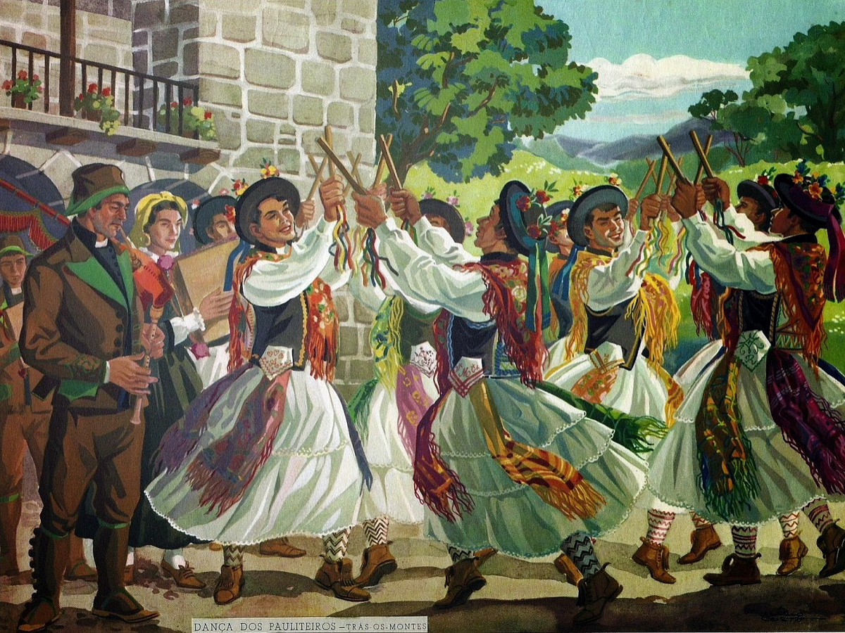
We took particular inspiration from the dress of the Pauliteiros de Medina. Over centuries, those from the mountainous and Celtic-influenced north perfected a kind of stylized, baton-wielding martial art, possibly as a way to keep their fighting skills sharp. Batons are held in both hands — one is for attack, and the other for defence. Not a bad metaphor for soccer.
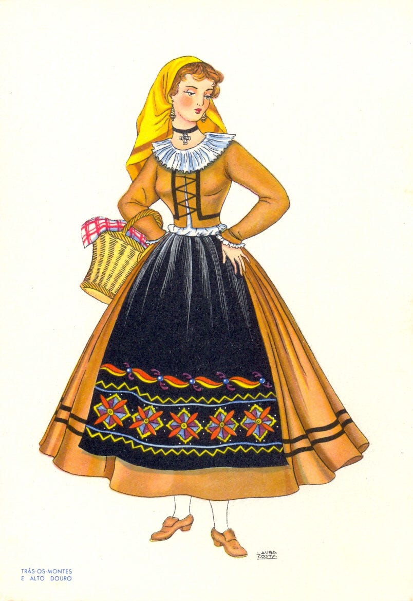
As generations passed, the training movements evolved into formalized dance — one still practiced by elaborately dressed performers. The embroidery is unbelievably detailed and colorful; unfortunately for our project, most of it is too complex for the type of pattern we were hoping to create. Luckily, I stumbled on the perfect Portuguese embroidery to emulate, tracing the hem of a traditional apron. The wavy, repeating pattern seemed to almost diagram the choreography of the Pauliteiros, down to what almost appeared to be tiny hands clutching invisible batons.
Starting with that apron pattern as a primary influence, we worked to derive a Portugal ribbon. The color scheme was simplified to the country’s traditional scarlet and green, and attempted to reflect some of the dance-like movement and curvy detail found in the beautifully embellished source material. I think it came out pretty well.
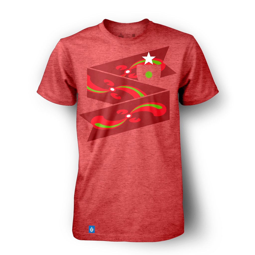
I also happen to think that it looks especially great on a red t-shirt. (Gone are the days that Spain would get first crack at red. Being top seed has its privileges.)
The poster and scarf came out great too:
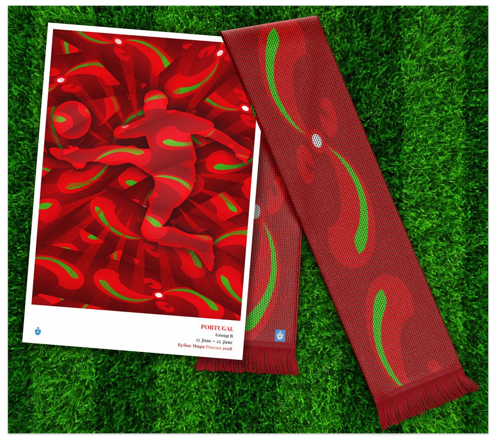
Pageantry, color and motion — not to mention an intrepid spirit — make Portugal a fun identity to design around. If we were pinning World Cup fortunes to the richness of historic influences, Portugal would be a perpetual top seed.
Spain
Group B created some interesting issues for the Ribbon project. We normally try to keep intra-group identities as separate as possible, but with three neighboring nations (Portugal, Spain and Morocco) that share a wealth of cultural influences, it wasn’t easy. Colors, symbols and traditions cross borders quite easily. Spanish and Portuguese identities, while famously separate and even rivalrous in many ways, share many qualities.
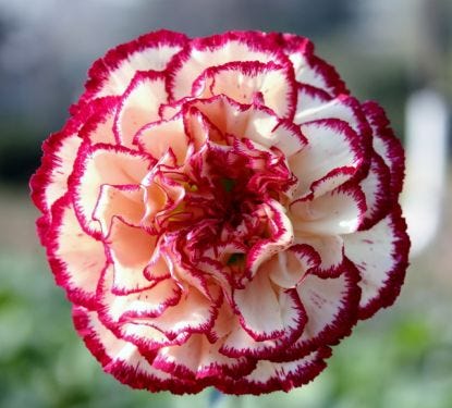
Having looked to traditional embroidery for inspiration for the Portuguese ribbon, it made sense to go in a different direction for Spain. We wanted a design that projected national identity — and while there are some strong ones, regional symbols did not seem appropriate. We also needed something that could anchor, but not dominate, the design.
The answer? The clavel, or carnation — the Spanish national flower.

Starting with a simple repeated red carnation, we built a pattern that reflected some of the intricate embellishment found on Spanish dress — including the ornate work that decorates a matador’s traditional uniform.
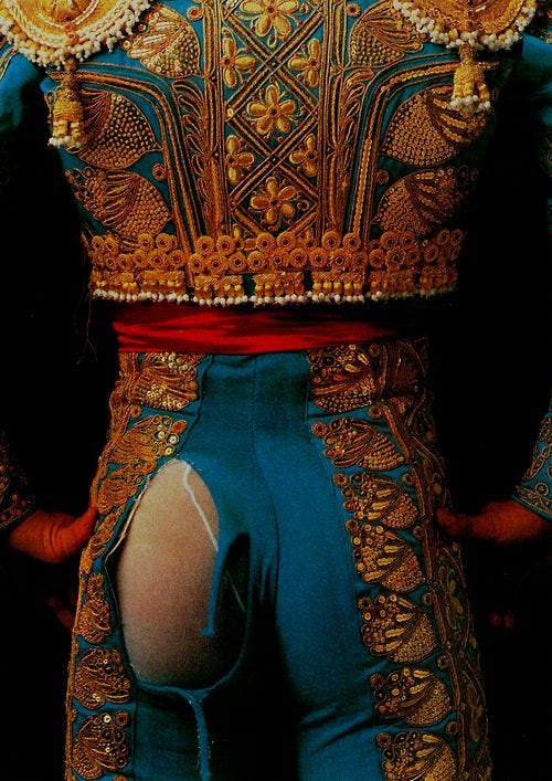
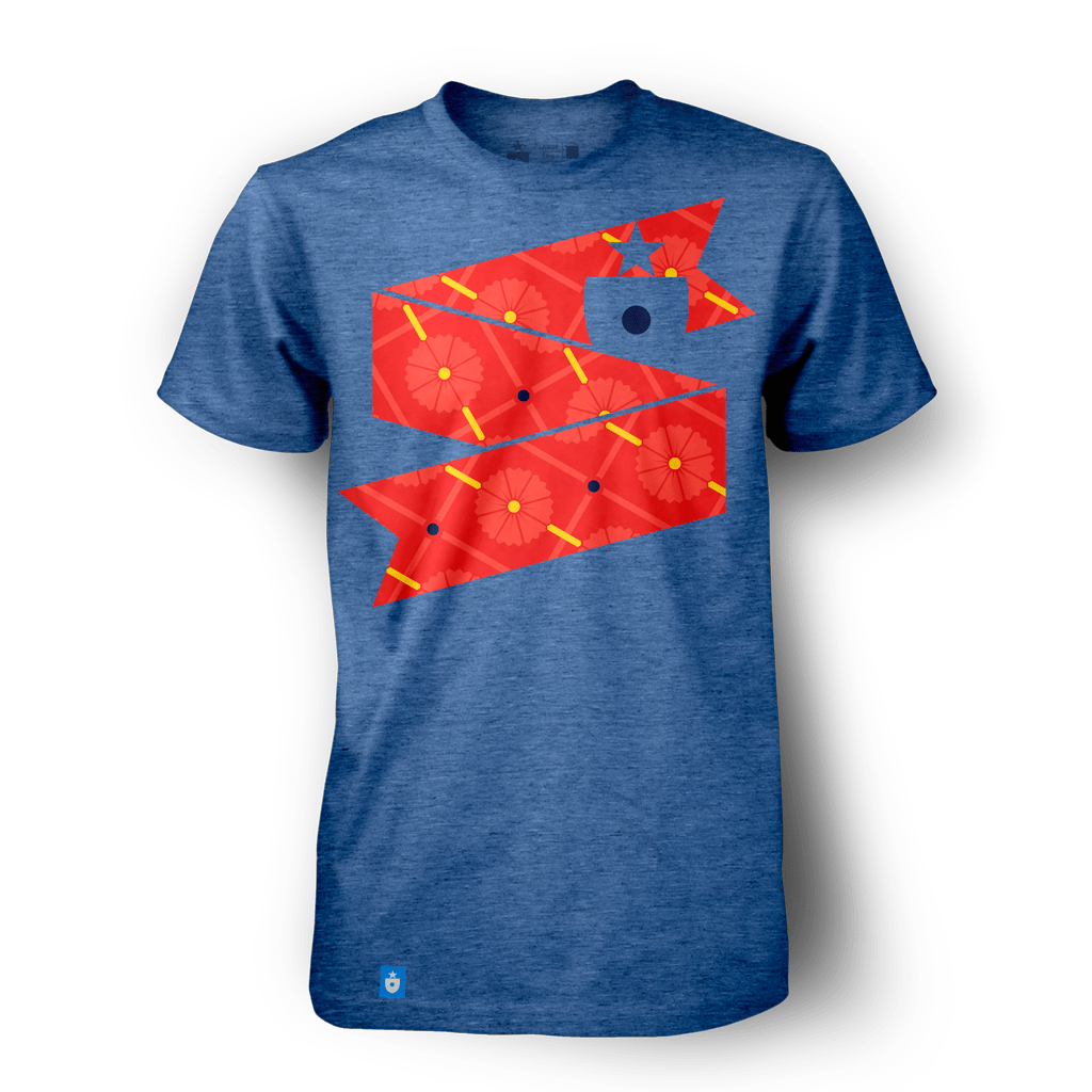
The matador inspiration helps us integrate another important visual differentiator: the color blue. Rich, vibrant blue (often found on traditional dress and on the national flag) is a color Spain (alone among its Iberian neighbors) claims as its own.
It all comes together in the t-shirt design, where blue takes center stage:
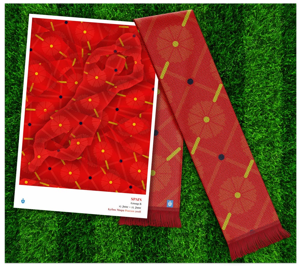
For the complimentary items, the ribbon, and traditional reds, take over:
Spain’s complex visual and cultural history could probably inspire 32 separate ribbons on its own. Here’s hoping the clavel-and-matador pattern is a worthy embodiment of the Spanish spirit.
Morocco
Leaving Portugal and Spain behind, we pass south from Gibraltar, across the mouth of the Mediterranean, into another world: Morocco. The culture, the symbolism, the language — even the alphabet — changes completely. It’s a place where styles of civilization smash into each other and create something new.
Morocco is at a global crossroads, influenced by Iberian, Mediterranean, African and Middle Eastern cultures in turn. The country’s unique visual history has always thrived on its proximity to many worlds and many ideas.
This clash of influences is expressed in everything from art to architecture — and perhaps most viscerally in a stunningly rich history of rugmaking and tapestry.
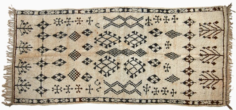
The patterns and flourishes found in Moroccan weaving aren’t purely decorational. Each symbol on a traditional Moroccan rug has meaning.

We were particularly taken with the Lion’s Paw symbol (يد الصبع), a prominent motif that is said to symbolize strength. The Barbary lion, now extinct in Northern Africa, was once a frequent and inspiring presence in Moroccan culture. Their presence persists today, quite literally woven into Moroccan visual history.
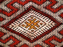
As we explored the ideas that could help us build a Moroccan ribbon design, the Barbary lion and the Lion’s Paw stood out. Using the paw motif as a basis for the repeating pattern, we created something unique:

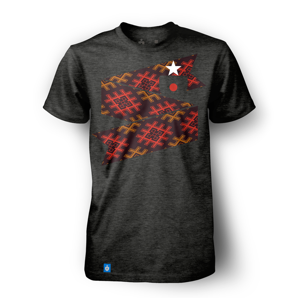
The paw pattern is rendered in traditional Moroccan colors of red and gold, with a rich, earthy black backing. This creates an opportunity for a shirt that is completely different from any other World Cup nation:
The darkly rich color scheme carries through to some vibrant poster and scarf designs:
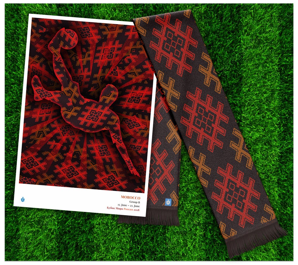
The more we worked with the Lion’s Paw symbol, the more it seemed to project a certain kind of power and authority. Morocco’s national team will do well to live up to its potent symbolism.
Iran
From Morocco, we can follow a thread — perhaps one taken from a tapestry — across North Africa, through the Middle East to Iran. With Morocco, Iran shares many visual motifs that stem from a common root; in particular, it also shares a history of integrating cultural symbols in to beautiful weaving and rugmaking.
For our Iran ribbon, we wanted to use a color that had not yet featured prominently in our Group B work: green. While both Portugal and Morocco make some use of green in national color schemes, we hadn’t gotten a chance to use it prominently yet. Iran gave us that opportunity.
We paired green with an obvious influence: the beautiful geometric patterns that show up across the culture, from rugs to mosiaics to architectural facades.
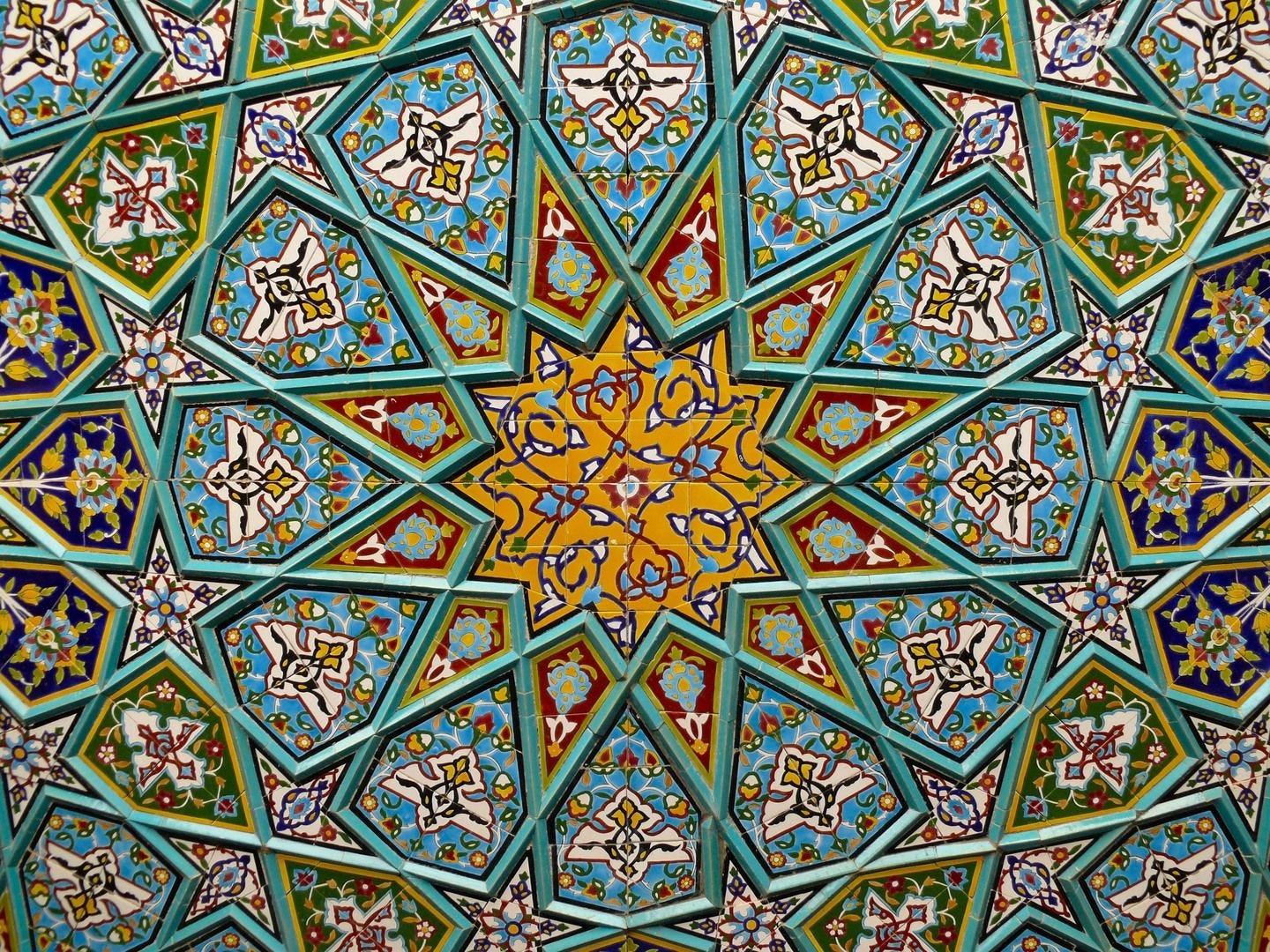
With some simplification and adjustment for our linear approach, we had it:

To allow the green and the pattern to pop, we paired it with a heathered white t-shirt. This also has the advantage of mirroring the look of the national team’s white first-choice uniform.
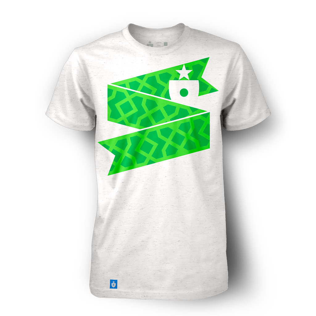
The additional material takes on tones of rich green that soften the energetic collision of lines and patterns.
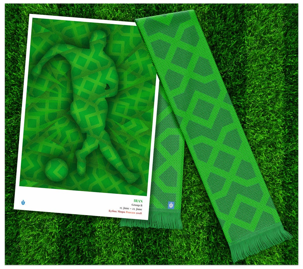
Iran’s task on the pitch looks daunting; it’s been drawn into a group with unrelenting competition. With luck, and perhaps drawing a bit of strength from its beautiful cultural heritage, the team has a fighting chance.
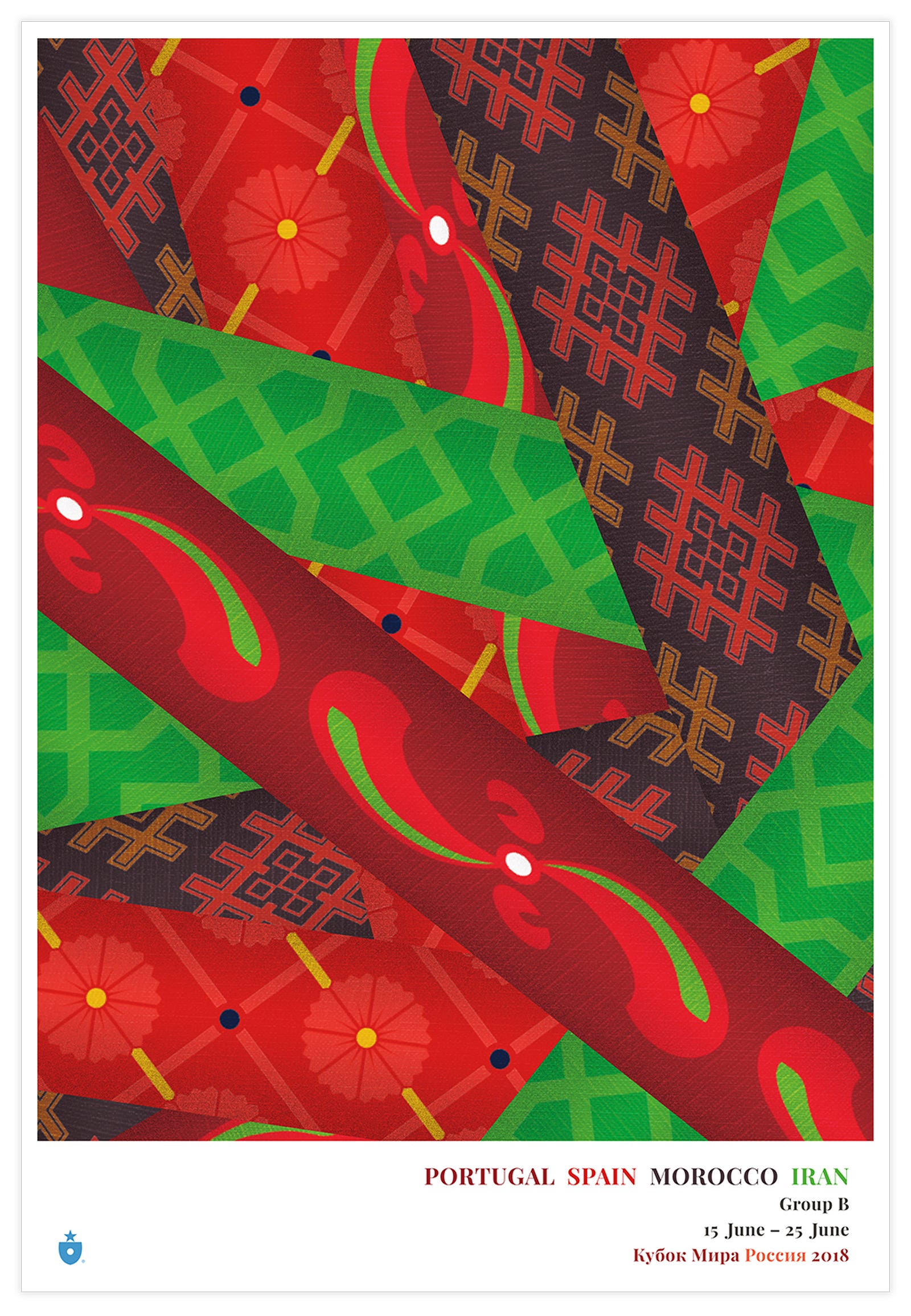
Once again, we’ve made a group poster, and we’re particularly proud of the visual and cultural interplay on this one. Like the national posters, these group poster prints are created with a gorgeous gicleé process and printed on your choice of stock (we prefer 11″ x 16″ on heavy photo rag, but you can’t go wrong with any choice). I can attest they look stunning.
These ribbons continue to surprise and delight us.
Two groups down. Six to go.
(Want to keep reading? Check out our designs for Group C.)

Mark Willis (@m_willis) is an artist, designer, digital strategist and the founder of Clean Sheet Co. (@cleansheetco) a soccer-obsessed, design and apparel shop based in the Philadelphia metro area.

