Russia, Saudi Arabia, Egypt and Uruguay
We’ve been over the rules, and the Ribbon. Now, let’s dive into some World Cup-inspired designs. We’ll start with Group A.
Russia
As the host nation, Russia’s world-facing “brand” will be all over the tournament. This will doubtless include Cyrillic-inspired typography, onion dome-like flourishes, and lots of saturated color. This is all great — it’s a beautiful and well-established national identity. But we went in a different direction for our Russian design inspiration.
The principles of modern visual expression were built over decades by individuals and movements—and many of those came from Russia. Russia contributed greatly to design philosophy during the early 1900s, most notably via the theories of constructivism that emerged from a tight-knit group of Russian artists and designers. The principles and stylistic choices of constructivism aren’t always represented in the country’s romantic, historic visual identity. But they are hugely important to decades of 20th century design, art and philosophy.
Constructivist theory took hold of Russian art and design almost exactly 100 years ago. Visually, it holds that art should not be made in a whimsical way — that it can and should be constructed from spare elements, with the rigor and discipline with which one would build something physical. Sharp angles, bold letter forms and a simple, stripped-down color palette came to define the style — often pared with simple black and white photography. This style could and did inform all kinds of visual communication, from posters to abstract artwork.
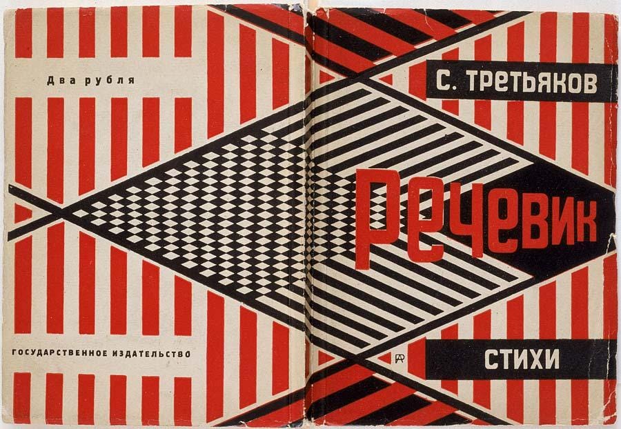
At the forefront of the movement: Aleksander Rodchenko and Varvara Stepanova. Husband and wife, they created some of the defining pieces of the constructivist movement, and helped it evolve into new forms and adapt to new cultures (Holland’s de Stijl, and Germany’s Bauhaus movements were direct descendents of constructivism).
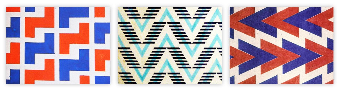
While Rodchenko’s work remains a touchstone, it is Stepanova’s work that inspired our Russian design. She applied constructivist principles to new textile design, creating incredible repeating patterns that directly inspired both our Russia ribbon, and our entire ribbon-based approach to the 2018 World Cup.
Oh, and did I mention she was designing sports uniforms, nearly 100 years ago?
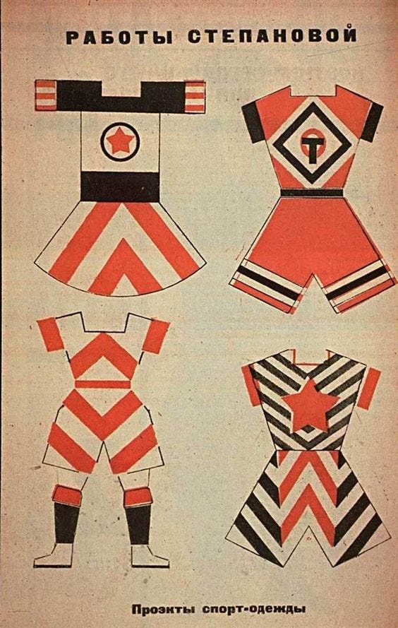
Amazingly, her work is both powerful and prescient — many of those looks would be welcome on soccer jerseys today. Inspired by Varvara Stepanova and the Russian constructivists, here’s our Russia ribbon: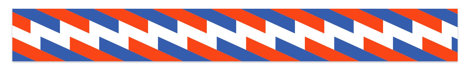
Reflecting Stepanova’s textile designs, and the colors of the Russian flag, it has a strong energy to it. Now, let’s see how it looks on a shirt:
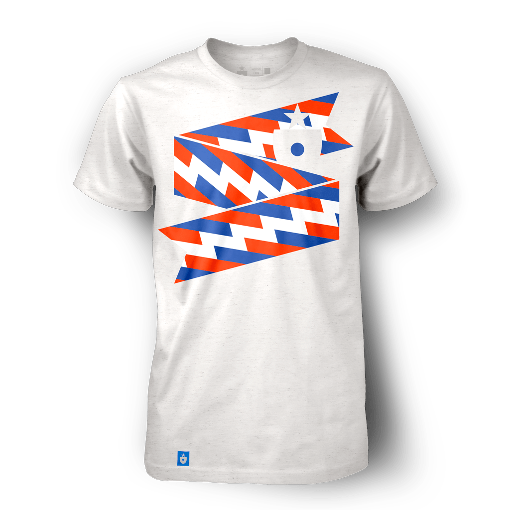

This is a good time to mention that all of our 2018 Ribbon Collection shirts will be soft, broken-in tri-blends with a nice amount of stretch to them. We chose a vintage, heather white for for Russia, which happens to be the traditional color of their away jerseys.
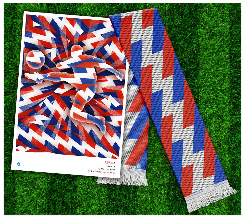
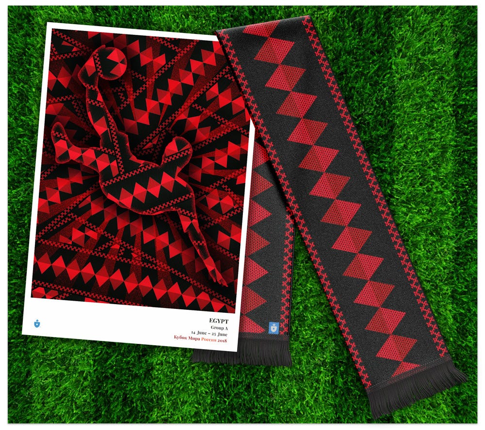
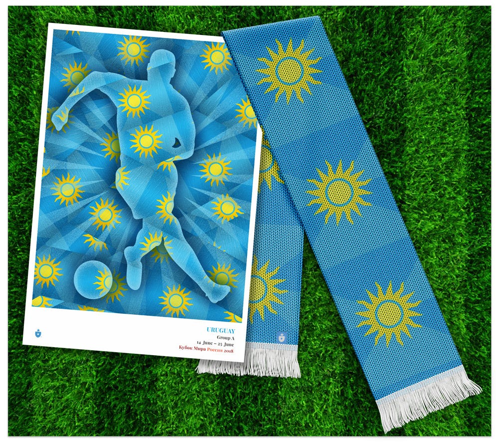
Finally, some fun stuff. Posters and scarves! We wanted to show the versatility of the ribbon system, and these were no-brainer applications.
We’ve created one-of-a-kind posters for each nation, to commemorate their inclusion in the field of 32. Each print individually and lovingly created by our gallery partner, ImageKind. They use a beautiful giclee process and your choice of high-quality stock (we prefer heavyweight photo rag; enhanced matte stock is fantastic too). We’re thrilled with how beautiful they’ve turned out.
The scarves, however, remain hypothetical, for now. We’ll gauge interest from you, and if a few become highly desired, we’ll make pre-orders happen. Let us know if you’re interested.
Take a look:

Pretty nice, right? It seems right that a design project centered around a Russian World Cup should be inspired by Russian design history. Designing for the Russian identity proved to be the perfect way to begin this project.
Saudi Arabia
Desigining for Saudi Arabia presented an interesting proposition. Culturally, there is a wealth of inspiration across the Middle East — but it can be difficult to pinpoint specifically Saudi-inspired design.
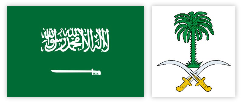
We ended up taking two enduring emblems used by the Kingdom of Saudi Arabia: the sword, taken from the flag, and the palm, taken from the national seal.
We also used requisite, beautiful forest green tone found throughout official Saudi world. Still, getting the balance right wasn’t easy. After some experimentation, we achieved something exciting: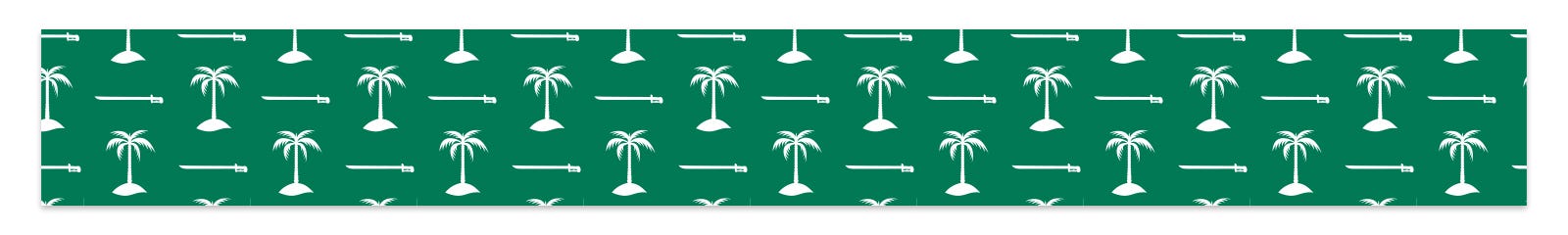
The repetition really works well, with a beautiful rhythm between the vertical palm and the horizontal sword emerging.
Let’s take a look at the shirt:
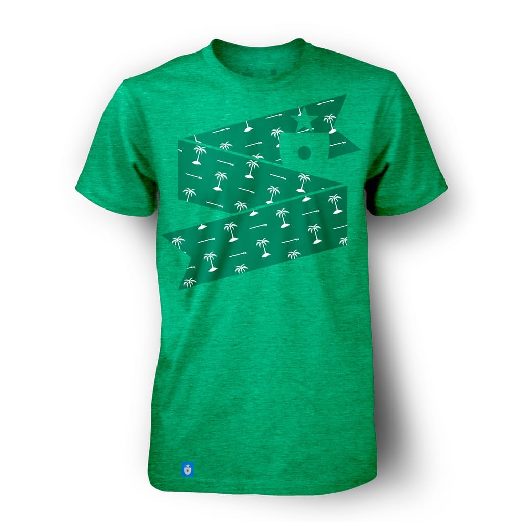
Like the Green Falcons’ away soccer jerseys, we use robust, verdant green as a fabric base. A few more applications of the Saudi Arabia ribbon:
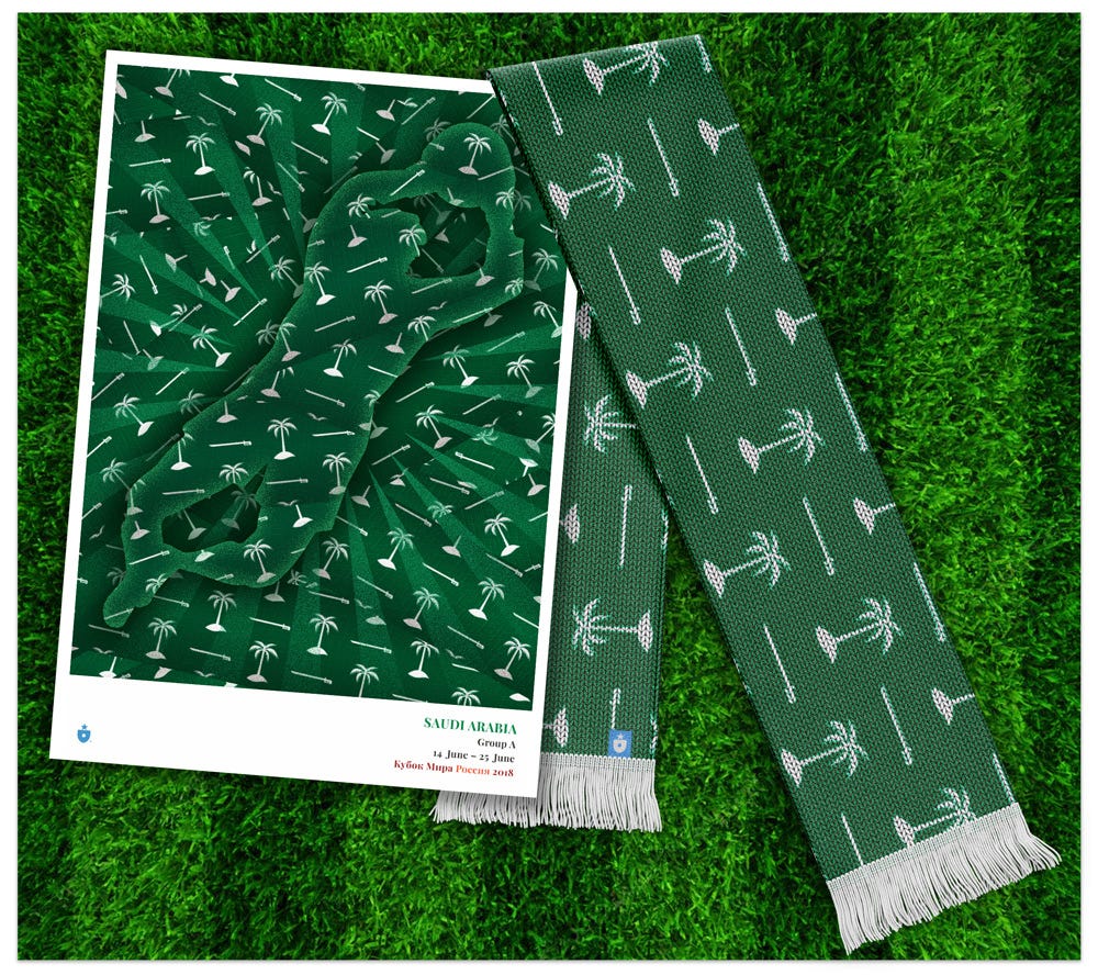
click the blue button to browse and order poster prints at cleansheet.co. If you think we should make the scarf, tell us: info@cleansheet.co
Saudi Arabia’s visual identity is complex, and I think we’ve honored that complexity in the ribbon design we’ve created.
Egypt
Only the narrow Red Sea separates Egypt from their group-mate, Saudi Arabia — but they might as well be a world apart when it comes to international soccer. Saudi Arabia (and most of the Middle East) is situated in the Asian qualifying region, and routinely plays teams like Japan to Australia in continental competition — but not often its neighbor and border-mate, Egypt. The Pharaohs, meanwhile, are part of the African region, and routinely battle with the likes of Cameroon and Nigeria for continental supremecy. In this World Cup, the two will meet.
Any Egyptian design work must balance the historic (and at times cliche) portrayal of a mystical Egyptian kingdom, with powerful imagery like the Sphinx and the pyramids, with both its modern identity and its less celebrated cultural signifiers. There’s also a lot to unpack — the classic Egyptian visuals have been re-interpreted by other movements over the years, yielding interesting designs to reference.
Our Egypt ribbon design attempts to put it all together gracefully: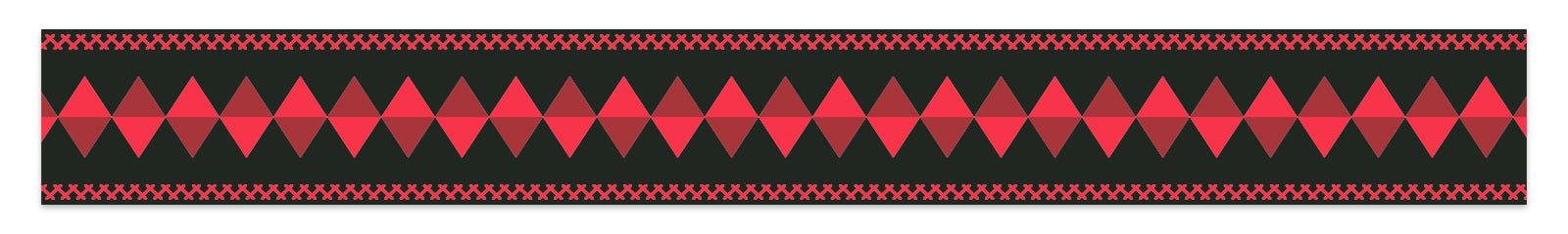
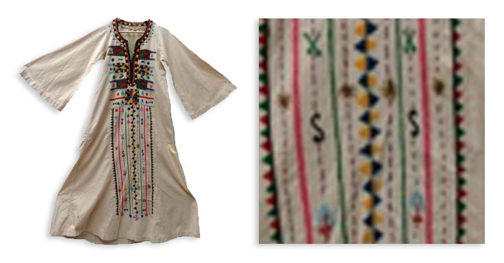
The pyramids are an obvious inspiration here — but the design is specifically modeled after a Kerdasa embroidery pattern. Kerdasa, near Cairo, has a centuries-long tradition of producing embroidered textiles; in recent history, it is this style that has driven global interpretations of traditional Egyptian clothing.
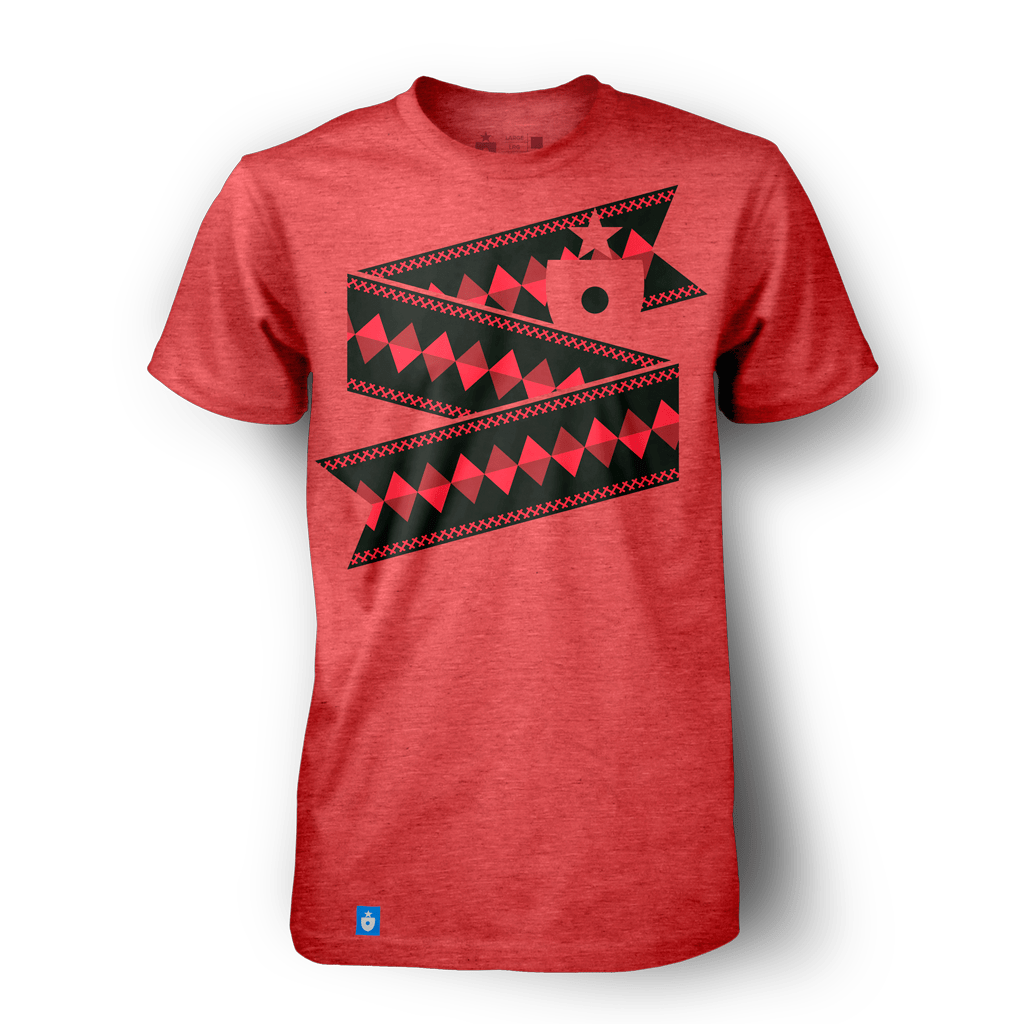
The pattern is both beautiful and versatile. Set in the red and black tones of the Egyptian national soccer program, it creates an extraordinary t-shirt.
And as you’d expect, the collateral stuff comes out really nice too.
The Egypt design turned into something completely unique on the international stage — we’re pround to have brought it to life.
Uruguay
Uruguay has one of my favorite national identities, filled with airy blue sky, friendly yellow sunshine, pops of dark tones here and there, and an overall crisp, clean feeling.
Uruguay’s ribbon was inspired by two things: the national flag, from which we referenced the beaming Sun of May, and a travel poster which, quite frankly, I’ve had a hard time getting out of my head.
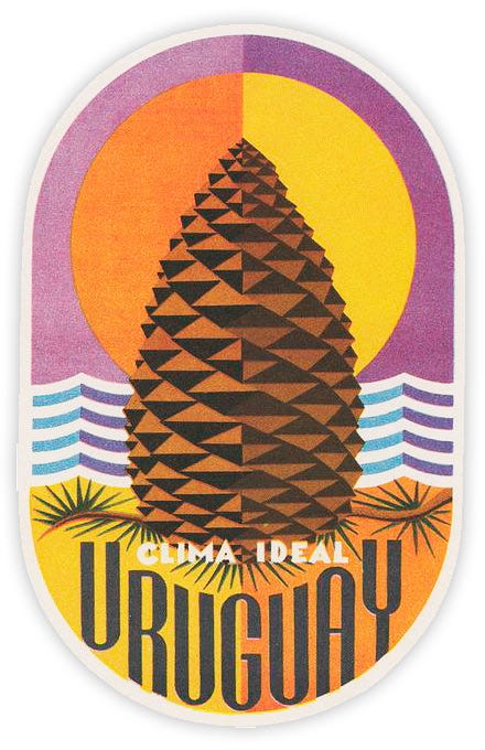
Sure, there’s an incredible pine cone. But don’t count out the two tone-sun, the purple and blue peaked waves, the bizarre shape, or the matter-of-fact “Clima Ideal”, which is among the best travel slogans I’ve ever come across. That pine cone, though. Some maverick designer thought it would work as the visual driver of the entire composition — and they were right! This is why I love poster design. The best work isn’t just visual. It’s visceral.
Here’s our Uruguay ribbon.
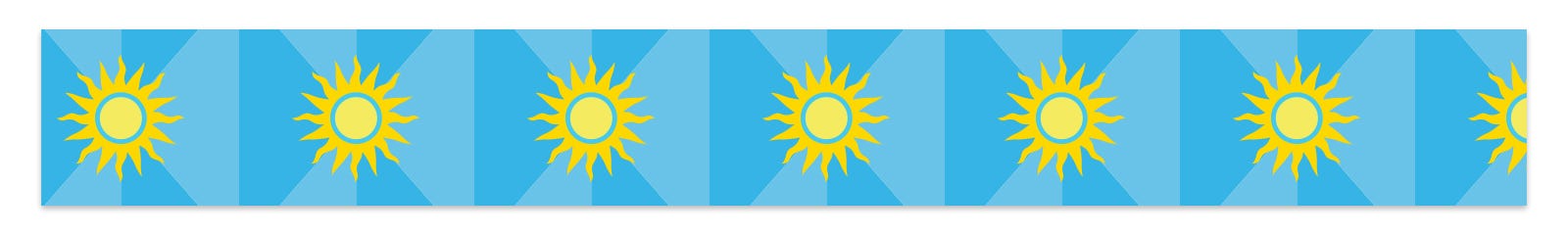
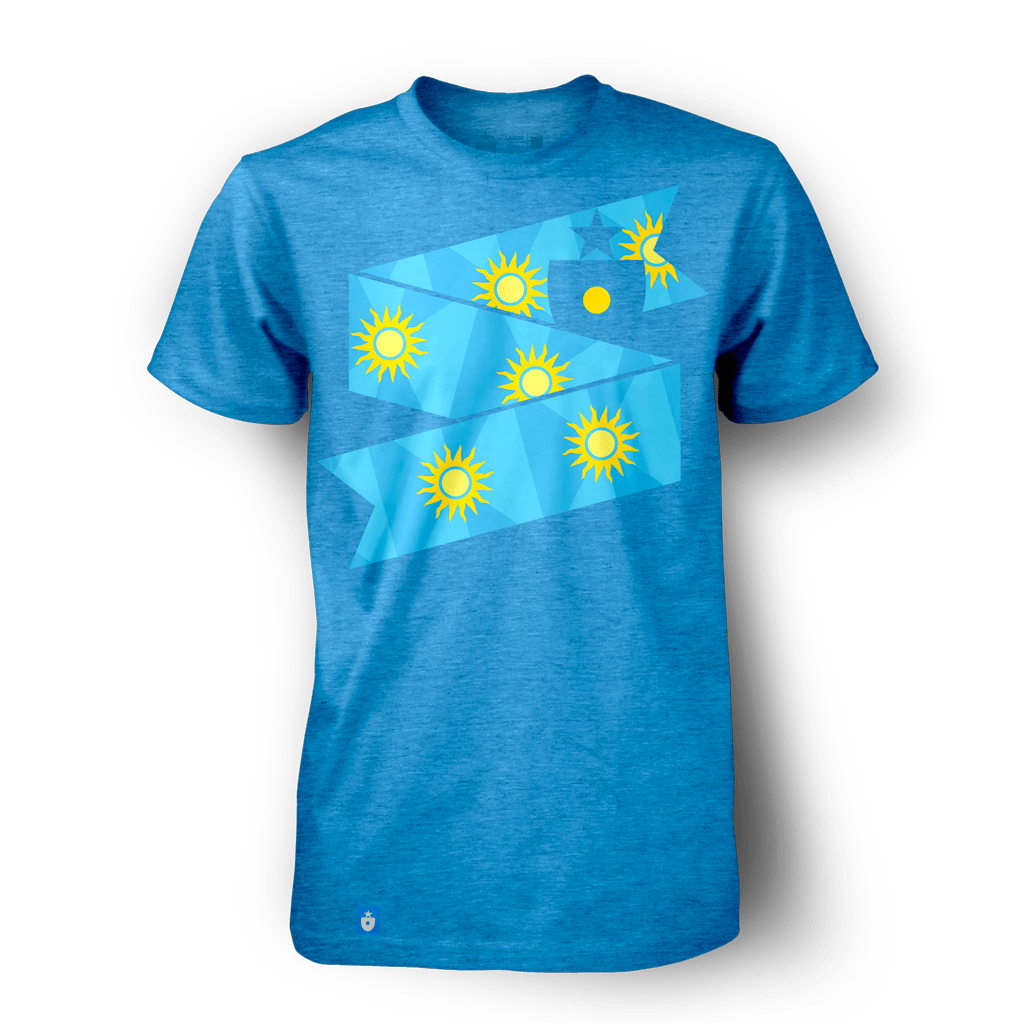
The sun anchors each section, and the tonal shades of light blue echo the triangular shaded areas found in the travel poster’s pinecone. It makes for a great shirt:
…and some great visuals.
We anticipate some fantastic play in Group A… and we can’t end this first piece without one last visual component derived from our ribbon approach. Until now, the ribbons have been hermetically sealed, staying within their own worlds national team. But let’s mix them up. It’s time to start group play.
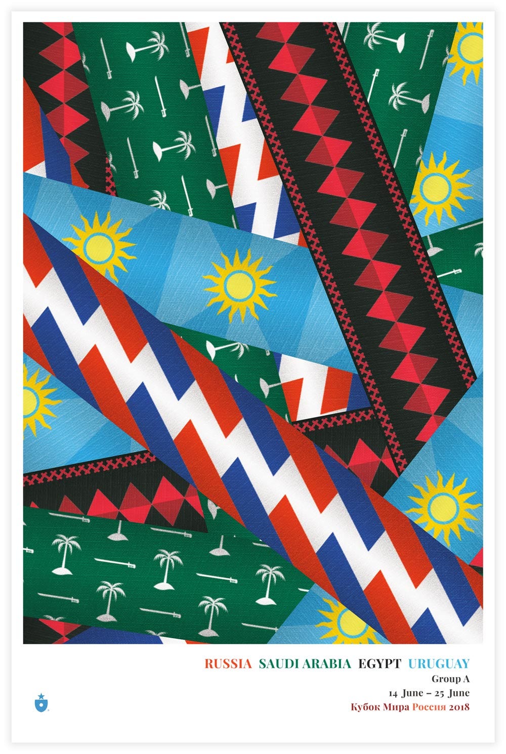
Like the national posters, these 11″ x 16″ group poster prints created with a gorgeous gicleé process and printed on your choice of stock (we prefer heavy photo rag, but you can’t go wrong). I can attest they look stunning.
This is why we made the ribbons — to have them interact! This, to me, is the best part of the project — watching the identities bounce off each other.
One group down. Seven to go.
(Want to keep reading? Check out our designs for Group B.)

Mark Willis (@m_willis) is an artist, designer, digital strategist and the founder of Clean Sheet Co. (@cleansheetco) a soccer-obsessed, design and apparel shop based in the Philadelphia metro area.