I left off discussing the concepts that have defined the US soccer kit to now: a preponderance of white (by default), an evolving crest and shield, the impact of Nike’s design shop, the on-again, off-again dance with a sash, the (seeming) need to incorporate elements of the American flag, the way supporters groups have shaped color and design, and finally, the lack of that one specific thing we could all agree formed the DNA of a US Soccer identity. (If you need to identify that thing, try some word association. Holland? Orange. Italy? Blue. Argentina? Sky blue and white stripes. Croatia? Red and white checkers. England? Losing on penalties. Brazil? Canary yellow & blue. America? Hmmm.)
In the modern US Soccer era – I’m counting the World Cup ‘94 as our Year Zero, which puts us almost 20 years in – we’ve done good work. Here’s where we started:
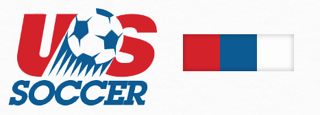
What do we have here? Well, the logo isn’t yet a shield, there’s some very dated font action going on, and there’s a very primary interpretation of our national color scheme (or is it Russia’s?). The red, white and blue are very saturated and bright – the nuances of the hues weren’t being given too much thought yet beyond “make sure it looks like the flag, dangit!” Here are the jerseys that accompanied this design era:

Regardless of your feelings about those particular kits, they spoke directly to the identity and era they were created in. They have charm, if not (exactly) sophistication. They were asking (in a shouting voice, perhaps) a few of the right questions. It’s just that we’ve gotten better at answering since then. For instance, here, in comparison, is where we are now:
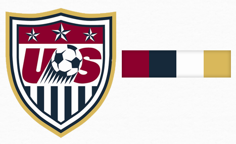
This is progress. The logo has become a shield, and has picked up some elements of US Soccer logos in the B.W.C. (Before World Cup ‘94) Era. The clip-art speeding ball has survived, but it’s been joined by other elements in a crest with a shield shape. The vertical blue stripes are an interesting quirk of history that I can’t figure out (anyone?); the stars are an American flag reference that, when considered in the international fútbol vernacular, can a bit confusing in significance (or will be until we’ve won three Cups, of course). The colors have been desaturated and darkened for a more sophisticated feel, and the addition of a gold option to the palette sets off the other colors and enriches the entire package. And now that we’ve had some fun on the field with this version of the logo, there’s a bit of sentimentality attached to it – helping the entire thing gain the permanence it needs to become timeless. (With a few tweaks over the coming years, I think it will.)
Here are the current kits, reflecting the newer color scheme:
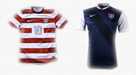
There’s a lot going on there. If we went back and reviewed the last twenty kit combinations the team has worn, there’d be almost too much to digest. But all the trends are here: the newer, deeper color scheme; the modern shield, the sash (in ghost form – suggesting Nike is trying to keep it in the design even when it doesn’t have to be), and design “test ideas” – white sleeves on the blue kit, silver numbers, a modern typeface, and hoops (or are they flag stripes?) on the red and white kit. These kits are Nike trying to push the US into new design territory while simultaneously trying to establish and preserve some sense of tradition. It’s a uniform in transition.
Author’s note: This is part of a series on US Soccer’s visual identity. When you’re done here, feel free to read on.
Intro: What Makes a USA Kit?
Part I: Colors & Combinations
Part II: Third Kits & Special Occasions
Final Thoughts: American Expression
Thanks for reading!
We’re almost there, but not quite.
First, the color palette. I agree with the direction our team colors have gone – to deeper, more authoritative, more interesting shades. I agree that the US scheme of red, white and blue needs to be offset by richer colors – and gold is a great one. But I’d make a few slight, subtle changes. On top, the current palette; on the bottom, where I’d move to:
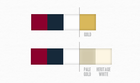
As much as I like the idea of pure gold, it’s too rich and bright to use consistently along with the other colors all the time. Furthermore, the kits need something to take the edge off of the dark, desaturated reds and blues we’re using, which pure white only accentuates. So, I’d a) dial back the rich, current gold color to a pale gold, and elevate it into a permanent member o the color palette; and b) add a cream or “heritage white” color that can be used to offset the deep primary hues, play well against pure white, and bring a sense of tradition and timelessness to the palette where currently there is none.
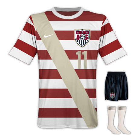
How would that impact our current kits? Well, here’s a look at how I’d build the red and white hoop kit:
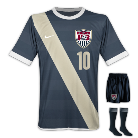
…and here’s where I’d go with the blue kit:
OK – let’s discuss. First, the red and white “hoop” kit should be our first-choice, home-team, everybody-wears-it-in-the-stands-no-matter-what kit.
We’ve finally found our thing. I’ve heard the “Waldo” jokes, I’ve read the skeptical articles – I don’t care. I love this concept. Red and white hoops need to become part of the DNA of American soccer. It solves so many problems: a) it’s incredibly distinctive, and unique internationally, b) it lets supporters wear red, c) it’s a callback to the flag, but using soccer’s existing visual language, and d) it embraces that goofy, fun “let’s go over the top” feeling you get from the celebrating a big match. It’s dumb hats and USA sunglasses and too much beer. It’s American!

I hope it sticks around and becomes the permanent visual identifier of American soccer. My version adds a sash (which I also think is here to stay) and a numbering scheme in pale gold. This (to my sensibilities) is an unobtrusive, classy way to maintain the sash elements while complimenting the base design (hoops) and removing the need for the strange “ghost sash” that Nike is shoehorning into the current kit.
One other consideration – if FIFA doesn’t like the “lettering over stripes” concept, I think there are better ways to solve it than the giant white panels the current design shows. Why not call back the “fabric patch” style from more retro-oriented hoop designs, and use it to create the naming area? Here’s one idea (at left). It’s not really extra fabric, just a design flourish – we can’t be weighing our players down any more than we need to with the likes of Messi on the loose – but this look is just a bit more fun. Plus, if you do it this way, fans who buy replicas or un-personalized kits could still add personalization later if they want. (It’s the little things, right?)
Now, my version of the blue kit. It’s our change kit / away kit / “just-the-facts-ma’am” look. The pale gold lettering and sash system stays in place; the navy color, on inspection, shows slight traces of the hoop design to help tie the two kits together.

It’s not flashy, but it’s professional and clean. And hopefully a bit intimidating. A few notes about the lettering – I chose a typeface called “Headline One” to get some strength and vertical chunkiness into the scheme, but any solid, non-demonstrative lettering would suffice. I didn’t want the typeface adding too much personality to the design language – just existing, with a bit of simplicity, alongside it. I also changed up the “bugs” in the uniform numerals to good old American stars – to me, using our shield is needlessly complicated and a bit unnecessary. If they’re good enough for the shield, they’re good enough for the numerals themselves.
So. That’s a look at the colors and first-choice uniform combinations that US Soccer has – and a idea of where I’d like to see them go. If you’re still interested, tomorrow, we’ll cover the next frontier: special kits. Update: that piece is live – so, go!
Mark Willis writes about art, design, soccer and web stuff here on mwillis.com, and on Twitter. If you like soccer, read about rebooting the Revs, or how the Revs work in the age of mutual love. If you like tech and Apple stuff, read “A Couple Things I Wish Apple Did Better”, or “Being a Commodity”. And if you like sweet t-shirts, check out some stuff to buy. Drop him a line about anything at mark@mwillis.com.