Digital
Seasons

Data visualization meets club soccer and a uniquely beautiful aesthetic.
I created “Seasons” for a few reasons: to learn about data visualization, to learn about creating web-native mobile applications, and to express my love for soccer design patterns.

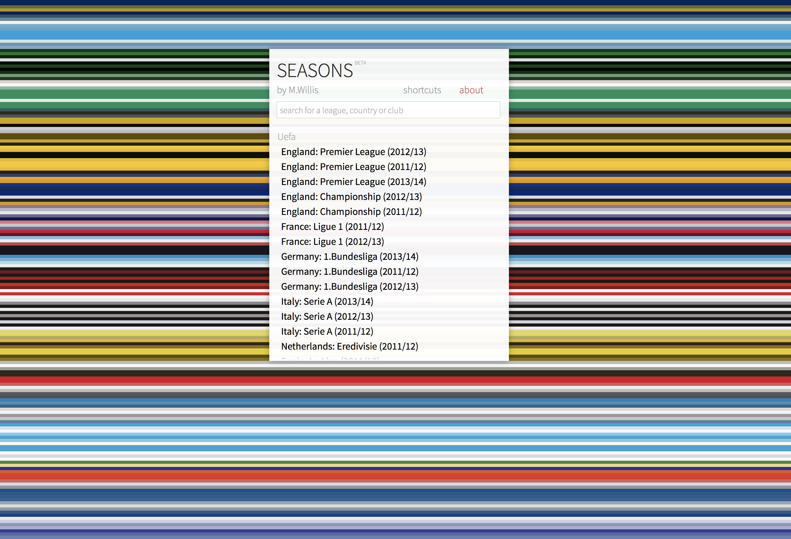
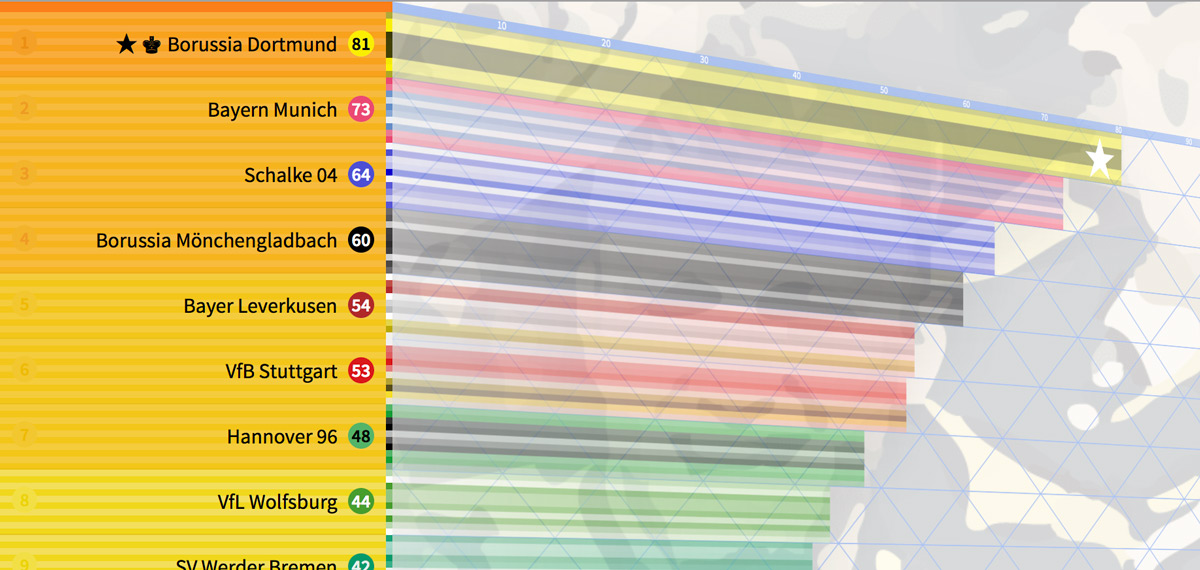
The app is simple: it shows a projection of soccer standings tables – the way most leagues around the world display their seasonal results. I used a clean, universal aesthetic and basic, beautiful iconography to show things like points, team details, and trophies.
![]()
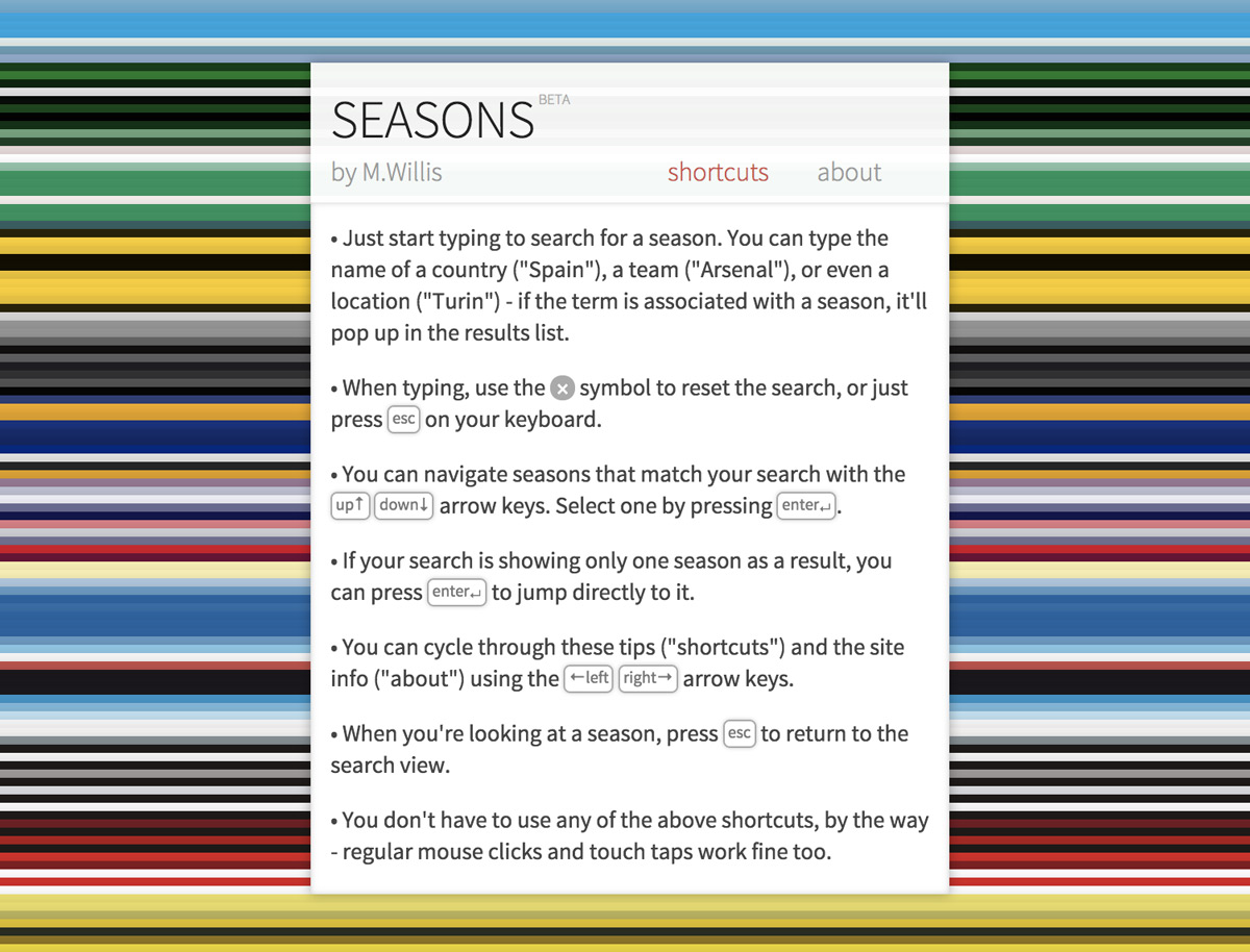
When it was developed, in 2012, Seasons used bleeding-edge web technologies to display content (including CSS animations and transitions) and to be useable as a mobile app. This included creating an app data manifest for offline usage. I also included touches like keyboard shortcuts to keep it useful as a browser-based app, and created a back-end system to automate and update standings in real time by scraping web sources.

The real thrill, though, was seeing colors and identities playing together in a beautifully standardized way. Seasons is perhaps the most complete digital and aesthetic project I’ve undertaken. Even years later, I love going back to its visuals for current inspiration.