Logos & Branding
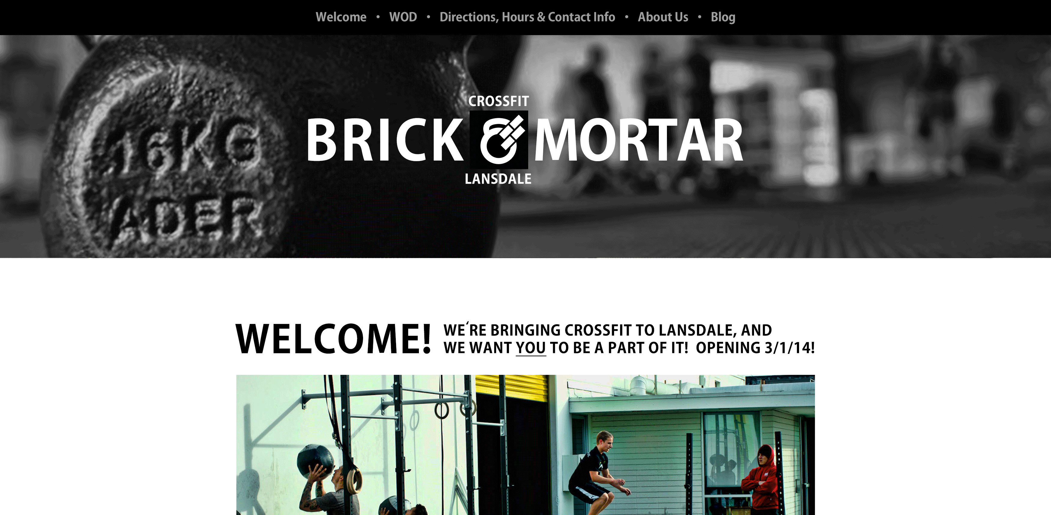
CrossFit Brick & Mortar

A national brand with local flavor.
I was contracted to provide branding and identity work for a new CrossFit identity – specifically, a new CrossFit gym opening in Lansdale, Pennsylvania. Owing it its spartan interior, the owners had a preferred name: CrossFit Brick & Mortar.
Using the name as a starting point, I created an identity from scratch.
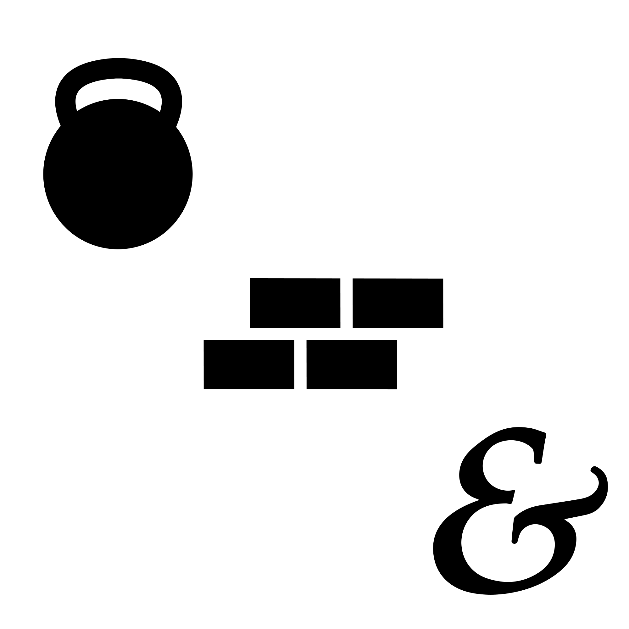
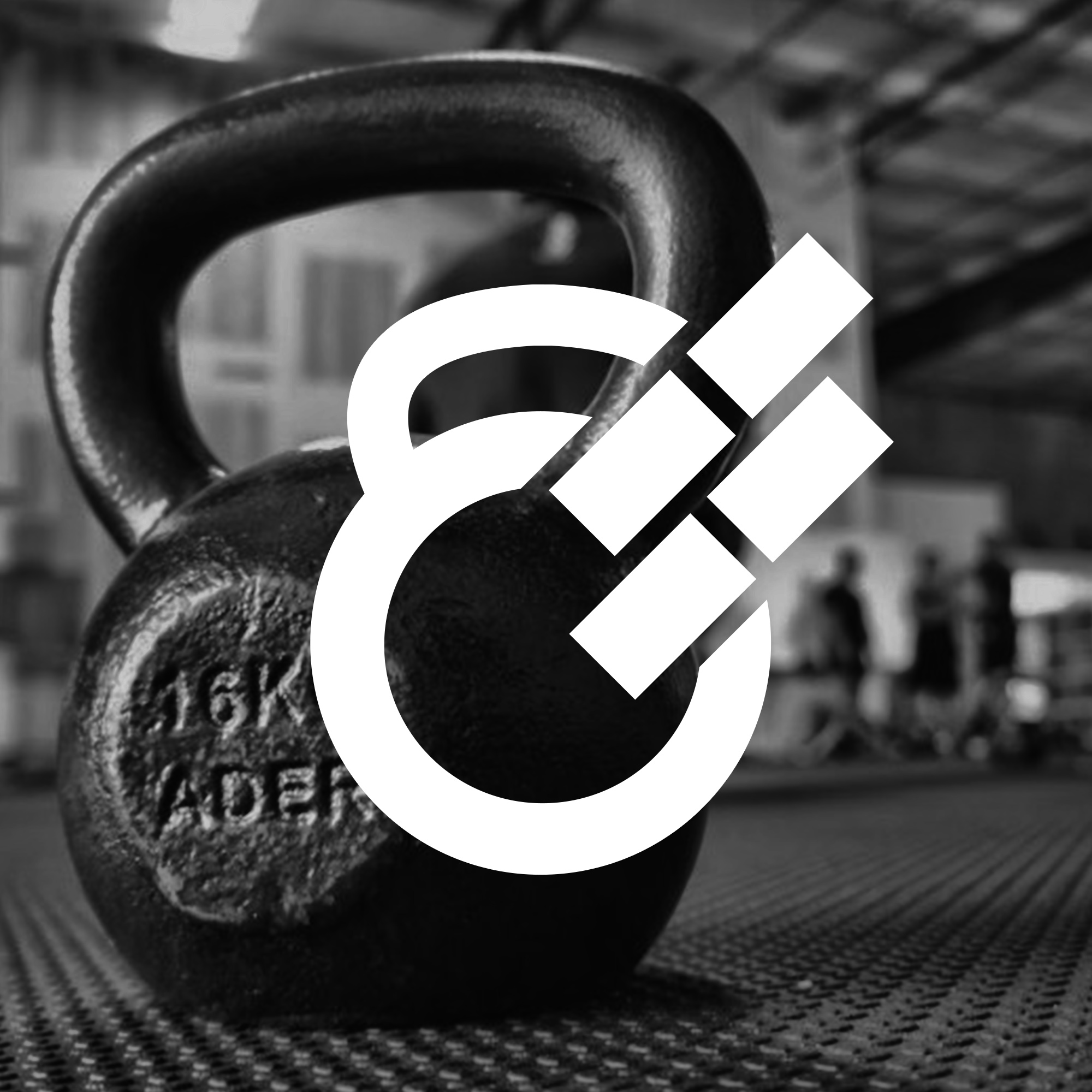
The inspiration: the kettle bell (a CrossFit staple), bricks and an ampersand.
The resulting mark, combining a kettle bell, bricks and an ampersand, was very well-received.
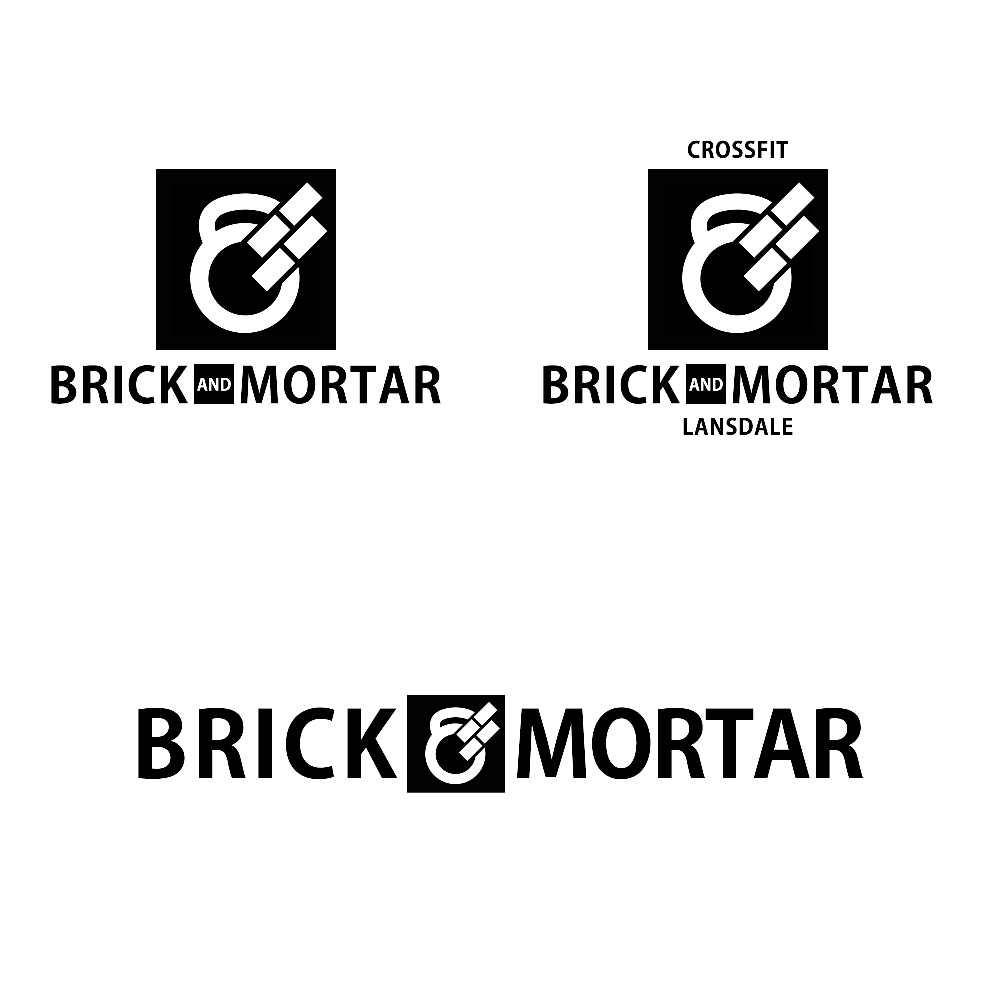
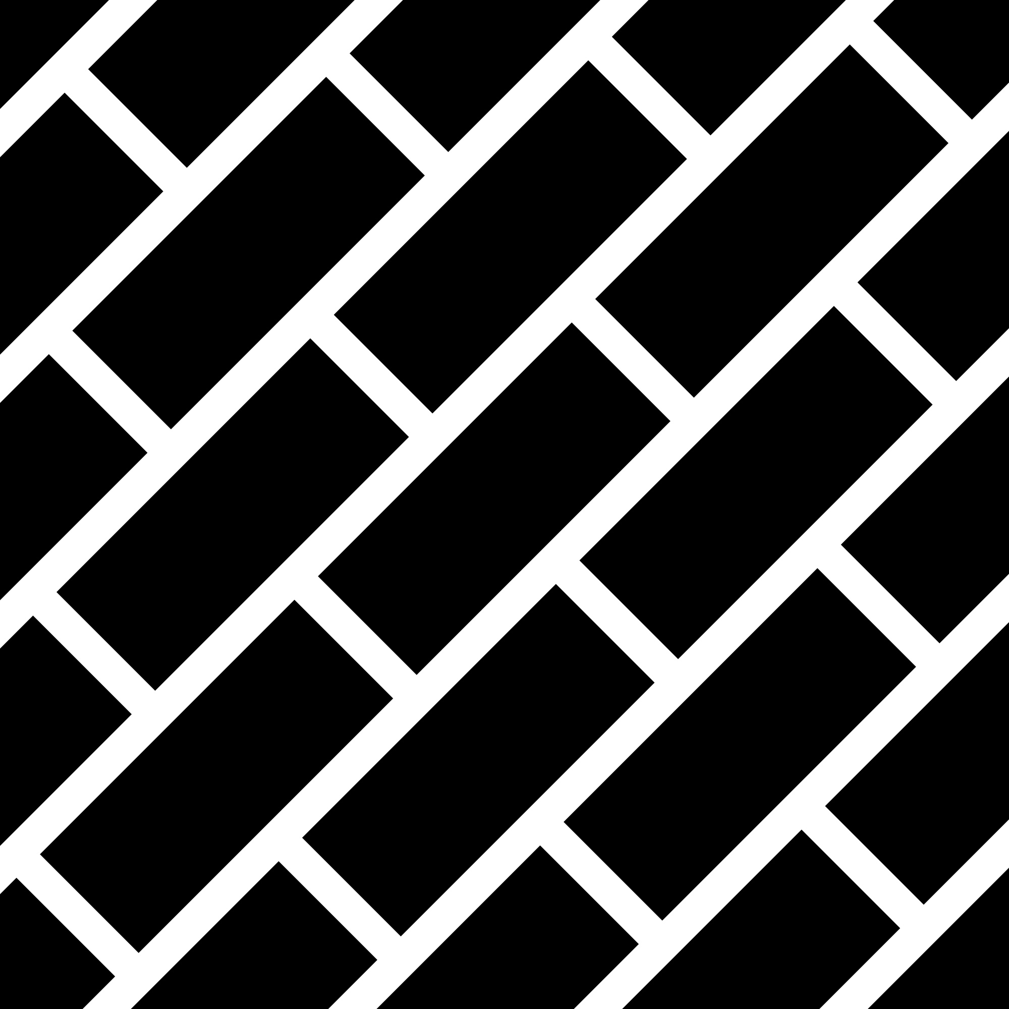
Variation was a key component. Pattern libraries also contributed to the overall aesthetic.
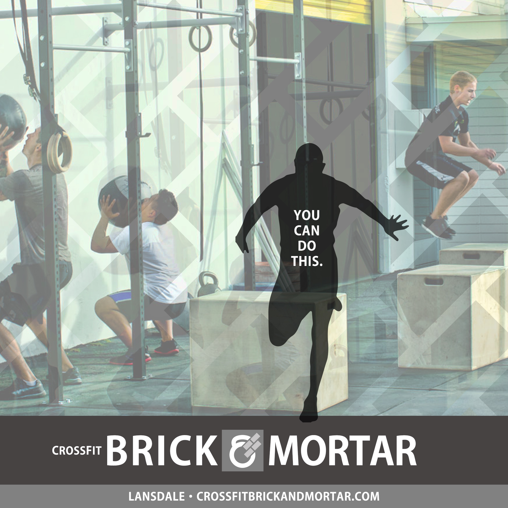
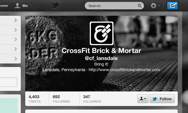
I designed the identity to work well across platforms (and built the CFB&M website).
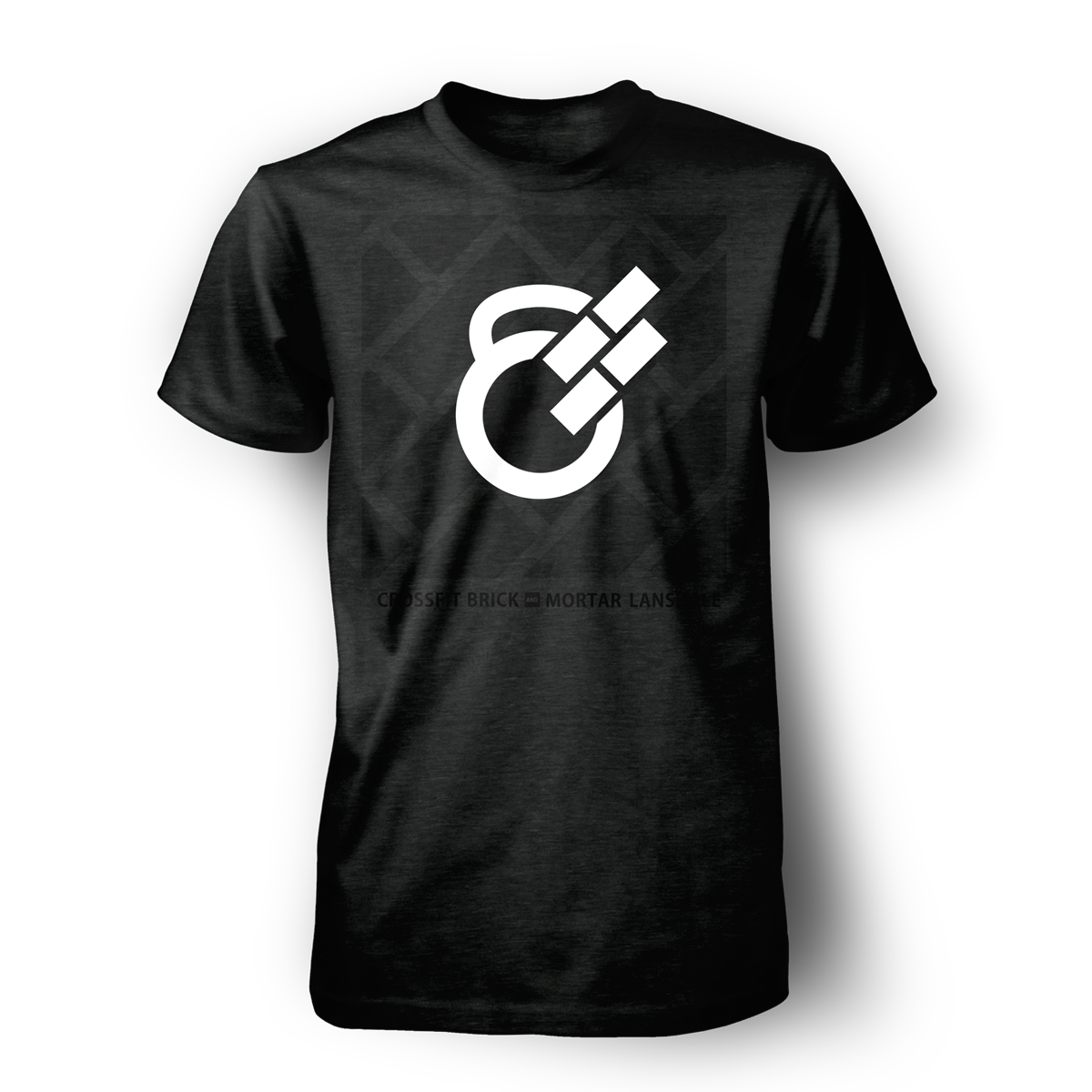
Apparel was an especially popular component of the identity.
The CFB&M brand was blessed by CrossFit and took its place as a memorable athletic brand.