Logos & Branding
Ball 4 Beth
An energetic logo – and a dynamic identity – for a worthy cause.
Participants in a local Boston-area basketball league conceptualized a fantastic idea: a charity 3-on-3 basketball tournament to raise money for cancer research. The organizers of the innaugural Ball 4 Beth tournament (named to honor a family member affected by cancer) reached out to me for help with an identity.
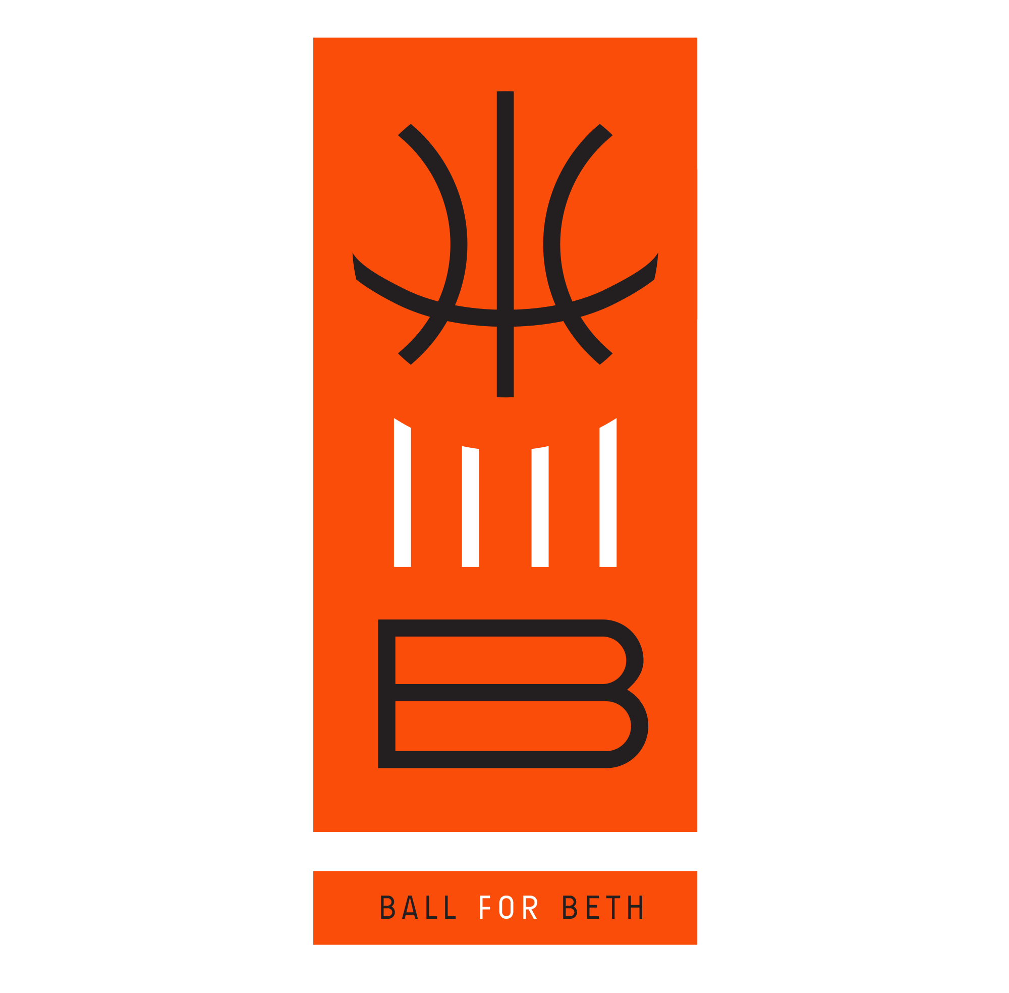
After several concepts, the identity emerged: a simple 3-figure pictogram that communicated the title (a basketball, four vertical strokes, and a B for ‘Beth’) in a simple, memorable way.
Taken apart, each element of the vertically stacked logo could be seen to represent one of the event’s words; together, the visual also gave the impression of a stylized hand throwing a ball up into the air in the manner of a basketball tip-off.
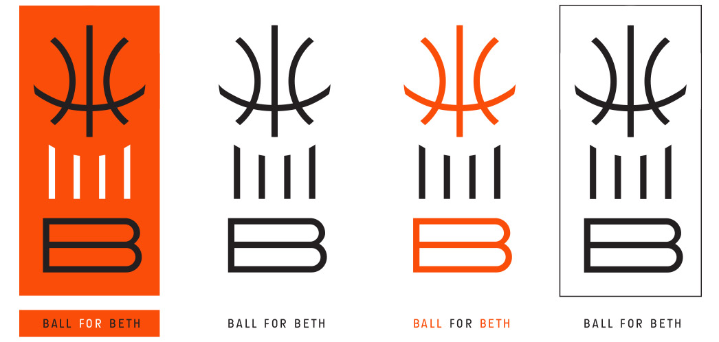
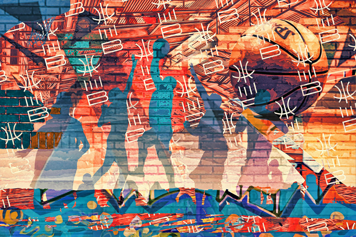
The logo is quite flexible, and can be used in single or multi-color applications. I also created a visual suite of artistic materials, including a mural, to help bring the brand to life.
An information card using the identity package was designed to efficiently and attractively convey information; other collateral (such as a “step and repeat” backdrop showcasing event sponsors) also demonstrates the identity’s flexibility.
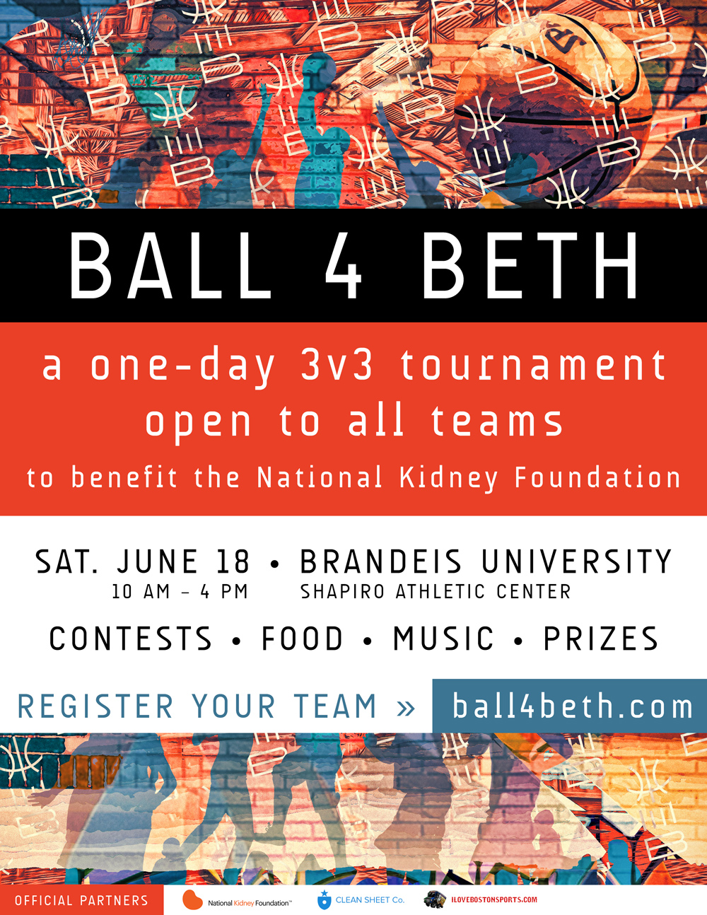

Collateral included a tournament detail card (left) and a sponsor "step-and-repeat" backdrop (right).
The Ball 4 Beth identity is one of my favorites, both for its success as a piece of design and for the cause that it helped support.