Logos & Branding
American Outlaws: Philadelphia
Philly + Soccer + America
With thousands of members across the country, the American Outlaws organization is known for two things: die-hard, dedicated support of the U.S. Men’s and Women’s national soccer teams, and incredibly generous charity work in local communities. I’m a huge American soccer fan, and Philadelphia is my home. When the American Outlaw Philadelphia chapter asked for my help with a new logo, I was thrilled to oblige.
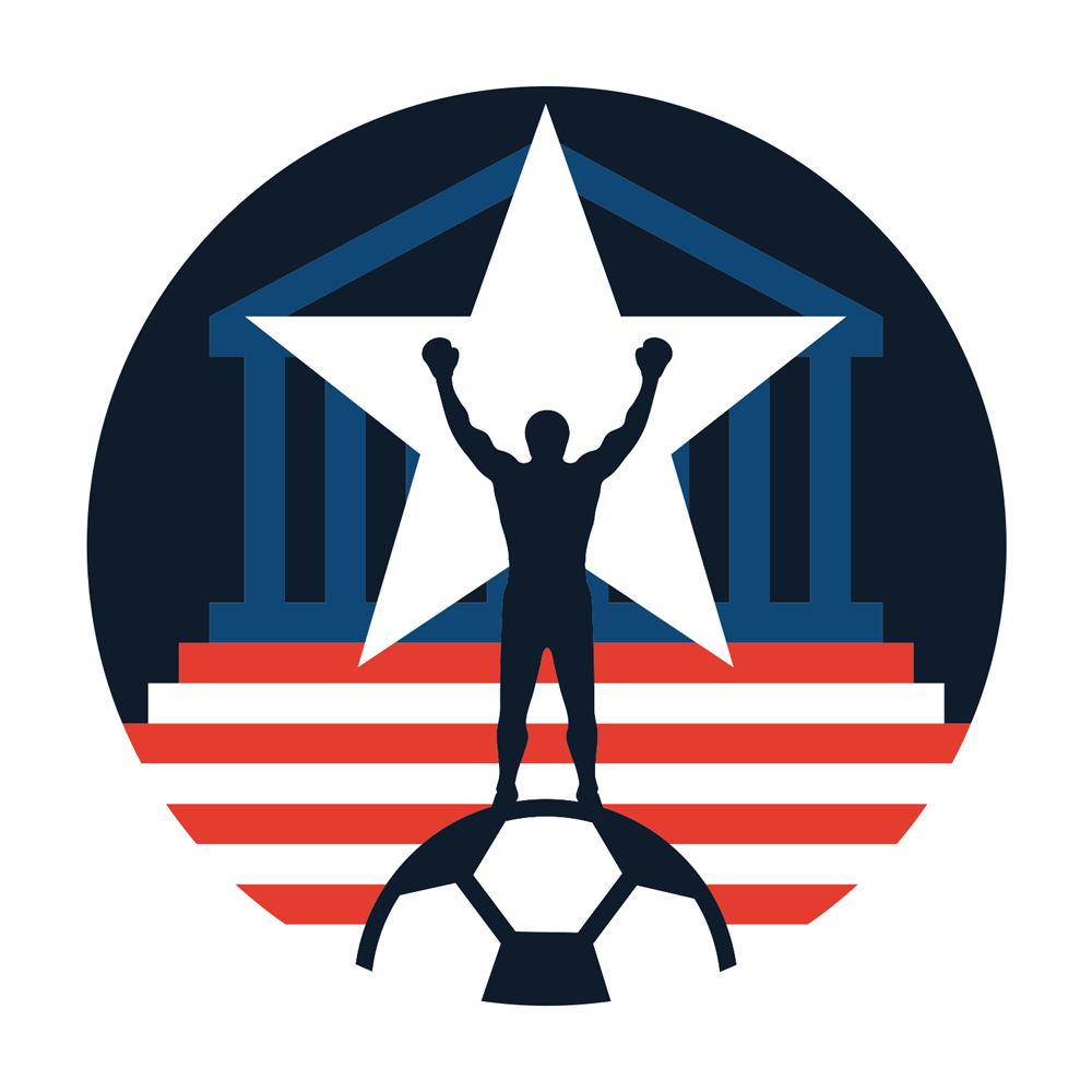
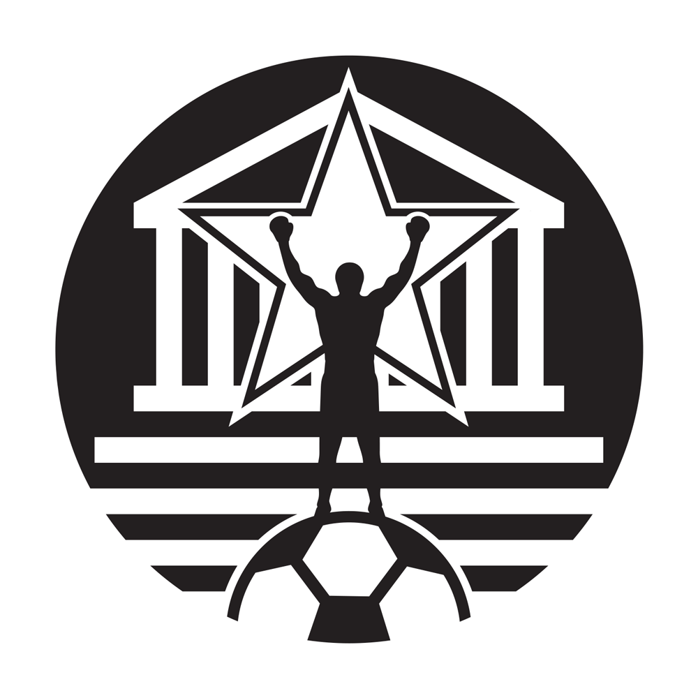
The logo needed to communicate American patriotism, Philadelphia, and soccer in a singular way. The previous logo had used the Liberty Bell and text to get these messages across; I wanted to do something more surprising and energetic.
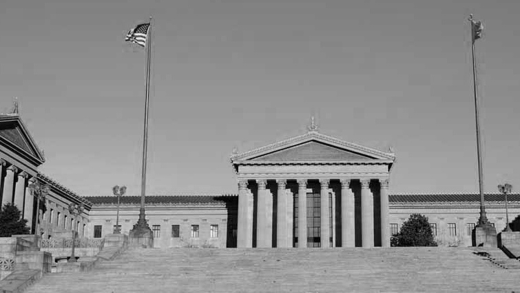
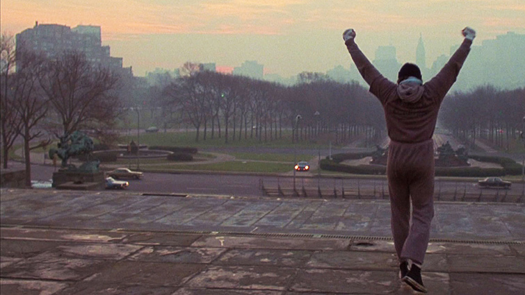
The choice seems obvious in retrospect: represent the Philadelphia Museum of Art building’s iconic facade and steps, and depict of a triumphant champion atop them. (A million conquering poses have been inspired by those steps’ most famous ascendent, Rocky Balboa.) Integrating an American color scheme and some basic symbols (a star and a soccer ball) rounds out and balances the identity. The mark works well because it checks all the boxes – Philly, America and soccer – in an energetic, exciting (and still visually balanced) way.
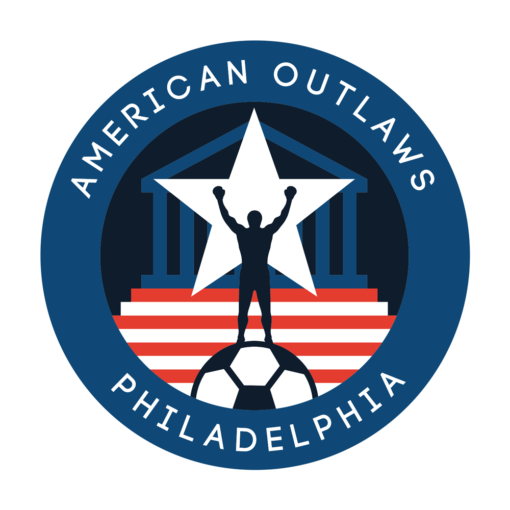
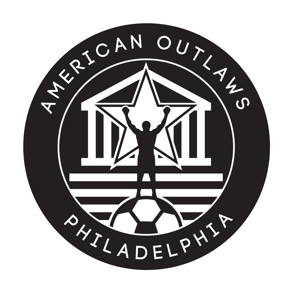
For applications that need more explicit branding, I also developed a roundel ring version that can communicate AO Philly’s name.
Delivery also included one-color versions that can be used in situations that call for reduced color (like bulk-printed t-shirts, posters, fliers, and even stencils).
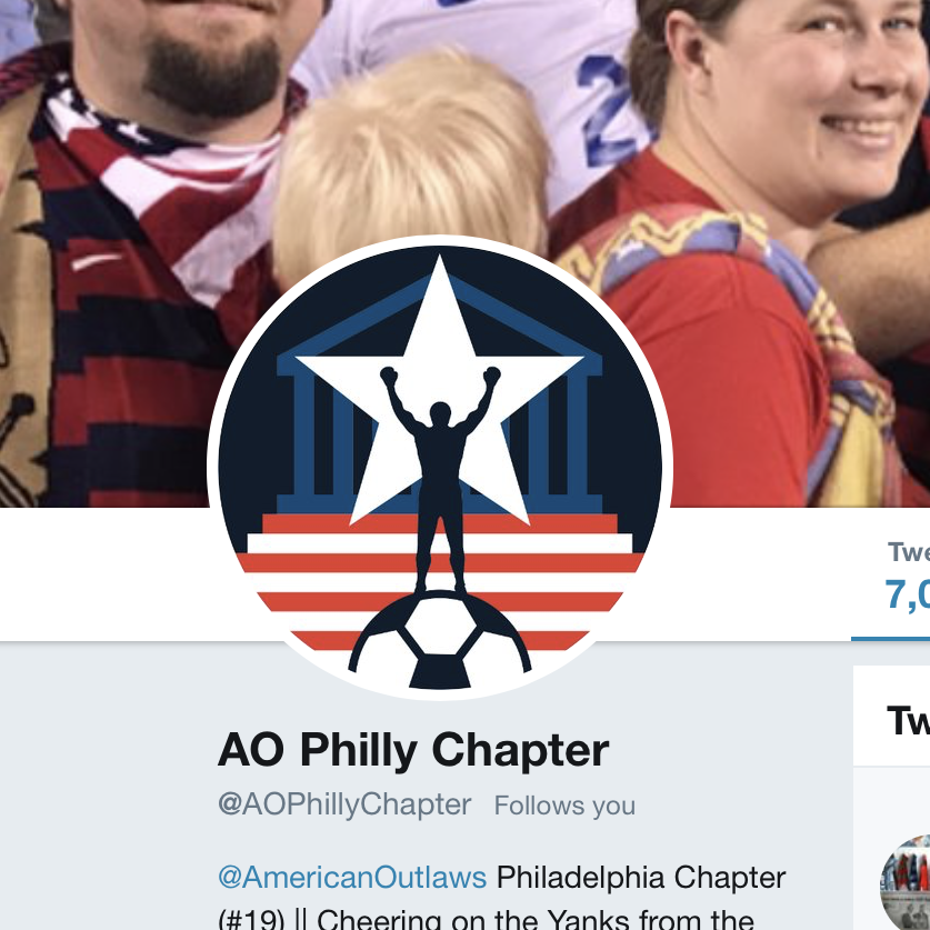
AO Philly has immediately integrated the new identity into its core properties, including social media and apparel.
I’m really proud of this identity – and will wear it with pride as I cheer on American soccer.